Comics design is something everybody appreciates whenever they walk into a store – in many cases, it’s one of the central reasons why they try a comic series they’ve never seen before. And yet it’s something which doesn’t get discussed as much as it perhaps should do, considering the importance of a good logo or cover design. Which is why I approached Dylan Todd a short while back to ask him a few questions about what comics design entails, what good art direction offers a comic, and where he thinks design should be improved within the industry.
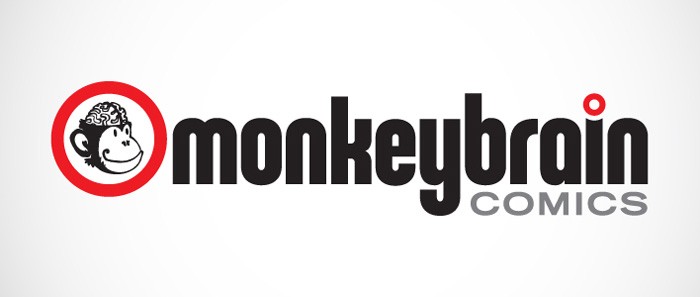
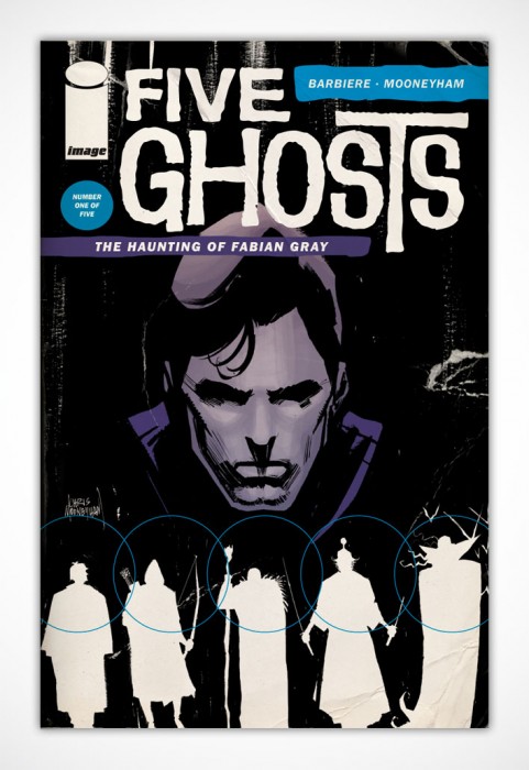
Todd is best known perhaps as the main artistic designer for Monkeybrain Comics, where he developed the design of their interior layouts, as well as the central logo for the company and several of the comic mastheads. He’s also worked on various other comics, including Frank Barbiere and Chris Mooneyham’s ‘Five Ghosts’; ‘Sacrifice’ by Sam Humphries and Dalton Rose; and many others. He’s a man who knows what he’s talking about, which is always a good thing when you’re talking to somebody like me – who rarely knows what he’s talking about.
He was kind enough to take part in an interview with The Beat about his process, what he looks for in a design, and just why it remains one of the most important facets in the creation of a series. His answers are fascinating, and well worth reading in full:
Steve: How did you get involved in design as a career? Do you have a background in art and design?
Dylan: Yeah, design is my career. For my day job, I’m an art director and designer in-house at a place here in Vegas. I started drawing in fourth grade, around the same time I discovered comics. I’ve always been interested in design, though when I was younger, I didn’t really know that was what I was interested in.
I remember the Dick Tracy movie campaign — which ran ads in every comic for months leading up to the release — being a real eye-opener for me, because it wasn’t just illustration, which I thought was what I was interested in, because there was also type involved and the copywriting style alongside the iconic, primary-colored illustrations. A few years later, I read or heard about design and thought, “Oh yeah; that’s what I want to do.”
Steve: Were you always a comics reader? I’m wondering if there may have been any dovetailing between an interest in comics and your subsequent interest and career in design.
Dylan: Until I was 10 or 11, I had no idea comics existed. But one night I slept over at a friends’ house and he pulled out a box of Jonah Hex and Nth Man and Masters of the Universe comics and my mind was blown. I grew up with Spider-Man cartoons and Wonder Woman TV shows, but had no idea that there were comics, too. And they came out every month!
The next day, we walked down to the 7-11 at the end of the street and he showed me the spinner rack full of comics that, somehow, I had never noticed before. I’m not 100% sure, but I’m pretty sure Fantastic Four #313 was my first purchase. I was hooked from then on out. I remember sitting in my friends’ yard with a hand-stapled comic, drawing the cover and taking a long time on the masthead (which was a perspectival, X-Men-ish thing) and our publisher logo. (Which was probably something like Cool Dudes Comics.) Way more time than on the actual cover.
Steve: How did you first make the move to work in comics? What was your first project?
Dylan: My first project was designing the cover for Curt Franklin and Chris Haley’s first collection of Let’s Be Friends Again strips, Under Pressure, which was a lot of fun to work on.
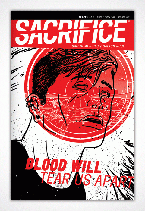
My first “big break,” was working with Sam Humphries and Dalton Rose on their self-published series, Sacrifice. Sam had followed me on Tumblr, saw some stuff I’d posted and hit me up to see if I’d be interested. I said, “Um YES,” because I’d just read Our Love Is Real, and knew he was super-talented. Then he showed me Dalton’s artwork with Pete Toms’ coloring on top of it, and I couldn’t resist.
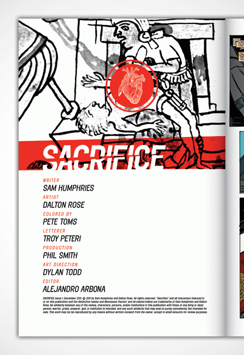
I’m a huge fan of everybody involved in that project: Sam, Dalton, Pete (who, if you haven’t read his comics, is just a real talent. Go check out On Hiatus over at Study Group. It’s hilarious and beautiful.), editor Alejandro Arbona, who’s the Associate Editor at Valiant now. It was intimidating to be included alongside those guys.
Steve: What would you say is the core goal of a strong design? Is the aim to convey as much as possible in as simple an image or design as possible?
Dylan: I think good design communicates. Period. Whether it’s minimal or maximal or in-between-imal, good design tells a story through art and typography and iconography. For comics, that’s usually a cover that catches the eye, lures a reader in, and gets them interested enough to plop down three or four bucks for, well, more words and pictures that tell a story.
Steve: Branding is a huge undertaking, and one which you took on for the launch of Monkeybrain Comics. How did that originally come about? Did Chris Roberson and Allison Baker approach you?
Dylan: I’d met Chris and Allison at an iZombie signing here in town and chatted with them while I waited in line to gaze uncomfortably upon the visage of Mike Allred. (He’s so dreamy.) I gave them my card and we started following each other on Twitter and stuff, chatting back and forth every now and then.
After Chris cut ties with writing for the Big Two, you could tell they were up to something, so when I got an e-mail to chat with them about “something cool,” I knew I wanted in on whatever this thing was.
Steve: What were the goals of the design? Was there a brief of what kind of identity they wanted for Monkeybrain?
Dylan: There wasn’t a brief per se, but we had a phone call where we talked about what they needed, the type of versatility the mark needed to have, what their end goal with the mark was, what sort of things it would be used for, etc. I’ve since developed a “new project questionnaire” that I give to new clients, but our phone call basically ticked off all the boxes there, so I knew what direction to be headed in. The only real restriction was that they had this icon they’d used previously for Chris’ novels, that literal monkey-brain drawing, and they wanted the mark to be fun, but not too fun that they wouldn’t be dismissed as not being serious enough.
Steve: If we take the main Monkeybrain logo as a starting point – this is a logo which uses the same image as Monkeybrain Books, but then adds to and around that central point. How did you approach building up the logo for Monkeybrain?
Dylan: So yeah, once we established the tone we wanted and set some parameters, I got started with my usual, what I call, “wool-gathering”: looking at reference, making word lists, sketching out rough ideas, building computer comps, deciding what to develop and what to toss. I remember looking through the Comixology publishers page and seeing which marks jumped out as you scrolled past quickly. With most things, it’s the simpler, easier reads that are memorable and jump out at you.
I think we went two rounds with the logo, with my first round being close, but overall too whimsical. (I’d had a gut feeling I was being too goofy, but went ahead and shared where I was at to get feedback) Once we looked over the first batch, I sent another round with the one we ended up going with. It was one of those projects where, as soon as I finished that comp, I knew that was the one they’d pick. Feels good man.
Steve: Did knowing this would be a digital launch affect the way you approached your design of Monkeybrain’s logo and branding? Your logo would need to be appropriate for a twitter avatar, for use on ComiXology – does there have to be an added versatility in design now?
Dylan: Oh definitely. I mean, end use of a design should always, not necessarily dictate the design, but at the very least, inform it. It’s something that you need to always have in the back of your brain as you go through the process, regardless of the project. But creating versatile marks and branding systems is something you’re trained to do in school. You need something that works horizontally, or can be stacked, something you can use as a social media icon, something recognizable when it’s shrunk down to an inch or blown up 3 feet wide.
Steve: Do you feel as though the rise of digital has now changed the way comics are designed as a whole? Instead of appealing to readers amidst a shelf of other comics, issues are now struggling for reader attention as undersized icons on, say, ComiXology.
Dylan: I think it’s still too early to say. I think there’s a lot of savvy creators who are definitely keeping digital in mind, but I also think there’s enough people who see digital comics as just a variation of the print product and approach it with that same mindset. It’s not that dissimilar from going from having a 12” LP to design a cover for, to a 5” CD to a 200 pixel iTunes album preview.
I think a good design by a good designer is going to work regardless of size, but I also think you need to remember how your art’s going to need to be used rather than approaching it in a one-size-fits-all mindset. There are titles I purchase digitally that I constantly manage to scroll past when I’m doing my digital New Comic Book Day shopping that look just fine on the shelf, but manage to get lost in the visual noise that is a digital storefront. Digital vs. print isn’t an apples vs. oranges thing, but it’s maybe an orange vs. grapefruit thing. Like, it’s still a citrus fruit, but it’s its own citrus fruit that’s consumed differently.
Did that make sense?
Steve: Looking across the various Monkeybrain covers and logos, the most striking thing is how different they all look, emphasising the variety of genre and styles in the stories the company publish. Was there ever an interest in creating a shared concept for the design of each book, or was this always the idea?
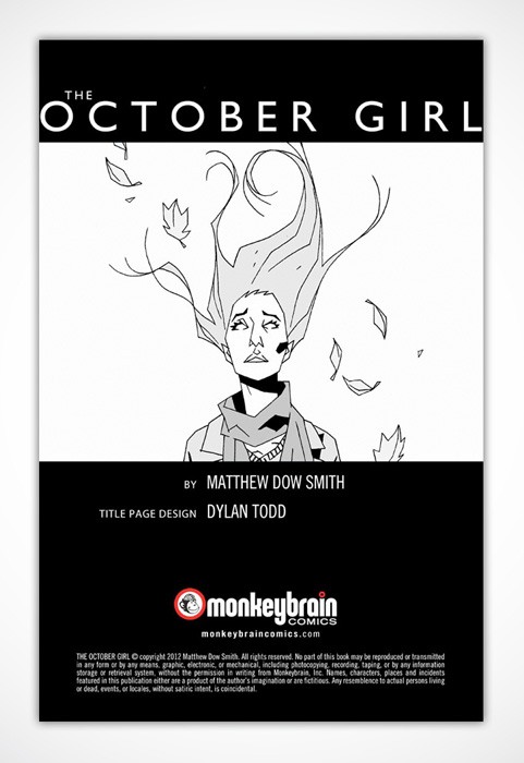
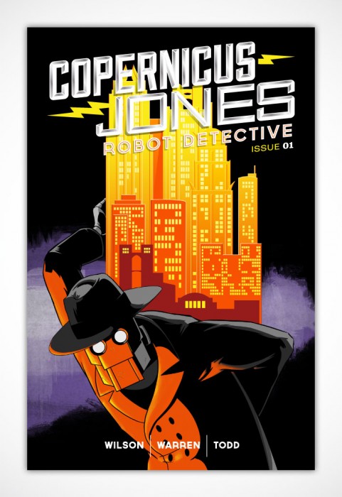
Dylan: The three MonkeyBrain titles I’ve done masthead design work for, Edison Rex, Theremin and Copernicus Jones: Robot Detective, are all wildly different books. I mean, one’s a supervillain-turned-hero book, one’s a psychedelic alternate history action thing and one’s a robot noir, so I’ve approached each of them from those starting points. From the beginning, Chris and Allison wanted to give the creators the freedom to come up with their own ideas and look while still managing to make it all feel like part of a whole.
One of the great things about MonkeyBrain — and one of the biggest challenges in coming up with their main logo and identity — is that they publish a crazy amount of different titles. So my goal was to find a mark and look that could apply to everything from superhero stuff Like Edison Rex or Anti-Hero, to stuff like High Crimes or Amelia Cole or Bandette or Strange Nation. With the exception of Edison Rex, I had no hand in developing the visual identity for any of those other books, but I had to make sure the templates I provided for the credits and bio pages, etc. were variable enough to allow for a host of genres and stories.
Steve: What influences the choices behind the fonts you use? “monkeybrain” here is in all-lowercase as well, which is possibly to highlight the company’s more informal and open approach to publishing?
Dylan: Will it completely blow the mystique if I tell you that the logo is that way because it made a nicer shape with only had the stem of the “K” and the descender on the “Y” sticking out of the shape of the logomark? Haha. I mean, yes, the friendliness of lowercase was definitely a factor, but the final decision came down to it looking nicer with most of the letters taking up the same visual rectangle of space. Sorry?
Steve: Fair enough! You’ll notice that lots of my questions are perhaps somewhat vague here, which is because I don’t know how to talk about design, particularly! I’m trying to learn. Do you find that people do tend to misunderstand or misrepresent the role of design in comics?
Dylan: Graphic design is really hard to understand in general. One of my professors in college told us a story about his dad, who could never understand what exactly he did for a living. My professor was home visiting and one of those Claymation California Raisin commercials came on. His dad looked at him, and said, pleadingly, “Is this what you do for a living?” My professor sadly told him it wasn’t. His dad finally, resignedly, threw his hands up in the air and said, “I’m never gonna get it.”
It’s a hard thing to wrap your head around. And really, design in comics hasn’t really been a thing until fairly recently. You have people like Jim Steranko and his work on FOOM in the 70s, but largely, it wasn’t until the Direct Market took hold and collections became a thing you could buy rather than hunting down back issues from retailers and comics started competing with books in bookstores (for younger readers, bookstores were IRL Amazon.coms) that designers were really brought in to make the product look like, well, a product as opposed to a pulpy, disposable entertainment module that was produced in the quickest fashion possible.
Steve: We’re in a period now where comics are being pulled apart more by fans and critics, and the role of colourists, letterers, inkers are getting more attention. With people like – for example – Jonathan Hickman placing a particular importance on design, do you think we’re starting to now see people pay more attention to art direction and design in comics?
Dylan: I hope so. I think people like Hickman, who has a good eye for design, and Jim Rugg, who won national design awards for his and Brian Maruca’s Afrodisiac, Rian Hughes’ work on the Valiant relaunch and now Dynamite’s Gold Key line, basically the entire output of Fantagraphics and Adhouse, the Steranko revival we’re seeing (his work on Marvel’s FOOM fanzine in the 70s is still some of the best superhero-related work out there), all are working to make comics look better, and that helps the recognition of design’s effect on comics.
Even having Chip Kidd, who is a fantastic book jacket designer (though I think his comics work mostly stinks), doing work in the comics sphere is a good sign.
The sad fact is that most comics design is pretty poor. And I get the reasons why: tight deadlines, overworked staff, corporate politics and cost-cutting, last-minute editorial decisions, being in this weird transition period between comics being this physical thing that sat piled on a shelf in a neckbeard pulp dungeon to something you can read on a future-tablet wherever you want. I get it, I do. I just want sexy, cool-looking comics. I want to try harder.
Steve: What do you want to see more from in terms of comics design? Or on the other hand, what concepts do you think we could do with less of right now?
Dylan: I’d like to see more experimentations, more risks, more pushing how a comic book is presented. More conceptual thinking and daring executions.
As far as what we need less of? Less covering up weak executions with textures or effects. Less “first idea is the best idea” concepts.
Also, more holofoil.
Steve: You write for Comics Alliance, and a few years back had a series of interviews with designers which I’d recommend people track down – in fact, with several of the people you mentioned above. Which designers do you admire, yourself? Which companies or books have especially strong work right now?
Dylan: Off the top of my head, my design heroes are Stefan Sagmeister, Milton Glaser, Jeff Kleinsmith, Chip Kidd, Rian Hughes, Aesthetic Apparatus, Bradbury Thompson, Paula Scher, Vaughan Oliver and the Australian duo behind We Buy Your Kids. I’m probably forgetting somebody, but those are the big ones for me.
As far as publishers who are really putting out top-notch work: Fantagraphics, AdHouse, manga publisher Vertical, 2000 AD/Rebellion. Lots of cool stuff coming out from Image, though that’s more a book-by-book type of thing, but I really like covers for Antony Johnston and Justin Greenwood’s The Fuse, Jasons Aaron and LaTour’s Southern Bastards. Fonografik’s work on Nowhere Men was excellent and his work for Saga is so simple and great. Tom Muller’s work for Ales Kot’s Zero and Jeff Lemire’s Trillium has been fantastic, surprising no one.
I’m not sure who did the design for the Manifest Destiny book, but that’s a really nice masthead. Vertigo’s FBP’s always looking on-point. I really like the design for Joe Casey’s Dark Horse superhero book, Catalyst Comix. Again, I’m forgetting a lot, but that’s what stick out in my mind.
Steve: What other projects are you working on right now? Where can people find you, and your work, online?
Dylan: Right now, I’m finishing up design for for Curt Pires and Jason Copland’s upcoming POP mini-series from Dark Horse, as well as finishing up an anthology I’ve been working on for the last six months or so titled 2299, featuring sci-fi future stories from Kyle Starks, Derek Charm, Nolan T. Jones, Kevin Church, Jordan Witt, Caleb Goeller, and a bunch of other people. It’ll be a 96-page-or-so anthology that we’ll have available through Gumroad in the near future and I’m really excited about it. Lots of dayglo future comics.
–
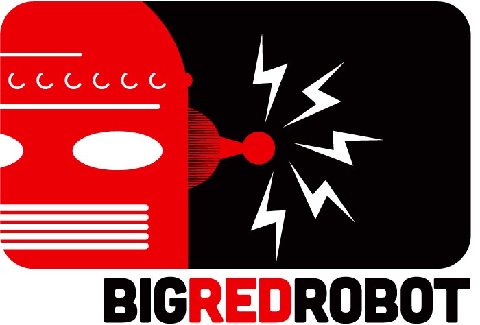
As far as where you can find me, my comics and pop culture design portfolio is located at bigredrobot.net (I have a non-comics design site as well at dylantodd.com). You can follow me on Twitter at @bigredrobot. I also have a bunch of Tumblrs, but my main one’s here. Guttersniper, which is more design/comics-focused, is here.


Thanks for the shout-out Dylan. I’m an admirer of your work as well.
How did I miss this article in the first place?! Really great to see the spotlight on design in comics, and Dylan’s work in particular (thanks for the shout out dude!).
Comments are closed.