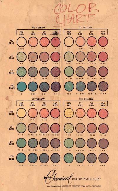
Via the CO2 blog, Gerry Giovinco explores the history of coloring via the color chart, a mix of CMYK values which was all folks had to work with as recently as 10 years ago. I remember once seeing an editor reduced to tears by having to spec a color guide from a color chart. It wasn’t pretty.
This Chemical color chart is all comics had to work with until the mid-’80s. All of the great comics of the Silver Age used just this palette.


I love seeing stuff like this. When I was in school, it was right before traditional paste-up finally died, and had to learn all of this stuff. I still swear by these formulas, and think that these percentages are the best, most vibrant base for coloring, even with today’s technology.
A few years back, Todd Klein posted some old DC coloring charts on his blog that had the formula codes written on them, and I spent an afternoon making a digital swatch palette that I still use constantly.
I still use CMYK color swatches to make some calls. Photoshop has reduced it all to an on-screen process, but there are times (when I’m at the art table) that I consider the color values and my swatches (each with a CMYK color code) come in handy.
With 13 years in pre-press in the high end commercial printing industry at the birth of the Desktop Publishing era, it was a very interesting time to observe the process.
Very, very cool
I can remember doing a coloring job ca. 1980 when I don’t think I had even this much to go on – just a set of markers in percentages of grey, and my mind’s eye, and my tears.
My posts on the subject are here:
http://kleinletters.com/Blog/?p=798
http://kleinletters.com/Blog/?p=811
Boy, do I remember this item from the Pacific Comics days. I haven’t had a chance to look at Paul Levitz’s big DC history yet (sorry, Paul), but I had occasion to speak with him recently, and in congratulating him I asked if there were any photos of the ladies at Chemical Color in action. He said there were a couple.
Various schemes were attempted to enhance this palette, the most notable that I recall being the “color hold”- an awesome special effect back then.
And yes- the poor editor, lost in a see of hieroglyphic “YR2” scrawls crowded onto a color guide was indeed daunted. You kind of waited with bated breath to see the printed comic to make sure it came out in some approximation of the intended result.
I’d take so much pride in hand-coloring my guides… and then I’d have to write color codes & directions for each special effect all over it. It was the most tedious joy-sapping process.
Very interesting. It is surprising how limited the range of tones was. Today, with small halftone dots, better paper and better register, do we even appreciate the work back then to visualize colour?
I remember doing halftone screens with rubylith in the 80’s, and trying to picture how the various PMS tints would print…
As far as I’m concerned, a lot of the old skool comics were BETTER colored than the ones that aim to be CGI on a color chart time frame.
This goes a long way to explaining why, in all of those old 1980s Marvel Transformers comics, Nel Yomtov colored every Transformer that wasn’t in the foreground a solid shade of purple. Heh.
Those were the days… There were usually less colors available than shown on the chart as some production managers liked to cut costs by eliminating the 25% Y entirely except for the “flesh” tone (Y2R2).
Wow, flashback city. This chart was still in use when I started coloring for Gladstone–used it for at least a couple of years. I still have one in my files.
We didn’t use the whole chart either; not for money saving but because Bruce H. hated any value of purple. (Funny, since one of his favorite shirts was a livid shade of lavender.)
While I love the greater latitude digital coloring provides, I have a fondness fro those old color jobs, One had to make a lot happen with less.