This is me still sort of figuring out where I want to go with this column. A side effect of so much comics output being monthly serials is that I often don’t have anything new to say in terms of design if a series has locked onto a solid trade dress. Maybe this is a column that should be bi-weekly? Or maybe I should put the focus more on weekly topics.
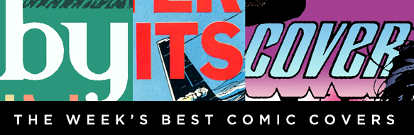
X-O Manowar #26 by Clayton Crain
This illustration is pretty plain and static, but that almost kind of works when most of the other covers out there are trying so hard to out-action each other. What I really want to draw your attention to is the trade dress. Placing the publisher logo and issue number in a bar at the top allows the logo to be centered while still passing the Hibbs Test. It’s an elegant solution that’s almost video game-esque. Ironically, this cover wouldn’t work well in the land of video game box art, where guy-standing covers have become an epidemic.
Personally, I hope Valiant will apply this change to all their covers.
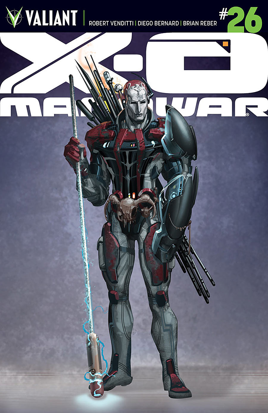
X-O Manowar #26 by Trevor Hairsine
I love the way the logo here blends into the second image at the bottom, and having the central figure overlap the logo and both images does a great job of creating a sense of depth in a dynamic way. My main problem with the image is that coloring the silhouettes orange initially causes me to read them as cut-outs. I might’ve tried to use a color that contrasts against the orange at the bottom of the top image, like a cyan, or a green to match the background toward the top of the cover (which would contrast the red).
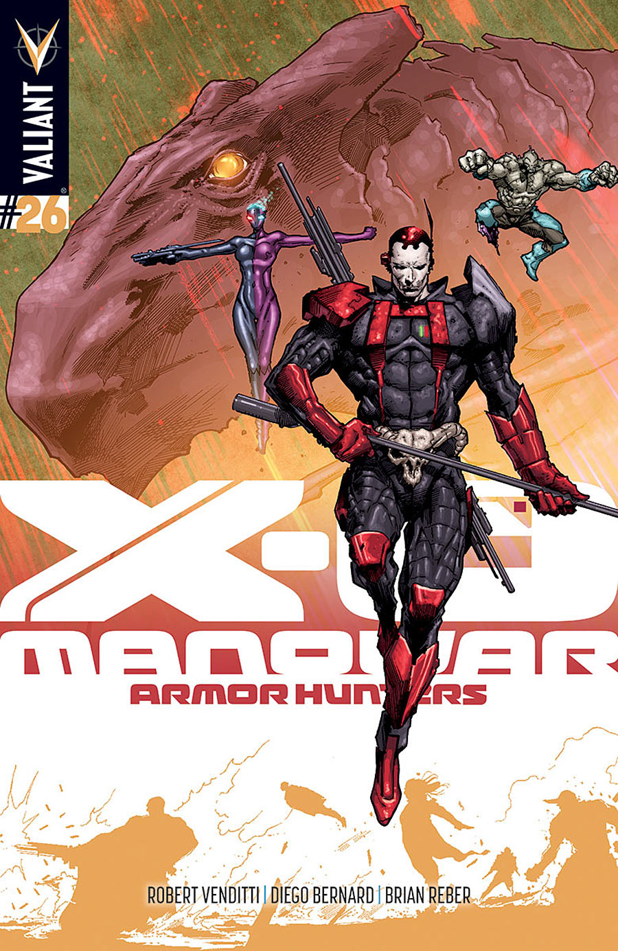
Brass Sun #2 by INJ Culbard
The trade dress still rocks just as much as last time I looked at it. I would’ve maybe gone for a lower angle in the illustration to make the scene more dramatic, but it fits the space nicely.
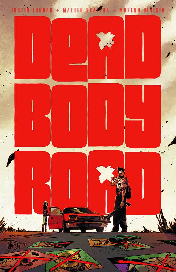
Dead Body Road TP by Matteo Scalera
I’m glad they went for a composition that made the logo very easy to read for the collected edition. Low angles are very dramatic, and the giant logo looks larger than life in comparison to the figures.
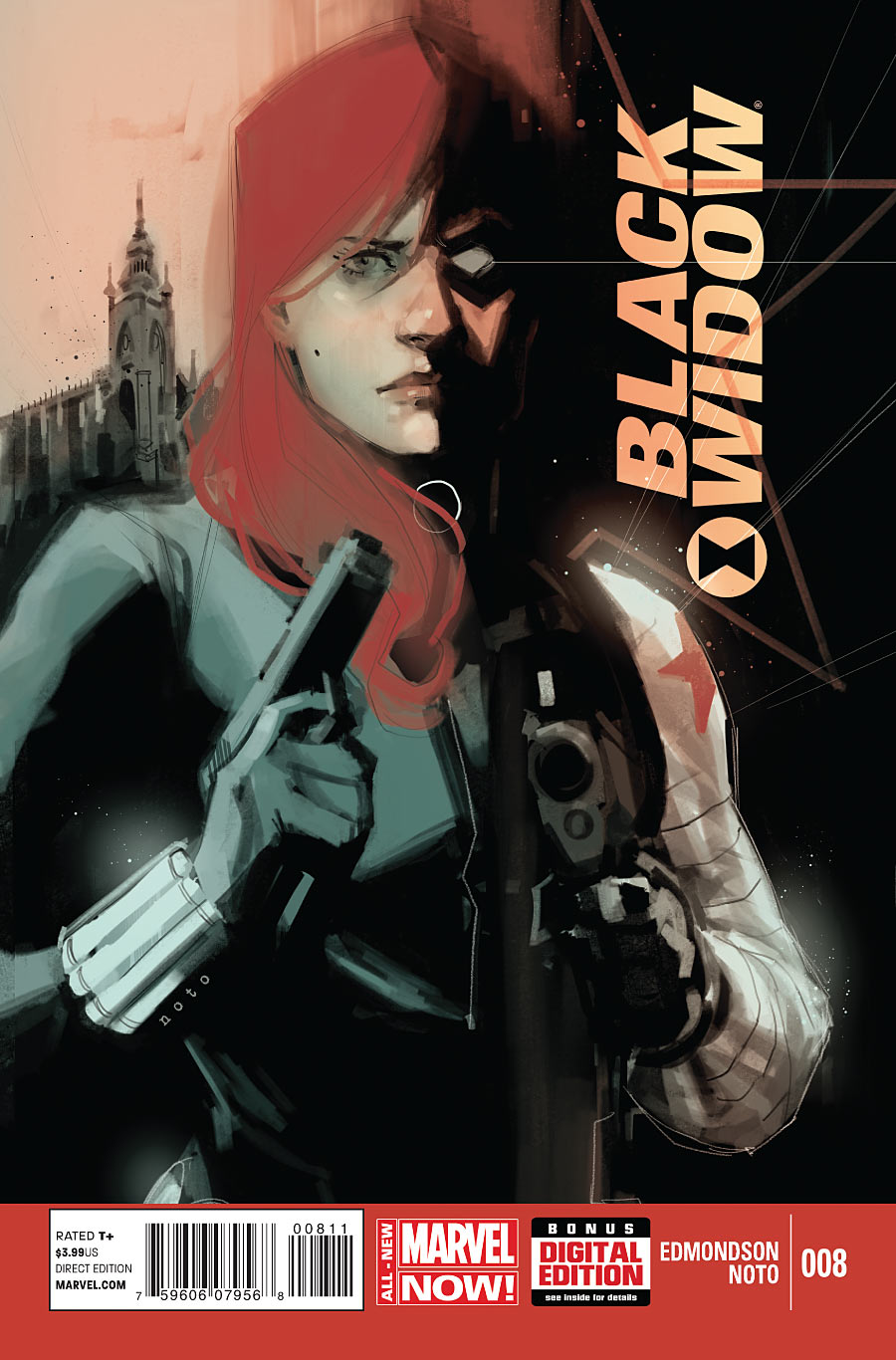
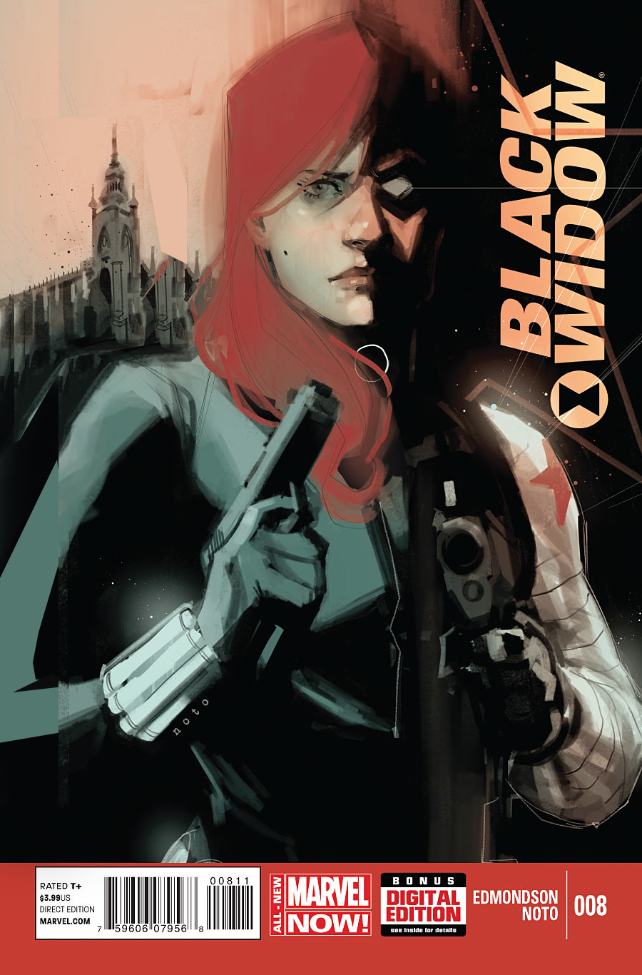
Black Widow #8 by Phil Noto
You can almost never go wrong with a Phil Noto illustration. The only thing I’d change is that I kind of wish the invisible dividing line was over to the right a little more, making that vertical black bar only about 1/3 the width of the page, which would also give more room for the scenic backdrop on the left side. Here’s a sloppy edit to give you an idea of what I mean.
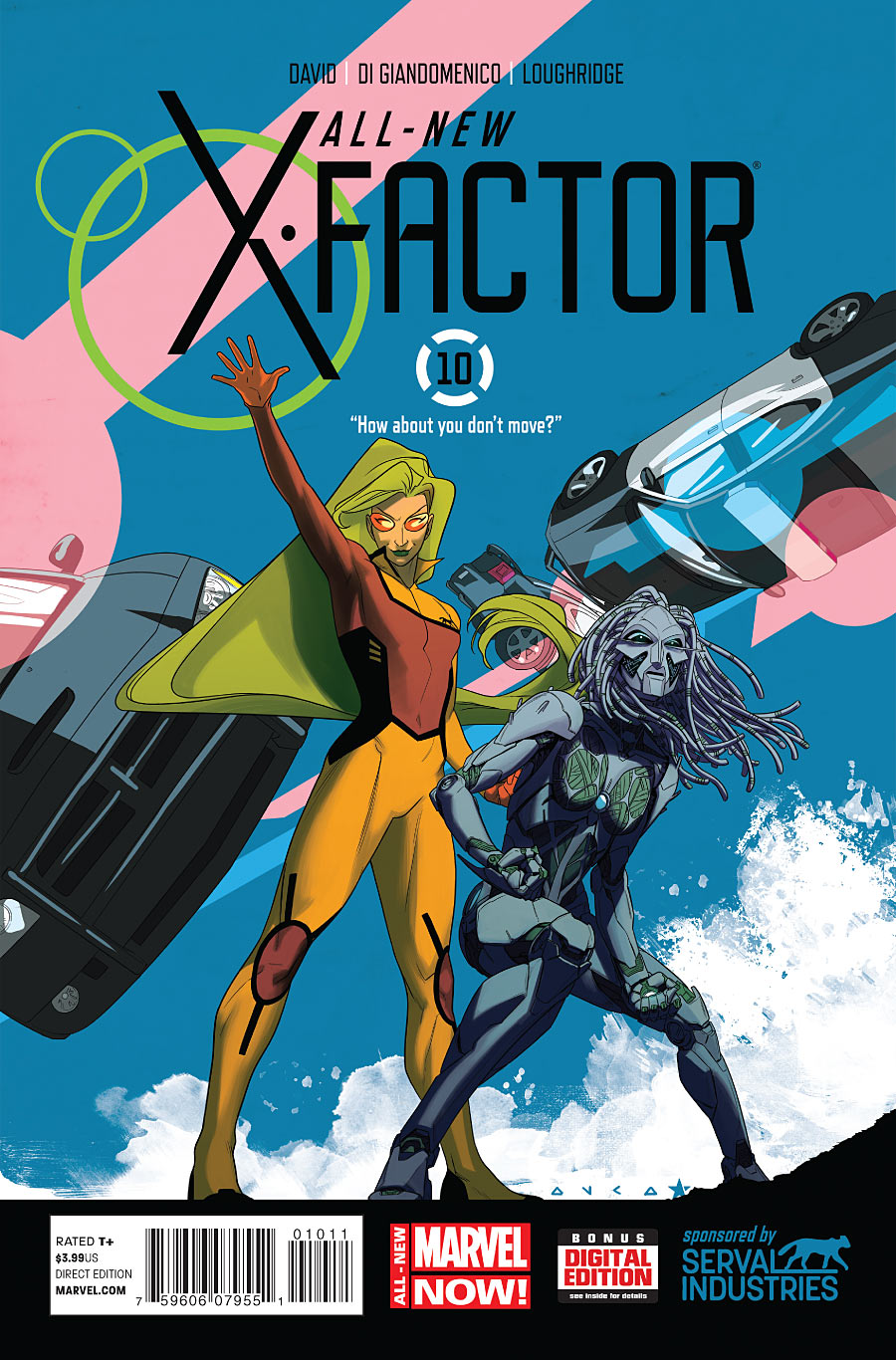
All-New X-Factor #10 by Kris Anka & Jared Fletcher
I love the energy of this cover. I particularly like how the positioning Polaris’ hand blast compliments the logo. It took me a moment to to recognize the objects behind them as police cars, but I don’t have any specific suggestions on what could’ve helped.
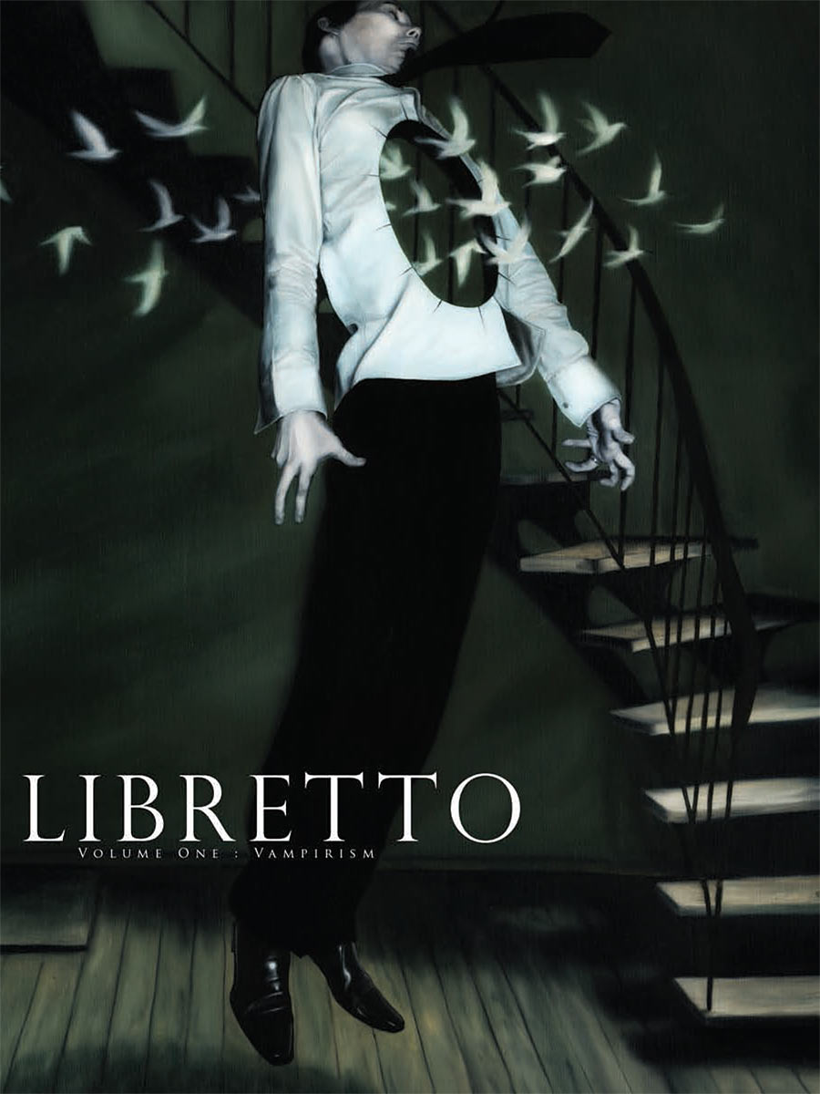
Libretto Vol. 1: Vampirism by mention3
This is a nicely creepy image. My only complaint is the weird way his head touches the top of the frame, as if he tried to jump and knocked his head on the image boundary.
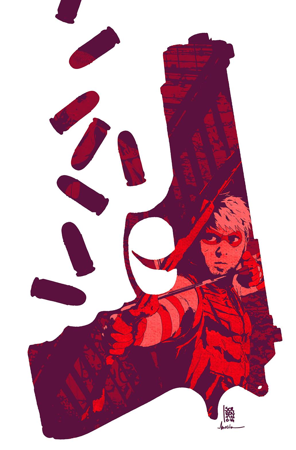
Green Arrow #33 by Andrea Sorrentino
Images of people inside silhouettes of shapes has been a popular theme lately, but this one is so nicely done. The arrangement of the bullets balances well with the gun, and the image inside is very clear and readable. Unfortunately, the final cover ended up looking like this:
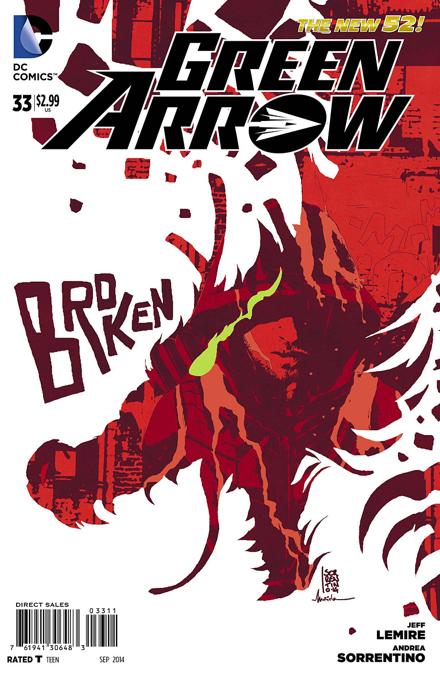
The word “Broken” sums up the last minute substitution. Was the artist asked to toss out that excellent cover and do a new one after the book was already solicited? The final cover looks rushed and is hard to read visually. It took me a moment to find the character inside the silhouette, and the placement of the dragon’s eye looks like the character’s shoulder has caught fire. A waste of a nice illustration.
Kate Willaert is a graphic designer for Shirts.com. You can find her her art on Tumblr and her thoughts @KateWillaert. Notice any spelling errors? Leave a comment below.


It’s kinda funny how every cover you like, I think is crap…none of these are terribly good designed…the gun is ok…the rest, I’d have tossed at the design stage.
My guess is the editor asked for the Green Arrow cover change because the dragon breaking through makes more thematic sense with the villain Ollie’s currently facing.
I just wanted to mention how much I appreciate your mockups, like the “sloppy edit” in this column. Makes it really easy to see the point you’re making, and I know there’s some work involved.
I’m a little sad that you didn’t mention my favorite comic cover of the week. If you get a chance take a look at the cover to Transformers: Windblade #3’s cover A by Sarah Stone. I think it is really great and very striking. would love to hear your thoughts on it. Link below.
http://www.tfw2005.com/transformers-news/attach/7/0/1/2/3/Bix67JOCQAAOu2x_1394899914.jpg
@Alex: What’s your pick for best cover of the last two weeks?
@Chris: I could see that being the case.
@Mark: Thanks. :-)
@Jason: Well, the first strike against it is the uncentered logo over a centered illustration, which I’ve mentioned before is a huge pet peeve of mine. Also, the over-rendered “Dawn Of The Autobots” header doesn’t match the tone (or color scheme) of the illustration.
The illustration itself is lovely, but I don’t understand at all what’s going on with the vertical red lines. I get the feeling that’s something that might make sense to me if I was reading the series, but as a potential new reader I have no idea what’s going on there.
Kate,
The only idea I can suggest for this column is just do Mind MGMT all the time. I dunno…I don’t read a l
Kate,
The only idea I can suggest for this column is just do Mind MGMT all the time. I dunno…I couldn’t possibly be anymore in love with a book.
Oh! BOOM has some really nice covers on its Regular Show and Adventure Time comics.
That’s really all I got. I enjoy this column because I see so many covers I never would otherwise. And you have a very firm understanding of design. So, yeah, great job!
Comments are closed.