Being that it’s the column’s one month anniversary, I thought I’d do some reader questions. Except I don’t have any reader questions, so instead I’m going to ask you the questions.
1) What’s your favorite part of the column so far, the opening topics or the weekly cover picks?
2) How would you feel if the opening topics eventually became a separate column (one that maybe even discusses interiors)?
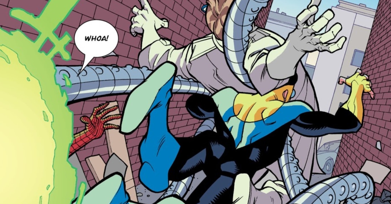
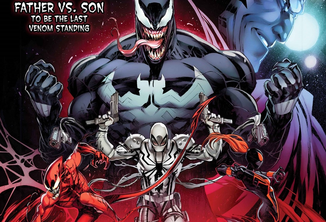
3) Can you name the comics used in the “ransom note”-style title image above? I will give an authentic Non-Prize* to whoever can even name issue numbers (if applicable).
*Non-Prizes are absolutely not just a cheap knock-offs of No-Prizes, and are in no way affiliated with Marvel Comics or its subsidiaries.
Last week’s covers:
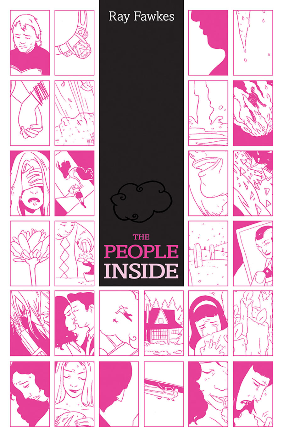
THE PEOPLE INSIDE
Attempting to read the cover like a comic page is like watching an avant garde movie trailer consisting of short unconnected moments played out in a rhythmic staccato manner. The bar in the middle functions as a container for the title, but also as a place for the eye to rest, during which you might notice the peaceful little cloud hidden in it. I don’t know what any of it means, but it makes me curious to know more.
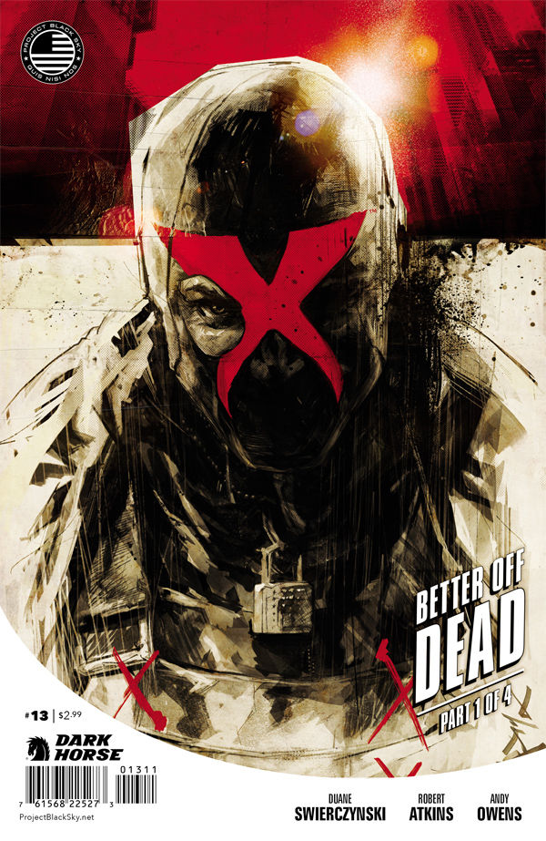
X #13
Personal Taste Alert: I’m a big fan of old record covers that didn’t have any text on the front, or that creatively displayed text within the image. So I love when I see comic covers do similar things, like this cover that use’s the character’s mask as the logo. It’s just unfortunate that they had to ruin it by including the story arc title (I could’ve ignored the barcode and other text, since it’s in a container outside the image).
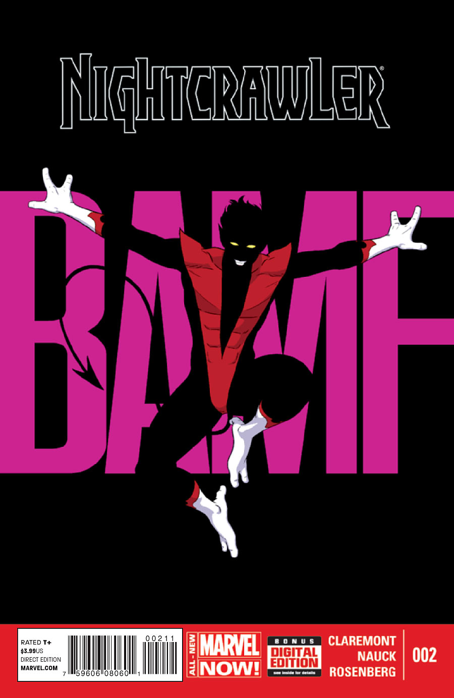
Nightcrawler #2
I love the way that the character disappears into the background and between the spaces of the letters. But doesn’t it seem like it isn’t a great fit for the space of the cover, or is it just me? I can’t help but think this would make an amazing landscape-oriented poster or double-page spread, but as a cover it feels like it’s missing something
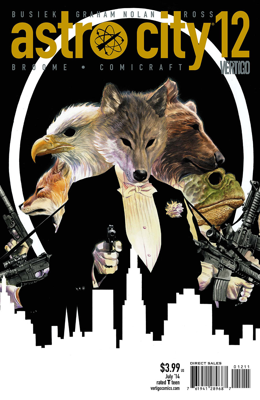
It’s the little details that appeal to me in this cover. I like the way the word “Vertigo” fits under the issue number. I like the way the image just sort of ends at the bottom, in a reverse-silhouette skyline. I like the way the one skyscraper blends into the white shirt of the wolf. Oh, and the animals holding assault rifles. There’s also that.
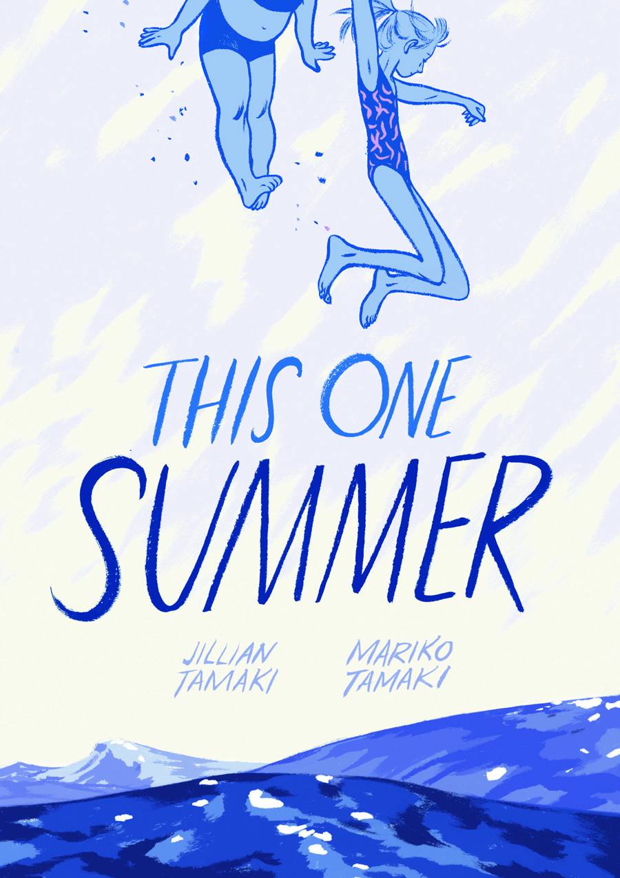
THIS ONE SUMMER
This composition is so fantastic. If they ever turned this into a movie, they’d pretty much have to recreate this image for the poster, because any other composition would be disappointing in comparison. I love how the falling characters lead you right to the title. If I had one critique, it’s that the blue color scheme seems very cold for a story about summer. Or is that symbolic of something in the story? Otherwise, it might’ve been nice to have even just the two characters in warm colors, to make it feel more summer-y.
Kate Willaert is a graphic designer for Shirts.com. You can find her her art on Tumblr and her thoughts @KateWillaert. Notice any spelling errors? Leave a comment below.

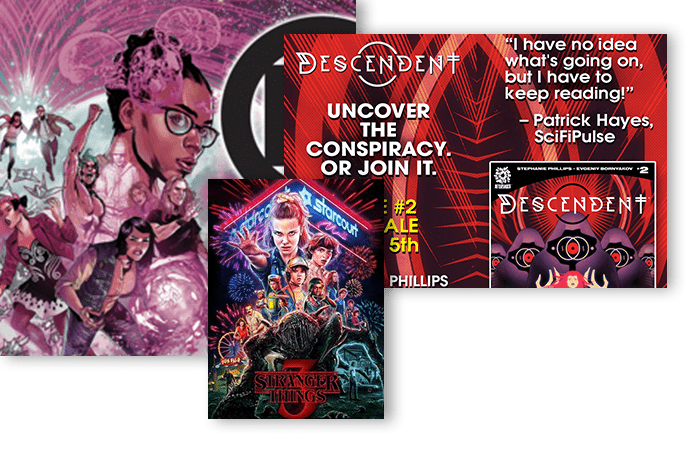
1) What’s your favorite part of the column so far, the opening topics or the weekly cover picks? I like both elements. I always feel I learn something new from the opening topic and then I love the weekly cover analysis.
2) How would you feel if the opening topics eventually became a separate column (one that maybe even discusses interiors)? I like these two segments together and think they work well together, but I would also be happy to read more art critique from your unique perspective.
3) Can you name the comics used in the “ransom note”-style title image above? I will give an authentic Non-Prize* to whoever can even name issue numbers (if applicable). I have no clue but kinda want to go try to research and find out now!
Okay reader question: Do you think you’ll ever take submissions or suggestions for great covers from readers and then analyze them? There is a cover coming up next month that I absolutely love and found very striking when i first saw it in Previews and I’d like to hear your thoughts on it.
At their TCAF panel the Tamakis talked about how they had to fight for that cover design since most YA novels have a very specific ook. Agree that coverr is a masterpiece though. As are the insides.
I like the two topics together.
If a topic generates great discussion, why not do a quarterly “fifth week” special column just on that topic?
I would like to see a discussion of trade dress for specific events, like the DC covers for February 2002.
No idea on the logo, but it does remind me of the Comics Interview logo which used letters from distinctive comics logos.
@Jason: I’ve been thinking about taking requests and occasionally tackling a group of them at once in the column. Though it might work better to request something I missed rather than something upcoming.
that Nightcrawler cover is so simple, yet effective. It was my favorite of last week.
I love reading about graphic design and how it is used and misused on comic book covers. I don’t have a favourite portion of this column, I like it all!
It would be interesting (and really catty and fun) to pick out a worst of the month every fourth column. I’d be curious what sort of thing you would feature as just getting everything really, really wrong.
Comments are closed.