We’re not going to plagiarize ALL of Dave Johnson’s cover comments…only several of them. He’s at it again this time with some cover PICKS:
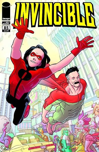
First off, this is a fun cover from Cory Walker. There’s a lot going one but it’s got great depth and priorities. The main characters stand out against the background, allowing you to discover the detail in the background as a secondary note. The way it should be. The atmospheric perspective helps out by lightening the BG as the elements gets farther away. It’s the way to do it people, take note.
Then he has at this cover, which has a teeny tiny problem
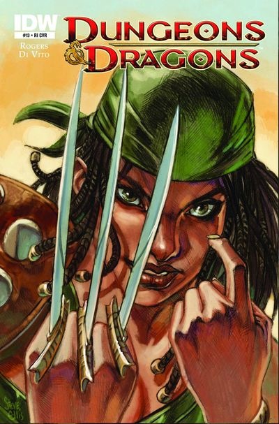
My main problem with this is lack of credit to the original artist Frank miller. People, without a credit note to the original source of your design I’m just going to assume you’re a plagiarist. You’re better than that.
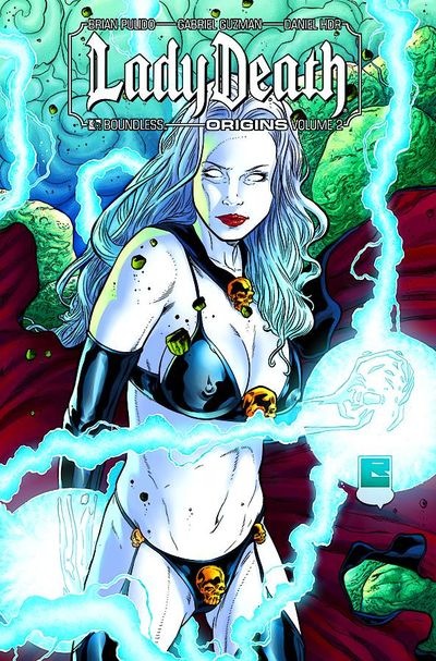
and says what we all wanted to say about Lady Death:
Ok, my issue with this cover isn’t so much that it’s a bad design, but the fact that all the Lady Death covers are basically the SAME FUCKING COVER!!! Usually a traced Victoria’s Secret photo with some random elements tossed in. Never anything about a story, although that might be on purpose. I can’t imagine that it would be that great of a read to begin with, but maybe I’m just immune to ways of Lady Death. For all I know, it could be the Watchmen of soft core titillation super hero books. If you’re a huge fan of the book and you think I’m wrong about it, let me know. But regardless, the cover designs of this title leaves me limp.
There’s more, but you will have to go to the link for that.


On that LADY DEATH cover — I can note a design flaw, even if Dave doesn’t. If you’re going to do a softcore titillation cover, you want the presumably-sexy silhouette to stand out. So why surround her left breast (which could stand out against the background, attracting the eye to Hey, Boobies Here) with blue, thus muting the silhouette? Even where it’s up against a red-cape interior, there’s a blue lighting effect.
Kudos to the realistic waist-to-hips ratio, though I’m not sure that’s what the audience for this wants. And having her belly pooch out over the garter belt skull? It’s endearingly literal, but again, maybe not what’ll hook this audience.
“But regardless, the cover designs of this title leaves me limp.”
“But regardless, the cover designs of this title leaves me limp.”
That pun HAD to be intended.
The skull on Lady Death’s underwear would likely create and odd bulge if she ever put on pants.
IF.
What a great blog — Dave Johnson points out something that should be common knowledge to anyone working in comics: a basic understanding of graphic design and illustration fundamentals. It’s horrifying how many times major publishers disregard or are unaware of simple rules of legibility regarding typography, color, composition, etc.
Look at those old silver age books — you could usually tell what was going on the cover from across the room. And they were packed with type, which you might think would make viewing more chaotic — but it actually made them more dynamic.
Possibly one of the worst “advances” in comics has been the airbrush tool. In the hands of a competent colorist, the airbrush tool can add a dramatic flair or a touch of realism. But too often it’s misused by hacks who don’t have enough sense to not use it on every square inch of the page.