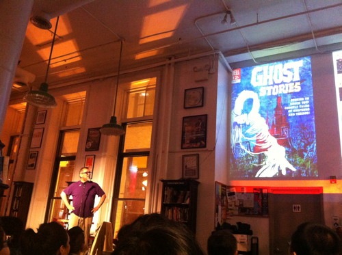
I was lucky enough to attend the slideshow and talk by Gilbert Hernandez at Housing Works Bookstore the other night. Beto presented a slideshow of his favorite comics of his youth, a particularly salient topic since his new Marble Season is about the joys and mysteries of a kid’s world, including comics and tv and games and baffling adults. (There’s an excellent interview with him on the topic in the Chicago Tribune here.) It’s taking all my will power not to post all the images that he showed—from old ladies to scary monsters—but I’ll refrain for those who have yet to attend the upcoming events on his tour. Let’s just say that I wish it could have gone on twice as long.
Okay here’s one, the famous story from Weird Fantasy #18 where the last panel reveals the hero to be a black man.
“It hit me like a bombshell,” he explained, that a hero could be brown or yellow or anyone, really. A stark reminder of why inclusion is so important in pop culture. He also mentioned the oft asked question of why he writes so many women characters. “Jesus Christ, why is it an issue?” he laughed. “The women had to be there because they were part of the planet.”
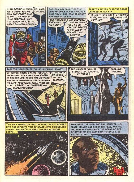
Although he didn’t come out and draw a straight line to his own work, the kids comics he most loved —Bob Bolling, Owen Fitzgerald—were all incredibly naturalistic, and obviously they spoke to him because thats the path his own work went down. (Brother Jaime’s twitter avatar is a Fitzgerald.)
I will link to this post by John K. on Fitzgerald, who drew Dennis the Menace comics, Bob Hope, and many others.
Owen is a master of pretty girl art, in fact, in my opinion, far superior to any of the Archie artists, even though I like some of them very much. Owen is a much more observant artist than the average comic artist. While most comic artists imitate other comic artists, Owen actually draws his style from life. His poses are very natural, his anatomy (esp. the girls) very studied and yet he brings an elegant animated cartoony flair to his work.
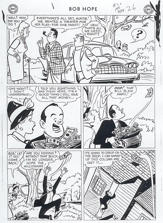
It is pretty glorious stuff.
Oh yeah and one more. Here’s the cover to that Weird Fantasy #18 from 1953 by Al Williamson and Al Feldstein.
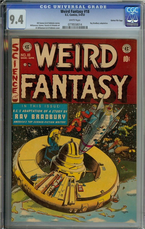
I’m not an expert on EC’s production methods (I’m sure someone will be along in the comments any second now) but I assume it was done in the same color guide and frisket method used in the olden days, when production artists had to make color separations by hand. Despite the “primitive” methods, this cover is better colored than 95% of anything on the stands today, and vastly superior from a legibility standpoint to the current video game style. Notice how the important elements — the space station, the floating astronauts— pop out from the background, and the planet below is given an extra layer.
While looking for the cover I found a jpg of what must be the Gemstone edition of the comic from 1997.
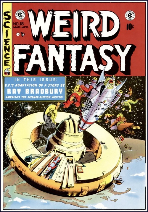
Even though they tried to stay very close, to me this isn’t as good. The more natural “greys” used in the new one are more “real” but less dramatic than, for instance, the blue shadow on the wheel gantry (or whatever it is) on the left. The deep forest green on the planet is also more interesting and intuitive than the brown of the new one.
In any era, it’s a stellar piece of work. The Grand Comics Database doesn’t list a colorist, but it was probably Marie Severin—I’d urge you to read James Romberger’s appreciation of her work here even if it wasn’t.
Gilbert’s slideshow also reminded me of that whole dumb argument over whether comics have their own merits or should only be judged against Ovid and Trollope. Sitting in the gorgeous space of Housing Works, beneath its beautiful lighting, listening to Gilbert talk as the giant images were thrown on the wall, confirmed for me that the poetry of the comics page is its own reward now and forever.
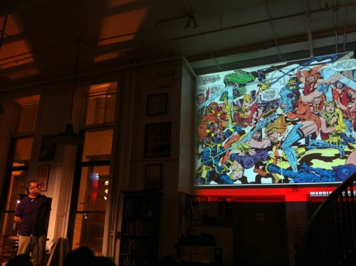
I’ll leave you with this image of Gilbert and a giant Jack Kirby image. Nothing could be more perfect.
[Gilbert Hernandez will be appearing tonight at Quimby’s in Chicago. Go!]


Since you brought up color: I came across a give-away Avengers comic done specifically for the military personnel given away at the local PX. While the cover was well drawn it was completely destroyed by heavy handed coloring. Too bad, the interiors were drawn by Tom Grummet but his excellent art seemed to be dulled by brownish coloring.. It’s a good thing this was a give-away ’cause I don’t see how anyone would be inspired to *BUY* it based on the color.
He’s the best there is. A man among boys. Chis Ware isn’t fit to crumb his table (and I think Ware is an all time great). Gilbert doesn’t measure up to Crumb, but then again Crumb isn’t human.
Great post! I was at Housing Works as well that evening, and it was a true pleasure to listen to Gilbert share his thoughts.
Comments are closed.