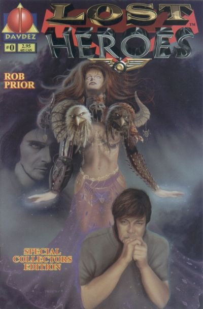
§ Dara Naraghi’s Indie Cover Spotlight is celebrating its 200th post today with a proto-nerdlebrity comics that features likeness of Mark Hamill, Julie Strain, Kevin Eastman, Walter Koenig, Bill Mumy, and more. It also has a woman with extra breasts in the shape of hawks heads.
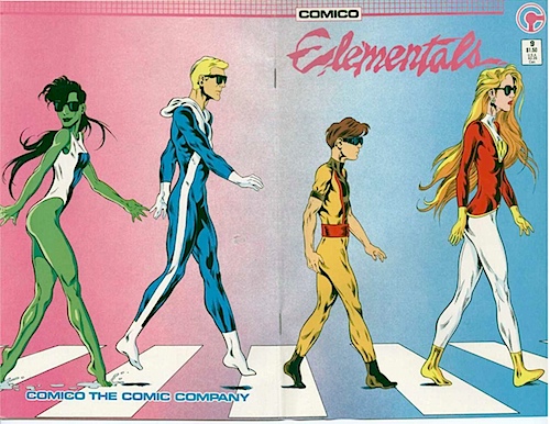
Dig back in the achieves of this feature for some of that 80s goodness like the time that Bill Willingham drew….and very well. Oh comics, will you ever cease to amaze me?
§ Wanna catch up with the tangled tale of Cassandra Cain? CHris Sims is your man.
§ A great career spanning interview with Society of Illustrators director Anelle Miller with a lot of information on her tim win the fashion industry:
FR: When did you transition out of Estee Lauder?
Anelle Miller: I transitioned out in 2005, about 9 years ago. I wanted to again make a change. I wasn’t sure about what I wanted to do. I needed to be more creative and surround myself with creativity. I started two companies on my own. One company did creative marketing for nonprofits. I was still consulting with Estee Lauder working on the archives for Origins and then started another company called Original Women that focused on female artisans around the world. I did that for two years and then I got a call from a headhunter who wanted to know what I was doing and where I was. She mentioned there was a top position at the Society of Illustrators and of course, I was beside myself, because I had been coming here to draw for 30 years.
§ Fan Expo, the 3rd biggest convention on the continent, wrapped this weekend but one smaller comics website complains that they are clamping down on press passes: now they don’t even give out Saturday press passes.
I don’t believe Fan Expo needs or really wants any press coverage: they have 100,000 or more email addresses of people who attend their show. A built-in captive audience they can sell to whom they know like the product they offer. One free pass means one body in the show who didn’t pay and is taking a spot in a packed convention centre that could have been occupied by a paying customer. Our site’s audience is interested in hearing about what back issues were available, how they were priced and what that means for the coming year. No cosplay, no toys, no video games. Just comics. End rant.
§ The Sydney Morning Herald, one of Australia’s most respected news outlets, either a) punker everyone or b) brought shame upon their nation by using fated font Comic Sans in a from page fumetti, that , to be honest, looks like I did it. THe paper was unrepentant.
“As for the newspaper, the decision was made to match the surreal nature of the shocking revelations at the ICAC (Independent Commission Against Corruption) — and it was felt the font would best depict the comic-book feel we were trying to give to the front; as if to make a mockery of the appalling displays in the witness box from a former politician and a current parliamentarian. I am very pleased with the result, but that’s about it.” In a show of total disrespect to design guidelines and the year 2014, Goodsir then described the font as “underrated.”
I can understand all the objections to the ubiquity and inappropriate use of Comics Sans. It has its place – it’s one of the fonts often recommended for use in materials aimed at people with dyslexia. And while I don’t suffer from that, when I had to close proofread a series of book sized manuscripts in another language I found it by far the easiest font for that purpose. However it is indeed often misused.
The snobbery about it is something else though. For me font-shaming is even more irritating than misuse of the font. It’s almost as bad as if I were to show off by pointing out that, despite what Harvey Kurtzman thought, the Italian word for a comic made from photographs is fotoromanza – fumetti simply means comic :)
I don’t mind their use of Comic Sans.
What I do find appalling is the amateur word balloon placement.
They should be placed above the speaker’s head, and the tail should point in the general direction of the speaker’s mouth (or head, if in thought).
Also, care should be taken to arrange the text in the balloon so that negative space within the balloon is kept to a minimum.
Comic Sans has one glorious moment in comics history:
Microsoft Comic Chat.
I don’t think those are extra breasts. They could be a two headed creature at both ends (tail and head) hanging from her neck.
Unless the creator stated that they are indeed breasts!
Toronto Fan Expo has been not giving press passed for all days of the convention for many years now. It’s the reason I stopped going. Why on Earth would I pay a convention (especially a for profit convention) for the privilege of covering them? Especially when I am welcomed with a press pass at virtually any other convention in North America?
Ireland, why ruin the fun? Raptor bird head mammaries are AWESOME! It’s one stop beyond the Colbert Show opener! Raptor bird head feather stoles are boring.
Gene Ha, if that is true, I’m countin’ 4 bewbs. Hahaha.
It reminded me of this character called Zuma.
http://glitternight.com/2012/02/26/man-in-black-reviews-has-been-kind-enough-to-add-me-as-a-reviewer/
They just look like shoulder pads to me.
They don’t read *to me* as extra breasts.
But to each their own. Art is subjective.
I like how there’s a discussion about the validity of the “hawk bewbs” with comic pros. That’s when you know your comic book cover has done its job!
Heidi: thanks for the link. I’m hoping to get back into regular updates on my blog.
Comments are closed.