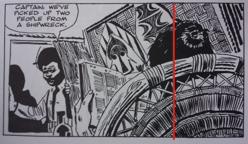
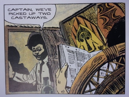
Publisher Rizzoli has responded to complaints lodged here and at the Big Planet blog about production shortcomings in the new edition of Hugo Pratt’s The Ballad of the Salt Sea. After we ran our own lament yesterday, Big Planet came back with a panel-by-panel breakdown showing how the art had been resized and repaneled into a much less appealing format. For instance, notice the cropping and poor image quality in the new version, below:
However, as the letter from Rizolli, the publisher, makes clear…Pratt himself approved this version in 1994 before he died the following year. That’s kind of stunning, that he cared so little for the layout of his own work but…well, who knows what he was thinking towards the end of his life.
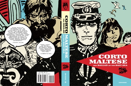
Rizzoli and our Universe imprint have a history of republishing classic works that have long been out of print. Occasionally these books need to be updated or reworked, such as with our M. Sasek This Is… series where facts need to be changed, but we as a publisher always strive to remain true to the artist’s original work.Recently, Rizzoli was thrilled to retain the rights to republish Hugo Pratt’s Corto Maltese: The Ballad of the Salt Sea. To ready this new edition, Rizzoli worked closely with Patrizia Zanotti, Pratt’s longtime colorist and collaborator from 1978 until his death in 1995. Zanotti is now executor of the Hugo Pratt estate.Our edition of Corto Maltese: The Ballad of the Salt Sea contains only changes that were made by Hugo Pratt himself or under the direction of the Pratt estate.Corto Maltese: The Ballad of the Salt Sea was originally printed in the Italian comics magazine Sgt. Kirk, in 1967, and later in the French magazine Pif gadget in the early 1970s. Hugo Pratt collected the strips, had them colored, and published them in an oversized volume in 1978. In 1985, the colors were revamped in collaboration with Patrizia Zanotti. In 1994, Hugo Pratt reworked the size of the strip to three rows of panels per page. This new, smaller, more manageable graphic novel format was done to appeal to new Corto fans in the Italian market.Universe/Rizzoli took the changes that Pratt himself made in the 1994 edition and reprinted this reworked format. We made no changes to Hugo Pratt’s 1994 version.There have been other English editions of Corto Maltese: The Ballad of the Salt Sea, but the Pratt estate wanted a fresh translation from Pratt’s original Italian text. Harvill Press published an edition of Ballad of the Salt Sea in the oversized format and in the original black and white. The translation for that edition was made from a French translation of the original Italian text. The NBM edition of Ballad of the Salt Sea also contained a translation twice removed from the original Italian.We worked directly with Patrizia Zanotti and the Hugo Pratt estate on this project, they were fully involved, and we had their support and approval during every step of the process: from the much-improved direct translation from the original Italian; to using art that came from the Hugo Pratt estate via their European publisher; to reviewing multiple rounds of color proofs.Chris from the art/design collective Meathaus addresses his involvement and contributions here:http://meathaus.com/2012/03/08/corto-maltese-in-english/ We hope that this explains the process and choices behind this new edition of Corto Maltese: The Ballad of the Salt Sea. If anything, we are happy that there are Hugo Pratt fans still reading his work. We hope to introduce his stories to an entirely new generation of readers and, with our edition, hope they will enjoy Pratt’s reworking of his classic Corto story.


Well, I appreciate the classy way they’ve responded, in any case. But I’m afraid I just don’t want to read the work in this form, regardless of whether it was approved by Pratt or his representatives.
I was quite surprised that Rizzoli, who has always produced nice books, at least in my recollection, would have made such a botched book. But this explains it a bit.
I hope there will be a more definitive version at some point, and perhaps Rizzoli will take these comments and dissatisfaction under consideration and approach future volumes differently. Here’s hoping!
Why do Euro reprints have to be resized AT ALL??? I don’t know anyone who prefers smaller versions of European albums. I’ve never heard anyone say “oh yeah I’m glad the NBM Dungeon volumes are so small,” or “good thing the Smurfs is completely illegible.” NBM, First Second, and now Rizzoli should know that there is a MUCH different comics reading and buying audience in the US than there was in the 90’s when album-size work was a hard sell. This is an obvious sign of that–the number of sales lost by a shoddy, cramped version–no matter if the Ghost of Hugo Pratt himself appeared and approved of everything–has to exceed the risk of publishing a book the way it was originally created, at album size, with the original page layouts and storytelling intact.
AUGHGHGH looking through this book in the store was maddening.
“Pratt himself approved this version in 1994 before he died the following year. That’s kind of stunning, that he cared so little for the layout of his own work but…well who knows what he was thinking towards the end of his life.”
In 1994 Pratt was old and ill…
I’m at least glad to know the whole story to this weird, unfortunate book. I completely agree with Matt and Dustin. I’ve never read Corto at any length other than glancing through friend’s copies. I heard the news of this new edition over a year ago, and have been crazily excited about it since. I bought it without looking through it, knowing about some of the flaws, but not the reformatting. Shoddy production sucks, but I could deal with it. The reformatting though, makes it a different comic than what I wanted to read. I don’t really care if Pratt approved it, except that it lends a level of legitimacy to this version that will make it harder to publish it the way he originally drew it.
If anything, buying it with a feeling that I’ll finally get to read the great Corto Maltese has gotten me in such a huff that I’m now gonna go pay way too much for an old Harvill trade on ebay. Like Matt says, I hope they will publish a more definitve edition. If they do, I’ll be all about supporting it my dollars, but this whole thing has left me less than hopeful.
:(
Albums sell (in bookstores).
Not only was I surprised at the sales of Tintin albums, but also at the sales of Asterix.
Cinebook manages to sell quite a few albums of Lucky Luke and other titles.
So the book is oversized. It makes it more like an art book, giving it glamour and cachet (and less price resistance).
A4 is approximately 8.27 × 11.69 inches.
Dark Horse’s Minara book (with Hugo Pratt) is 8.60 (w) x 11.10 (h) x 0.80 (d). What was the critical reaction to that volume?
“Officially approved” or not, it still looks like shit. Wonder how many people will take one look at the new books and instead download “unofficial” but undoubtedly far better scans online, causing both Rizzoli and the estate to lose out on potential $$.
Yeah, you know what? I don’t care what Hugo Pratt or “his estate” approved. We can toss around ideas of why on Earth he would ever say this looked OK till the cows come home, but in the end, I don’t care if he had all of his wits and the best intentions and honestly thought that it looked better. It doesn’t change the fact that it rearranges the flow (arguably negatively) and cuts out art, and if you put this book next to the original publications you’ll be hard pressed to find five guys out of a hundred that will prefer this new edition.
I’m with Dustin! Let albums be albums.
Why can’t Rizzoli just admit they screwed up? I bought the first one, I will not be buying any others if their like this edition.
I felt burnt by Checkers Publishing for their terrible editions of Flash Gordon and Steve Canyon and never looked at another book by them again. Rizzoli: you should consider this before publishing any further editions. Anyone interested in Corto Maltese will most likely prefer a quality production over less costly inferior printing. Make good by improving future Corto Maltese editions.
I hope you come through on the potential of the quality of this series. I want to continue reading this series.
So, basically you’re all arguing against what the artist himself wanted. To reiterate: YOU’RE ARGUING AGAINST WHAT HUGO PRATT WANTED AND INTENDED. Maybe something worth keeping in mind.
@32 Flavors–no, that’s not exactly the case. I’m saying that I don’t want to see the art reformatted if I can see it in a better state. Based on the examples that were contained in the Big Planet article, the original formatting was much more evocative (to me).
I don’t know the circumstances of Pratt’s approval at the end of his life and don’t need to, but I think it’s conceivable that “approval” means “I’m sick, I don’t give a shit” rather than “that’s what I always WANTED it to look like!” And given his proven skill at laying out pages and telling a story, I think the “don’t give a shit” story is likely.
What he “wanted and intended” is not necessarily the same as what he or his representatives “approved”.
yeah i need to get my hands on the BW version, im struggling to finish ballad of the salt sea knowing im not looking at the work in its intended/original format.
>> So, basically you’re all arguing against what the artist himself wanted. >>
No, we’re arguing against something the artist approved as an after-the-fact alteration, in favor of doing what he originally intended.
And I doubt Pratt approved crappy printing from bad scans, even if he approved chopping up panels and cutting art from them.
Similarly, American newspaper strip artists drew their comics in such a way that they could be trimmed at the bottom and still make sense, and Sunday strips could have panels dropped. But it would be a mistake to say that since they planned for it, it was what they “wanted.”
In Europe, CORTO MALTESE was widely available in the form Pratt intended — if someone convinced him that chopping it up to fit a different page size would work, then perhaps he okayed that as something that didn’t outright destroy the story, and would work as an alternative — but does that mean he’d have wanted that to be the only version American audiences would see?
That’s quite a leap to make.
Me, I want a good translation, I want well-produced artwork, and I don’t want art cut from the panels in order to cram it into a smaller page size. I don’t believe that in wanting that, I’m opposing Pratt’s wishes. After all, that’s how it was done in the first place, and he approved that, too.
The only other analog I can think of is George Lucas reformatting the original Star Wars movies. He’s the artist, it’s his right to approve whatever he wants. He’s the artist after all.
It’s just sad because I think it weakens the art – it feels like it’s been second guessed so much that it looses it’s original impact.
@Matthew @Kurt I don’t think it’s our place to determine the state of what Hugo Pratt wanted to do and when. We have no evidence or proof on either side of the issue. If the estate says he himself made those changes, why would we question it? I assume they’re ultimately looking out for the best interests of Pratt’s art.
Certainly there’s an argument for people who want to see the original size, etc. But to totally whale on the newest copy of the book, which seems to have been done in good faith? Or say that Pratt didn’t “really” make those changes or was “too sick” to know what was right? That’s absurd.
I agree about the condition of the art. I’d prefer to see it more crisp and clear. I hope they find a way to present the art in a better way if they decide to make other volumes.
@32 Flavors–I agree in the respect that I can’t pretend to ACTUALLY know what was in Pratt’s head when these changes were approved. I can only make a decision on my own reaction to those changes, and I’m not interested in reading it in this form. So despite my anticipation and excitement for the book, I won’t be buying it this time around.
@32 Flavors again–however, nothing I’ve seen says that the Estate asserts Pratt himself “made” these changes. I’ve only seen statements that he “approved” the changes, and who knows what that means.
I’d guess that he or his representatives felt these decisions were made in order to facilitate printing the book in this smaller size and format. But no thanks, I’ll search out the larger format that is as originally published.
Regardless of what Pratt approved in his lifetime, the realities of publishing and production in 1993 were much different than what they are in 2012, and this edition should have taken advantages of those realities and most crushingly do not.
>> I don’t think it’s our place to determine the state of what Hugo Pratt wanted to do and when.>>
But you did. Check your first message, where you’re telling all nay-sayers that this is what Pratt wanted. Once someone disagrees with you, suddenly it’s not okay to do that?
>> If the estate says he himself made those changes, why would we question it? I assume they’re ultimately looking out for the best interests of Pratt’s art.>>
I don’t. I don’t assume they’re not, either; I see no reason to assume either way.
>> Certainly there’s an argument for people who want to see the original size, etc. But to totally whale on the newest copy of the book, which seems to have been done in good faith? >>
If it’s not good, it’s not good. A bad result done in good faith is still a bad result.
>> I agree about the condition of the art. I’d prefer to see it more crisp and clear.>>
Even if the estate says it’s just fine?
Like I said before, I want good repro, a good translation and artwork that hasn’t been carved up and had parts of it discarded to fit a different page size. If the estate tells me that Pratt wanted his art carved up, that he felt that was superior to the way he did it originally, I don’t believe it. If they say they’re looking out for his best interests by having the version distributed to the US be carved up and badly printed, I don’t believe it.
I want a version where the art didn’t get chopped up, and I want it printed well and lettered well and translated well. Regardless of what the estate tells me, or what Pratt was willing to allow, I want the art to look like what he drew in the first place.
And no offense to the estate or the colorist or the publisher, but I don’t need their permission to want that.
For this new version, the font they used for the lettering blows… and the old translation reads a lot better than the new one.
The smaller, reformatted size makes sense in Italy. That’s the standard size for Italian comics, like Tex Willer or Dylan Dog. I guess Pratt maybe wanted to reach some new readers that prefer that pocketbook size. I’m pretty sure the Italian publisher must have kept the original size albums in print, as well, so that you have a choice. That’s the case in France. You can choose between three different versions of The Ballad of The Salt Sea: the original in black and white, the original in colours and the smaller, reformatted size. I don’t see why the artwork should be pixelated, though. I got a copy of the smaller size Corto Maltese in Siberia, and it looks okay, there are no pixels visible.
John:
“The smaller, reformatted size makes sense in Italy.”
I don’t know the Italian edition, but as Big Planet’s breakdown shows in excruciating detail, the page layouts of the new U.S. edition don’t make any sense to anyone who knows anything about storytelling or aesthetics.
Whether Pratt approved it or not, it looks like a badly botched hatchet job, and people are right to reject it.
My point was that I don’t think Pratt suddenly became a senile hack who just didn’t care. Not as long as readers had a choice which version they could buy. I guess the problem is, in the US you don’t have that choice, unless you want to spend the extra cash on finding the old black and white version on ebay.
Of course, I prefer the original black and white version of the story – it’s the way it was meant to be – but I’m sure some people are fine with the reformatted one, just as some people are fine with watching a pan and scan version of a widescreen film.
“The smaller, reformatted size makes sense in Italy. That’s the standard size for Italian comics, like Tex Willer or Dylan Dog.”
It’s not the same format of Tex and Dylan Dog.
In 1994 Lizard changed the format of the short stories of Corto Maltese. The publisher did the same mess that did with the Ballad. Each original short story was 20 pages long and had four rows of panels per page. The new crap edition had three rows of panels per page and every story was 35 pages long instead of 20.
Why did Lizard do this mess? Because a 35 pages story can be published in a standalone book. Instead a 20 pages story is too short. I’m talking about sc high priced books sold in the bookstores.
Lizard published a lot af 40 pages books instead of three 150/200 pages collection of short stories. They did this mess because they wanted to milk the readers.
They had these twenty short stories and they published twenty books thanks to the new awful reshaped version.
I don’t know why they did the same with the Ballad: original Pratt’s comics CAN be published in the graphic novel format. Mondadori published the four rows panels version of the short stories in graphic novel format in the seventies and I assure you that it is a great edition. Maybe they thought that a 250 pages book could have a price higher than a 180 pages one.
I don’t know if it was mentioned but in 2007 Lizard produced a 40° Anniversary b/w edition with new scans from the original art printed on quality paper with 1:1 proportions (32×41 cm). Casterman printed the same version in France. Both are still available.
http://www.corto-maltese.org/pratt/corto-maltese/ballata/edizioni
… should have been “in 2007 Lizard produced a 40° Anniversary ITALIAN b/w edition”
Torsten: I paid $60 each for The Manara Library volumes one and two and don’t regret a penny of it because they were so beautifully printed. I’d have bought the Corto Maltese if they has been printed the same way.
I would like to take a moment to point out that the comic sites are all blowing up about HUGO PRATT!
I never in a million years would have guessed that this many of my fellow American comic readers would even know the name Hugo Pratt, let alone be this passionate about his work.
THIS IS AWESOME!
Yeah, the book looks like s#!t, but I’m used to seeing horrible editions of the European masters.
There’s never been a “good” US printing of Maltese , I’m not the least surprised that this one sucks too. I was kind of expecting it.
But everyone getting loud and pissed off about it is probably the biggest exposure Pratt’s work has ever gotten on this side of the Atlantic.
This is great!
Italian edition:
http://lizard.rcslibri.corriere.it/libro/7097_anniversario-una_ballata_del_m_pratt.html
Price: 49.00 EUROS
first edition Year: 2007
EAN: 9788861670976
French edition:
http://bd.casterman.com/albums_detail.cfm?id=2762
ISBN: 2203005793
EAN: 9782203005792
Dimensions: cm 32.8 x 42 x 3.4
(13 x 16.5 x 1.3 inches!)
Price: € 49.00 ($65!)
Dear American publishers: There are many archival editions being produced in Europe which could easily be imported here. (The Fantagraphics Mickey Mouse volumes come from Italy.)
My wish:
http://www.ehapa-shop.de/product/3022-don-rosa-collection?source=233
See also: http://www.ehapa-comic-collection.de/index.php
It’s very likely Pratt approved the new format because the publisher said, “We are having success with this new format and would like to present Corto in the new format. What can you do to help us with it.”
That’s not the same thing as Pratt thinking the new version replaced, or was superior to the original.
In Europe in the last couple of years the Pratt estate is re-releasing alot of the Corto albums in different formats and sizes.
If only for the bad printing, this edition would be approved of by Pratt
also, in his lifetime most of the Pratt books have had horrible print editions, so it’s rather par for the course
I can’t see anyone going for a book where the artwork has been cut apart, parts of panels and backgrounds missing, poor lettering and so on. Let’s all wait for a better product.
whether or not Pratt approved the changes or not the buying public or fans want the original layout and in B/W not color. (well at least I do.) I too refused to buy the new edition (though if it was not reformatted i would have bought it even though i wanted black and white). I have been to Switzerland many times in the last 14 years and I always see the editions available in color and b/w in various languages at the larger size. Makes no sense that this edition would or should be any different. Lets hope next time this won’t happen.
Looked forward to the reprint eve since it got announced, but I can’t support this edition.
Regardless if Pratt approved the changes or not, he was old and ill back then. Who knows why he said “yes”?
Hugo Pratt’s work deserves better.
Before we get too cautious about trying to divine what Pratt did or did not think about this reformatting, remember that we have one extremely compellingif not utterly conclusive, reason to believe that while Pratt may have “approved” the reformatting (for whatever reasons), it’s unlikely he preferred it to the current presentation of the material: the work itself, ie, Pratt’s cartooning.
As Jared at Big Planet so persuasively details, Pratt crafted his pages in very specific ways, for very specific effects. Effects which the current edition dashes. This presentation of the material changes the very storytelling — the very *cartooning* of a *cartoonist* — in important and fundamental ways.
It’s ridiculous to think Pratt would have designed his storytelling, apparently so meticuolously and consistently, one way and then prefered to have it chopped up into something that completely erases that design’s effects later. UNLESS he looked back at his work and found ALL those effects to be poor storytelling.
People who have read both formattings of this work: How likely do YOU think that’s the case?
Matthew
“it’s unlikely he preferred it to the current presentation of the material: the work itself, ie, Pratt’s cartooning.”
Oops. I meant to say “original presentation” instead of “current presentation.”
Matthew
“or under the direction of the Pratt estate”
OR, in other words, we don’t give a **** what you do to that **** as long as we get PAID.
Sorry, but there’s really no other way for that to read. I’m PRETTY damn sure Siegel and Shuster wouldn’t approve of what their vulture offspring are doing now (since, you know, they didn’t do it in their rather long lifetimes). The only thing an “estate” cares about is its pocketbook, artistic integrity be damned.
Plus, my spelling and punctuation is for shit today. Sorry.
Matthew
>> I’m PRETTY damn sure Siegel and Shuster wouldn’t approve of what their vulture offspring are doing now (since, you know, they didn’t do it in their rather long lifetimes)>>
Except that they tried to reclaim Superman and Superboy and/or get better compensation for them repeatedly, in whatever ways the law allowed. And if you think they’d consider their heirs, who they would have liked to provide for, greedy rather than the corporation they sued and protested so often, I think you don’t really grasp what they’d approve of.
Thanks Kurt, Isn’t it sad how many people there are who haven’t even taken the time to learn basic facts, but have the urge to leave insulting comments.
Hugo Pratt approving the italian reformat is no different than a director approving of a pan-and-scan video release of his movie (back in the days of video and 4:3 exclusive television sets)
The complaint from readers here is no different than the kind of complaint you’d get if the Blu-Ray release of Sergio Leone and Clint Eastwood’s “Man with No Name” trilogy was copied from a pan-and-scan VHS version.
The response from the publisher is akin to defending such a botched edition by saying that both Leone and Eastwood were quite happy with the pan-and-scan VHS release 20 years ago. Which totally misses the point.
Corto Maltese is an internationally renowned classic that has barely been given the exposure or saturation it deserves in the US market. That makes it worse. But even with lesser works the guideline for translated reprints should always be to try to get the best possible version.
I’ve pointed this out on another site, but there was a Norwegian edition that was also published in an American TP size (which is less ideal and the larger volumes are preferrable). This was a 7-volume hardcover full-colour set, with all the pages in the original 12-grid layout, with great high-resolution files. Even the lettering was just as well placed as in the original, and while of course smaller than in regular volumes, still at the regular size for modern Marvel Comics. Perfectly readable, even beautiful. Hugo Pratts work is so big and bold that it can take a lot of reduction and still be better than 99 percent of what’s out there, if the files are hi-res enough.
And while those books were published by Egmont, they were printed at Casterman’s own printing facilities (I think it was a pan-European release with a standard design and different translations simply being “dropped in”).
If a smaller format was deemed necessary, better options still existed. That’s what’s so galling about this.
Artists have the right to ruin and destroy their art, but their friends, publishers and relatives should say “What are you doing?? You’re wrong!!”, and they shouldn’t encourage artists to ruin their pieces.
I.e. Frank Miller can say: “I wanna find a new audience for 300. I could cut all the pages and create the comic book version of 300.”
Dark Horse editor should say: “No, Frank. Dark Horse is a serious publisher. We don’t publish your comic book.”
Then Miller should ask to DC, Marvel, IDW, Image, and so on. I’m sure that every serious publisher should say “No, Frank, you’re wrong.”
Until Frank finds the world’s worst publisher: “Welcome, Frank!”
Well, I’ve never heard about Dark Horse encouraging Frank Miller to cut the pages of 300…