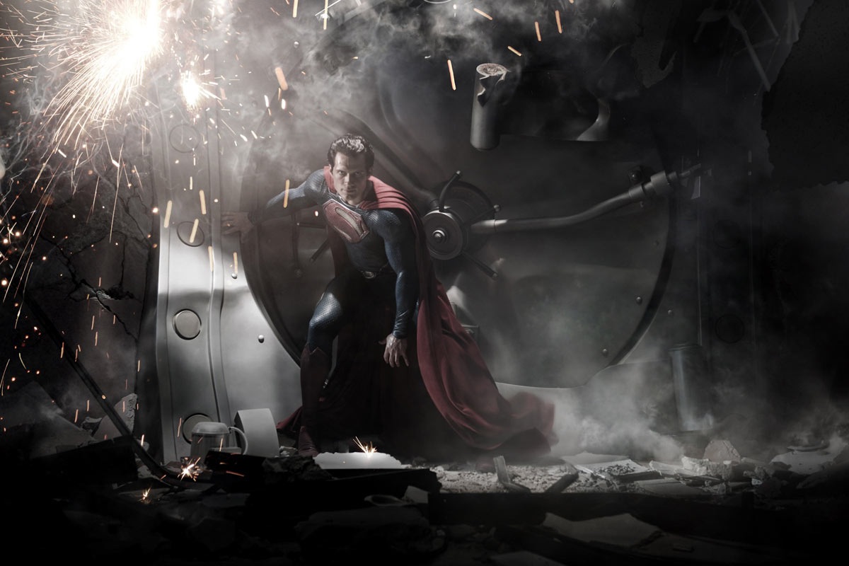
Warner Bros. has released the first picture of Henry Cavill as Superman, and as opposed to previous reveals, they have decided against a standing poser and gone for something way more action-filled and dramatic.
And it works.
While the trunks are in shadow, this does seem to be the traditional, red-pantied Superman look. Gone, however is the spit curl. The look of the photo is more than a little “Jim Lee-esque” with its heavy grading and dramatic lighting. In our opinion, not a bad update — but what do you guys think?
MAN OF STEEL is set to open in two years, on June 14, 2013. Besides Cavill, it stars Amy Adams. Michael Shannon, Laurence Fishburne. Kevin Costner, Diane Lane, Julia Ormond and Christopher Meloni. Zack Snyder directs a script by David S. Goyer from a story by Goyer and Christopher Nolan.


Someone elsewhere noted that the absence of the spit-curl makes Cavill’s Supes more of a George Reeves figure. I’m fine with that.
If you look at the hi-res version elsewhere, you can see that the red undies are gone. There is also some sort of stripe or line on his thighs, and a considerable amount of the basketball texture similar to the new Spider-Man costume.
I do like how the cape attaches, though it does seem unreasonably long. Good length for Batman, a bit overdone for Supes.
The cuffs on the sleeves are a throwback to the 1939 costume, which I kinda like. I don’t like the texture at all but we can thank Spider-Man for that I guess.
Looks like there’s some kind of “side panel” on the thigh?
The movie doesn’t interest me at all, despite being a big Superman fan, because it sounds like a (or another) retread of the previous movies. Zod was never that big in the comics. What about Toyman? Darkseid? Mongul? Even Doomsday, at this point?
I’m surprised at the number of haters who don’t like Zod being the villain. Wasn’t he the best villain of the Chris Reeves Superman movies? Also, it’s written by Nolan and Goyer, the guys who brought us the best Batman film ever, The Dark Knight. I’ll be there (as you will be too!).
Don’t like his hair. I keep seeing people calling it “Goodfellas” hair and it’s kinda spot on.
“As far back as I can remember, I always wanted to be a supah-hero…”
[60s’ doo wop music]
Superman doesn’t belong in shadow like Batman.
Not terrible or anything, but dark shadowy-ness and basketball textures don’t make me think “Look, up in the sky!”
“I’m surprised at the number of haters who don’t like Zod being the villain.”
Haters? Egad … is no one permitted to having a different opinion?
As for Zod, I’d be as thrilled to see him in another Superman film as Lex Luthor … which is not at all. Time to trot out some different villains.
This kind of reminds me of the “Lois and Clark” approach where Superman’s hair is slicked back and Clark has a kind of spit-curl.
I wish they would do a Lois Lane movie. That could be something new.
I agree with John’s comment about the cape being overly long. I like the photo, and the pose, it feels retro, but think it is a bit TOO dark. It may look ‘real’ this way, but doesn’t draw enough attention to Superman.
Eh, it’s not bad. I could do without the “basketball texture,” though.
Yeah, seems bit dark. So much so that my first thought this was going to be another Superman has turned temporary evil plot line.
That said I’ll likely see it no matter what, although I still haven’t gotten around to seeing Green Lantern.
I agree with others who say it is too dark. Superman is supposed to be in the light, right? Maybe this was just the best shot they had . . .
Not a fan of the texture, but I don’t like it on spidey either. Combined with the cape, hair and way they’ve done the ‘S’ it just seems too plastic.
On Batman the heavy rubber/plastic makes sense, but why would superman care?
Superman belongs in shadow as long as it is lit by Hugh Ferris, which this reminds me of. I also like this because for the first time we see a Superman in ACTION, posed in a dynamic asymmetrical fashion. He’s not hiding in the shadows ala Batman, he is the focal point of the light source. We need Superman doing incredible stuff and maybe they will have less origin and get on the SUPER doing! Audiences want good stories but they also go for the ride so we need a superhero film that delivers both.
A lot of the newer superhero costumes are so dark and rubbery that they look dirty. I guess this is realistic (how could you do a lot of the superhero stuff they do and not get pretty dirty?), but it doesn’t look so good for promo posters and the like. Still, I am okay with the look so far … the S-shield looks a bit more like the one from the Fleisher cartoons, at least in shape, if not color. This guy looks a bit more like a man, like Chris Reeve, but not like Brandon Routh (who seemed too young to me).
It’s a publicity shot at best, movie still at worst. Which means you’re not seeing anything here that will remotely equal the full extent of what the movie will bring. Light, dark, shadow, texture, mean nothing unless this still is frozen for more than 5 seconds in the actual movie. When we see it move, then it will all make sense.
There’s another shot of the lead actor as Clark Kent – spit curl intact.
This picture looks more like the aftermatch of Superman being thrown INTO the vault. Hence the buckling behind him.
I dig the George Reeves look.
I wish they would do a Lois Lane movie. That could be something new.
Why?
Get rid of the damn curl. This is the 21st century, time for a new Superman.
I like it. Unlike the guy who played him in the last movie this guy actually looks believable as Superman.
It looks fine, more traditional than I expected. But I actually like the “Superman Returns” costume better.
That S on his chest looks mighty big…
Superman defines a cape, if its a feet o 9, he was the first cape crusader. the suit looks FANTASTIC! excited on snyders version! even though singers one was a nostalgic, better CGI version of reeves. this has such a GRIT to it.
I don’t mind the suit, or the missing curl to his hair. What I do want to say that’s one crazy haircut. Either short hair or an Elvis pomp would look better than that.
Ugh…
Internet powers ACTIVATE!
Form of pointless over-analysis of a single image!
Shape of fanboy complaints over every tiny detail as if it were a litmus test for the movie as a whole!
@Derrick ha ha
Kudos to WB for leaving the briefs in the dark on purpose so as to incite rampant speculation. TWO YEARS???
I agree that there seems to be a slight retro look — actually, the Fleischer Superman cartoons were pretty dark and moody. That’s a look and feel I think would work well and give the film an edge that might appeal to a modern audience.
I’d just like to say, YIPPEE!!!!
“I’m surprised at the number of haters who don’t like Zod being the villain.”
I’m not. I think the consensus was that Superman has a far greater variety of adversaries that would be more interesting to see on the big screen than yet another carbon copy of a one-note character.
“Wasn’t he the best villain of the Chris Reeves Superman movies?”
Replace with ‘most overused villain ever since the Chris Reeve Superman movies’ and you’ve got your answer. Choosing Zod again merely shows a lack of imagination.
“Internet powers ACTIVATE!
Form of pointless over-analysis of a single image!
Shape of fanboy complaints over every tiny detail as if it were a litmus test for the movie as a whole!”
Look, up in the snark over the preview! It’s another pointless corporate fanboy whine over what’s intended to be criticized in the first place! Who needs a bird or a plane, when you have yet another big screen Superman actor that needs to be fawned over instead?
The costume was designed by Michael Wilkinson, who also worked on Tron:Legacy, Watchmen, 300, Jonah Hex, and… Twilight.
Anyone know what the material is?
Looks like a more expensive version of the tacky Lois & Clark suit to me.
Surprising amount of “unsightly” wrinkling — with previous suits, even that one, they went to great lengths to avoid that.