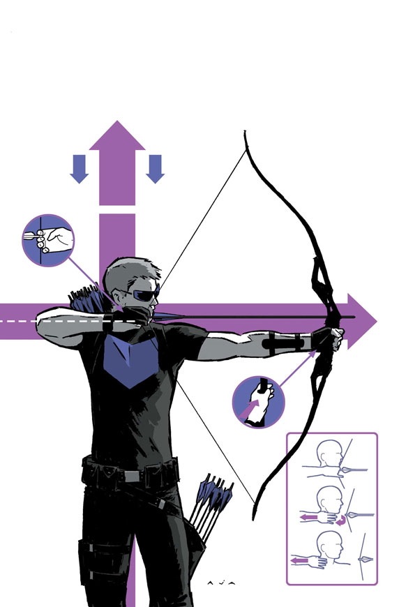
Stately Beat Manor approves of David Aja art. Click for larger images.
HAWKEYE #2, written by Matt Fraction with art and cover by Aja, goes on sale September 5.
Stately Beat Manor approves of David Aja art. Click for larger images.
HAWKEYE #2, written by Matt Fraction with art and cover by Aja, goes on sale September 5.


David Aja looks like he’s channeling Steranko without copying directly. Just that cover is amazingly eye-catching.
I picked up the first issue as a last-minute impulse purchase, expecting nothing.
It ended up being one of the best books I’ve read in months.
Actually that cover looks like some new-wave band’s record sleeve c.1978.
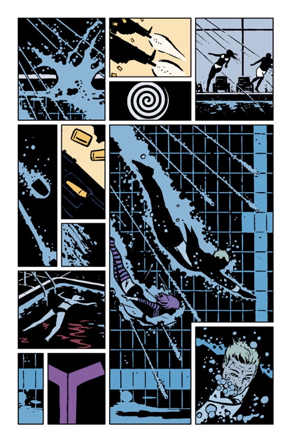
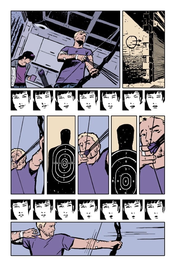
Those tiny panels make me think of a poor man’s Guido Crepax.
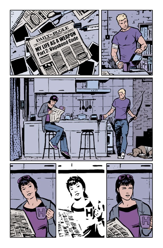
Pretentious layouts and duff storytelling, I think. For all the diagrams and pointers the cover conveys no feeling of energy and stress at all. On the third inside page, his girlfriend seems to be indifferent at first, then impressed – but at what? His arrow-holding technique?
I’m gonna have to agree with Joe. Plus the lack of his real costume just makes it feel like a superhero book that doesn’t want to be a superhero book. Not that this is the only comic doing that, sadly..
Besides, I fail to see how slathering everything in purple is supposed to be more “realistic” than his just having a superhero costume in the first place.
Joe, that’s not his girlfriend, looks to be his sidekick, the Hawkeye from Young Avengers.
I’d hate to live in a world so devoid of joy that I couldn’t enjoy Fraction and Aja comics because somebody in it wasn’t wearing a pointy purple mask.
This looks quite refreshing. Nice to see good graphic design and colour choices at work. And in those little panels and high contrast illustrations, I detect the spirit of Jim Steranko…
Lobster: oh, well perhaps she IS impressed by his arrow-holding technique.
I never liked Steranko much – all visual flash with no real invention behind it.
@RJT: having a hawkeye book without hawkeye wearing a pointy purple mask is a world devoid of joy that we sadly have to live in.
I enjoyed the first issue quite a bit. Loved their Iron Fist. And frankly, I would buy this just to support an artist who actually researched archery and depicted it accurately. I really don’t ask for much — I just want the arrow on the correct side of the bow. That’s all. If the artist gets that right, I’ll forgive any other wonkiness.
Well, I think it looks gorgeous. Of course you can see traces of Crepax, Steranko and Mazzuchelli, but I’d much rather have a monthly superhero book influenced by those guys that yet anonther Jim Lee clone.