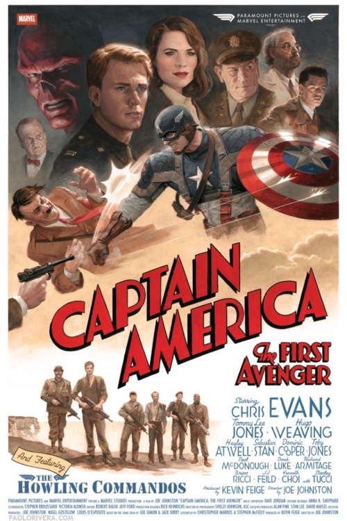
Artist Paolo Rivera was commissioned to create a special poster as a gift for the CAPTAIN AMERICA movie’s cast and crew. This is the result:
The prints, limited to 100 or so, were reproduced at actual size. Even Stan Lee got one! I was given access to a vast collection of production stills—each emblazoned with a watermark pattern of my name—from which I selected my favorites. All of the lettering is hand-drawn, with the exception of the small credits at the top and bottom (I ran out of steam). While I did some post-production work in Photoshop, the original looks more or less like what you see here. You’ll have to wait until I finish Daredevil #3 before I share some of the behind-the-scenes material, but the “Hitler getting punched” reference will be well worth the wait.


That is nice.
With all the varient covers of the last few years why hasn’t someone done ‘punching Hitler month’?
Beautiful work. I love the lighting on the faces. A true Marquee style poster. It is so different from everything in the market today.
Excellent. The attention to detail even in the fonts – check out the “OO” of Cooper – is fantastic
Dammit. That’s amazing. Why doesn’t Marvel do this for the actual posters?! They have dozens of artists creating dozens upon dozens of covers a month. Why not pick a artist they find suited for the upcoming Marvel movie and have them design a damn movie poster? Instead it gets handed off to a bunch of Hollywood jackoff marketing idiots with a copy of Photoshop and a handful of stock cast photos.
It’s a film based on comics. Heaven forbid you have an actual comic artist make a poster for it. It might turn out good and eye catching like this one. You know, instead of another genetic character photo or bland image that blends in with all the other summer movie posters.
This is done in the style of movie posters from the ’40s, down to the lettering. I like it, but I can imagine a studio exec today saying it’s not “dramatic” enough for the kids. Too much glamor, not enough grit.
No comment on the homage to the CAPTAIN AMERICA No.1 cover?
it’s a pity this sort of thing is no longer present in current film posters. most of them are pretty damn bland nowadays.