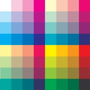
Ed “Wizzywig” Piskor has created a Photoshop version of the famous 64-color chart used to color comics up until the advent of computer coloring and scanning in the ’80s.
It is, as he points out, rather than a crippling limitation, an invitation to actually think about color:
Anyhow, the color work that I’ve always responded to positively seems to share the similarities of operating within a select palette of color. With this sparse set of colors, the artist is forced to be pretty inventive and has to put some thought into his choices. The mind isn’t boggled by the “candy bowl” effect of seeing too much information at once. This goes without saying, but a consistent palette also creates a cohesion throughout an entire work which helps to pull the story together as one unit ( I have seen comics where The Hulk was 10 different shades of green throughout).
It isn’t much discussed, but surely the badly, rendered pseudo-CGI coloring that saps all drama from the art by removing the artist’s pencilled intentions is as responsible as anything for the gradual erosion of support for mainstream comics.
Piskor links to a piece by Gene Fama that covers this same topic.
Modern comic colorists, however, don’t need more building blocks. They need damage control. Colorists should be doing much, much less. They’re using too many colors, too much ink, too many effects. Comics look sleazy and grotesque with all their phallic airbrushing, cheesy transparency effects, and modeling. As Miles once told Monk, today’s colorists need to “just sit out” more.
Fama offers a few examples that show what he’s talking about:
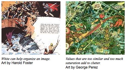
Hard to argue with.


Nice article and very helpful!
ArrrOOoo!
I can’t understand why the discussion of how modern comic book colouring destroys art isn’t happening on a larger scale.
For the longest time now, the bane of my existence has been the godawful digital blur that some colourists overuse. And, by the way, “overuse” and “use” in this case are synonymous in my mind, because I think it always looks awful. Sometimes it’s used to simulate fast movement, other times to add fake focal length effect, with the foreground in focus and the background all blurry.
I notice these effects in at least half the comics I buy, both from DC and Marvel and from smaller publishers. I hate it. And I don’t understand why nobody else hates it! Why don’t artists complain when their carefully rendered detail is destroyed by the colourist’s cheesy photoshop effect? Why don’t the editors look at these panel and say: “Wait a minute, that looks like shit. Can you please not do that anymore?” How could this be allowed to go on for as long as it did? It makes no sense.
Seriously. If there are any colourists reading this out there: Just stop with the photoshop filters. The gaussian blur is a no-no. Pretend it doesn’t exist. Leave it alone. Thank you.
One of my major turn-offs with modern comics is the coloring. You’d think colorists (especially given deadlines!) would no longer be enamored by the overwhelming tools they suddenly had in the 1990s when Photoshop became the de facto tool for comic book coloring, but sadly, few have pulled back. Worse, it seems like the company line at the mainstream companies is to over-render colors to reflect “real life,” which just makes the artwork muddy and dull. Want to see a good example of subtle, limited palette coloring in comics? Check Francesco Francavilla’s recent work on “Detective Comics.”
less is more.
…..we are in the Muddy Age of Comics.
Don’t get me wrong, if used correctly, i think digital coloring can be nice, but comics have had a muddy look to them since the nineties. If you look at the books from the sixties and seventies, colorists came into their own realm, where their work was as important to the books as the writing and art. Now, everything seems very dark indeed!
New comics suck in this respect.
Comments are closed.