
New School
by Dash Shaw
(Fantagraphics Books, $39.99)
I find Dash Shaw’s work to be strangely invigorating. I admit I had some reservations when I first saw the daunting heft of his Bottomless Belly Button, with its absurdly extended passage of a man running and profusely sweating, drawn in a style so crunchy that it makes Gary Panter look slick. The idea that all we cartoonists must now draw books that are at least three inches thick and that take several years of deprivation to accomplish thanks to the efforts of obviously dedicated workhorses such as Shaw and Craig Thompson was not a pretty one. But I was eventually to resign myself to this new order.
The next work of Shaw’s that I saw was the short story “Look Forward, First Son of Terra Two” from MOME #10 (reprinted in Shaw’s Fantagraphics collection The Unclothed Man in the 35th Century). Here Shaw displays an inventive narrative sensibility in a tale of a man whose life runs backward, that also shows the artist to have an innovative approach to color. This is also displayed by the neo-psychedelic explosion that underlies the craggy drawings of his graphic novel Body World, which must be read sideways, approximating the scroll of the strip’s initial webcomic appearance. At this point, for some reason the visceral energy of his drawings and his brutal inking began to remind me of very early Jack Kirby and the generally aggressive attack on convention seen in his coloring of the experiments of Jim Steranko.
Color is the point of most immediate impact on the viewer and it remains one of the great unexplored territories of the comics medium. Apart from the careful consideration given to coloring that is seen in the greats of newspaper comic strips such as Hal Foster and Milton Caniff, most artists in comic books have been content to leave it to others and only a few auteur artists have made significant strides in this regard, for examples: George Roussos, Harvey Kurtzman (working closely with Marie Severin), the aforementioned Steranko, Neal Adams and Richard Corben. Moebius’ early blue-lined color stories in Metal Hurlant made a profound impact on many artists including myself, but he soon thereafter ceased to color his own comics, with the result that I became much less interested in his works.
Among his young contemporaries, Shaw is one of the most comprehensive auteurs in that color seems to always be integral to what he is doing. He has had some experience in animation and the traditional technical aspects of that form, for instance the standard use of transparencies for cels, seem to have informed his approach to color. A drawing done or reproduced on acetate can be laid over any other image and there are many precedents in fine art for montage and the layering of images. In the present volume under consideration, a layered and often jarringly discontinuous color is perhaps the book’s most distinguishing quality. The color only rarely registers with the drawings and more often fights it entirely, yet it makes for some fairly magnificent moments and overall propels the narrative to provide a bizarrely exhilarating read.
In a way similar to the effect of the art in Shaw’s recent 3 Stories floppy comic, the book utilizes an “adventure comics” type of non-grid layout and is drawn in a more “realistic” style than his previous, more cartoony efforts. However, in New School Shaw has inked all of the art with a thick marker (a “Sharpie” according to the review on The Comics Journal site and I concur), in a deliberately crude and nearly generic way that seems to be almost a parody of the idea of the “holding lines” of comics, that were developed to be as thick as they were for the purpose of containing the badly registered color of mass-produced newsprint. I say “parody” because under the drawings, the at times overly dark color actively obscures the art, or it vibrates with seemingly randomized, painterly or sometimes photographic images that are mis-registered with and most frequently have no apparent connection to the drawings and pages they are part of. But still, the reader’s eye continually seeks to find a rationale for the way the color is interacting with the line. This color/line business really is somewhat of a mindfuck, but in the end, it works surprisingly well and amplifies a sensation of adolescent confusion.
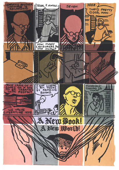
Besides its color dynamics, New School nicely buttresses a recurring theme of education that is seen in many of Shaw’s works; from the relationship of mentor to usurping student in his short story “Galactic Funnels” to the degenerate teacher protagonist of Body World to the tweedy detective who belatedly returns to school in “Object Lesson,” my favorite piece from 3 Stories. New School depicts an American student who seeks to be reconciled with his estranged brother, who has travelled to a foreign school to teach English to students of his own age group, a situation that it is said Shaw himself was in as a teenager on a small Japanese island and which he has mutated for his purposes here. The school is near an in-construction theme park, which features such tasteless attractions as recreations of Kennedy’s death at Dealey Plaza and the bloody games of the Roman Coliseum. In some of the book’s most impressive moments, expansive locations like the theme park allow Shaw to indulge in series of Frank Milleresque spreads that afford some widescreen scale to the proceedings. The artist’s deadpan humor is further displayed by the overblown dialogue that permeates the story, which reflects an enervated state of naïve youth, overly sensitive, anxiety-ridden, alienated and far from home—even when they ARE at home.
[James Romberger is a cartoonist and fine artist best known for the graphic novel 7 Miles A Second (Fantagraphics) and the Eisner-nominated Post York (Uncivilized Books). His pastel drawings are in many public and private collections, including the Metropolitan Museum of Art.]


Wow, this is a really strong review.
Shaw’s use of color fascinates me. I was able to have a long discussion with him about it once and the effect he’s going for with the choices he makes. You hit pretty close to what he told me here: “I say “parody” because under the drawings, the at times overly dark color actively obscures the art, or it vibrates with seemingly randomized, painterly or sometimes photographic images that are mis-registered with and most frequently have no apparent connection to the drawings and pages they are part of.”
I also missed the recurring theme of education in Shaw’s work. Interesting. Now I want to go read all of it again.
I love Shaw’s work because he constantly does things in whatever manner he thinks is best whether or not that manner conforms to any rules. I like that new approach to comics.
FYI Shaw uses a Tombo brush pen to ink his drawings. Those brush pens have two ends: the brush end and the “sharpie” end.
http://www.dickblick.com/products/tombow-dual-brush-pens/
Comments are closed.