The Private Eye #1 isn’t about a detective – it’s literally about people looking for privacy from the public gaze. Following a somewhat simplistic central conceit, Brian K Vaughan, Marcos Martin and Muntsa Vicente manage to create an interesting world for the first issue of their new digital-only series. The characters are a little slight, but the world-building here is excellent, and makes for a decent first issue, with plenty of promise for the rest of the series. You can find the issue here.
The premise of The Private Eye is that at some point the internet basically implodes, probably through nefarious means. Every inch of private information gets made public, with massive damage worldwide. As everybody nowadays shares everything about themselves with the rest of the world, private photos, conversations, bank details, and everything gets shown to everyone else. Families collapse, businesses fall, and it looks like the press get put on an extremely tight leash. The Private Eye is set after this event, focusing on the public backlashing against their previous happiness to make themselves open books.
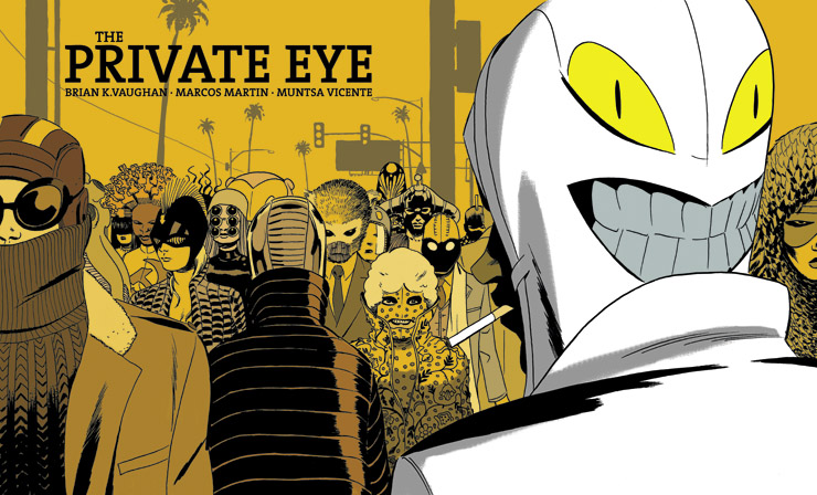
Not particularly a unique concept, but the creative team use it for some excellent sight gags, creating an uneven sense of humour which moves through every page of the issue. In their efforts to hide from the world, everybody now wears a mask or holographic facial mask, or paints their face – in essence, everybody becomes a totally unique individual. Vaughan doesn’t swell too much on this for the moment, leaving aside any temptation to moralise. Instead, the idea is conveyed solely through Marcos Martin’s artwork – although more accurately, it’s conveyed through Vicente’s colouring.
Vicente is the undisputed star of this first issue, taking Martin’s work and creating some blunt, strikingly coloured patterns for the world the characters live in. Buildings are bright green, the costumes are garish and manic, and the starkness of the colouring creates a futuristic landscape. It helps that Martin is drawing hovercars and people wearing squids on their heads, of course, but Vicente’s colouring does more for the issue than anything else here. Her work is utterly fantastic, and should be one of the main reasons you continue picking up the book.
Surprisingly, Marcos Martin’s art visibly falters halfway through the issue. Whilst his layouts are well-executed and stylish, his art becomes weaker and scratchier towards the end, with the final sequence particularly wobbly. Marcos Martin on his worst day is still one of the finest artists around, with an exceptional use of poise and placement in his characters – but his work here starts to struggle partway through. His characters are well designed and entertaining, but proportion and perspective start to fall off-kilter in sequences where they aren’t supposed to, and the final few pages reveal a sketchier, less detailed side of his work.
Vaughan’s writing is, as you may expect, very strong indeed. His dialogue has picked up greatly over the years, and he falls into familiar habits less often – there’s no fact-dumps here, or the length moralistic lessons you can find sometimes in Ex Machina. Instead, this is a book which is far more confident in its central premise than previous Vaughan works – and so doesn’t reference it. The world simply is, and the creative team are happy to leave it at that. There’s no explanation or analysis given to the situation the characters find themselves in, and the writing leaves enough clues for readers to be able to piece it together themselves.
There are some very interesting quirks in the story, too, which might grow into something. The most noticable is the amount of branding on display. Each page features movie posters, book titles, snack brands, cigarette logos, corporate stores, and more. You can’t turn the page without seeing Kodak’s logo, or the Disney Store, MTV or the LA Times. It appears that whilst this futuristic America has given up and moved on from the internet, there are still some other aspects of corporate sponsorship still on display. I’ll be very interested indeed to see why the creative team are doing this, and how the motif recurs.
The second quirk of the story, which gives it a little distance from similar works, is how the press appear to have been bought out by the government, and freelancing has been dissolved. There appears to be a conspiracy building in the background, and the main hook – for me – for issue #2 will be how that subplot is developed.
Although there are some wobbles, The Private Eye #1 is a solid first issue. It isn’t revelatory – it’s just a strongly designed comic, with a brilliant sense of panel space and layout, wonderful colouring, and a story which does just enough to pitch issue #2. The characterisation will likely grow once we’re a few issues in, but at the moment the main reason to try this series is the world itself. Set on a familiar foundation, Vaughan, Martin and Vicente manage to build something uniquely different and odd. Try it for yourself!
Steve doesn’t hide from the public eye – he’s one of those very idiots who shares too much of his personal life online. Find him on Twitter, or via his stumbling webcomic with lovely Isaac Leiro, Stardark City.


Good thoughts on the issue, Steve. I noticed the corporate logos too– I wonder if that’s just a subtle hint that people solely consume physical media in this world (again). MTV is once more prominent, Tower Records is resurrected, and P.I.’s shooting incriminating material with an old-school film camera (with the Kodak logo looming large in the background). Makes it pretty cheeky that we’re only able to read it online.
Comments are closed.