
by Zachary Clemente
Sometimes, it’s the smaller details that stand out most. Sure, Image Comics is pushing for changes in the comics industry and has really been an a great example of how different publication platforms bolster the climate for making comics. Sure, they’re making new programs for retailers to make it easier to manage Image’s extensive line of new comics when shelf-space is at a premium. But the fact that they put together an all-artist panel composed of a 4:3 women-to-men participants speaks volumes.
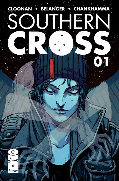
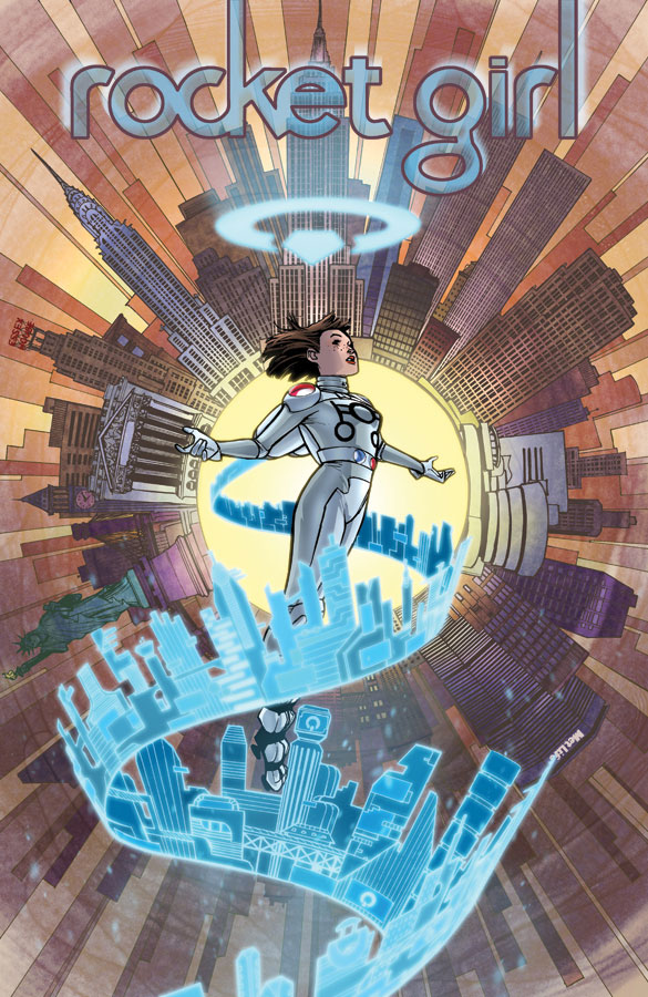
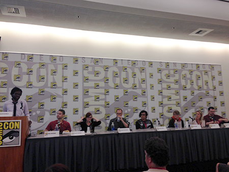 The features artists were Chris Burhman (Nameless), Becky Cloonan (Southern Cross), Gabriel Hardman (Invisible Republic), Sloane Leong (From Under Mountains), Amy Reeder (Rocket Girl), Tula Lotay (Supreme: Blue Rose), and Declan Shalvey (Injection).
Image Comics’ David Brothers started off with some questions about process and approach.. Burnham, working on Nameless with previous collaborator Grant Morrison found himself being stretched as he develops a working method of “strange geometry” and “super tangents” where he makes bizarre choices in representing perspective on a page. Hardman, asked about his process of storytelling, enjoys utilizing the available poetry to the limited amount of panels he’s able to use.
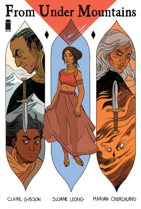
Leong, collaborating with artist Marian Churchland (co-writing From Under Mountains with Claire Gibson) discussed the division of labor on the book. All of the internal art is her, while she and Churchland will work together on the covers. She then went on to touch on coloring in comics, a role she is often in.
Color depends on the art, too many comics have color because someone says “we need a color product.” – Sloane Leong
Reeder, when asked about her approach to coloring her own art on Rocket Girl, finds that her palette is very wide a single page can contain a wide variety. She draws from different influences when coloring the two time periods that are portrayed in the book, which create very different palettes.
Cloonan, known for her self-published comics with her own writing and art, drawn for scripts will now be writing for Andy Belanger on their newly-announced Southern Cross. She went into the differences of roles, but ultimately iterated that it comes down to the sorts of challenges her working style will have to adapt to not being in charge of the visual narrative of the book. She will be doing all the covers however (which I am thrilled for) so it’s clear she and Belanger have a collaborative working relationship.
Burnham and Hardman, two of the most technically-minded artist I’ve heard talk, discussed the different approaches to leading the readers’ eyes along the narrative of the page in an intuitive way – even though they approach with vastly different techniques. Burnham bounces the eye with dynamic movement, often breaking borders and panels out into a more fluid visual, mimicking the cadence of the story, while Hardman typically uses a static page layout, moving the eye panel to panel instead of using crazy compositions.
The panel was then opened up to the Q&A from the audience. A couple of younger fans asked about how the Image platform functions and what sort of work best fits with the publisher and it seemed that all the panelists were excited to discuss the ins and outs of the company’s breadth of published work and how the submission and ownership process works. Brothers, moderating, summed it up best.
We work for the creators […] we want to do what you want to do. – David Brothers
One of the most interesting questions for the panelists was one about using photo-reference. All of the panelists had different approaches to it, some seeing it as a stage in their process, others seeing it as a sometimes-useful tool; a couple reluctantly seeing as almost “cheating.” Many credited photo reference as extremely useful for figuring out how cloth would drape and hand motion is captured – finding that portraying credible subtle movement as something worth succeeded at even through photo reference. As the topic was bounced about, critiquing the use, Shalvey had a good take on the process.
There’s a difference between reference informing the drawing and reference dictating the drawing. – Declan Shalvey
In the end, the panelists essentially agreed that reference can be a supremely useful tool, but when too heavily depended on, you just end up drawing a photo, not a panel. Additionally, the point that the drawn characters need to be viewed as “actors” and basing them directly off of photo-realistic reference undercuts the credibility of the visual acting and artistic ability.
Lastly, an interesting question was their feeling on how people read their comics digitally, since many readers, such as ComiXology allow panel-by-panel reading. The resounded response was no – they don’t care at all. Most suggested that people are going to read they want to read and they just have to make the work speak best to all readers, digital or print.
Thanks for joining us for our Image Comics coverage! We’ll hopefully be right back at it in October for New York Comic-Con in October.
<3 – The Beat Staff.


It’s kind of astounding that Burnham and Hardman would describe all the hard work they put into composing a comics page so that the panels flow and relate to each other in interesting ways, and then turn around and profess to have no preference whether readers view their work on a digital platform that only displays a single panel at a time. It certainly seems like a good deal of their effort and skill would be lost on such readers.
Personally, I strongly prefer the format for which the work was designed. Reducing comics to a slideshow seems like such a sad concession–unless that’s the effect the artist is going for.
I was kind of shocked to and it was clear the person asking the question definitely thought it would be a serious bother to them as well. Shalvey was the most vocal in his response to this question, but everyone basically didn’t necessarily care. Mostly I think it’s because these apps allow you to switch between panel and page reading, some pages read better panel to panel, others page to page – and they can see the benefit to that.
– Zach
My answer on the panel may have been a little flippant. What I was trying to get across was that I design for a full page but it’s just a fact that readers have multiple viewing options digitally. Since individual panels generally read left to right, they still tend to work when broken out from the page. I don’t think you really need to design it to read panel by panel on a phone, it’s pretty much built in to the storytelling. That said, I did intentionally use a 6 panel grid for my series KINSKI which was digital first (and will be collected in print from Image in November). The intent was for the panels to be standardized when read on a phone but it also played into the stripped down aesthetic of the story. I wouldn’t use a grid on every book.
Thanks for clarifying Gabriel! It was a treat to hear you talk about this.
– Zach
No problem. And thanks!
Cloonan, who has previously self-publishers comics with her own writing…
I think that was self-publishED.
Comments are closed.