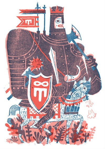
Not quite comics, but hours of fun: The design blog Grain Edit features work by several cartoon-affiliated folks, and sums up the look of the day (as defined by the Mid-Century influence, whatever you call it) very nicely. Above, an illustration by Joohee Yoon, one of the artists featured. If you dig around, there are interviews with Gary Taxali, Tad Carpenter and just lots of great looking typography and books. Here’s one more, a Spider-Man logo treatment by I Am Always Hungry.
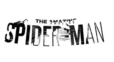


That Spider-Man logo just does not grab me. It looks broken, deconstructed, but not in a good way.
However, IAAH’s website is interesting, they have lots of other good ideas that show that They Are Always Thinking.