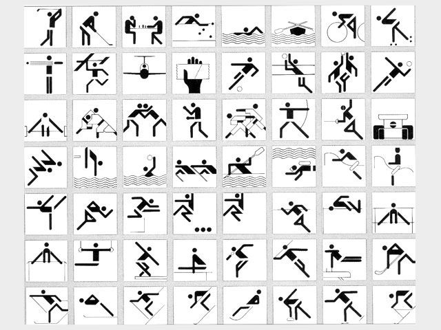
Here’s a couple of stories on the evolution of those symbols used for the various sports at the Olympics. They began with the 1964 Olympics in Tokyo, but attained a cleaner, more Saul Bass-like effect for Munich in 1972, as designed by a fellow named Otl Aicher. These proved to be more lasting and iconic:
The 2012 edition is designed by a firm called SomeOne. They’re more ornate—inspired by the Tube map—although there’s also a silhouette version.
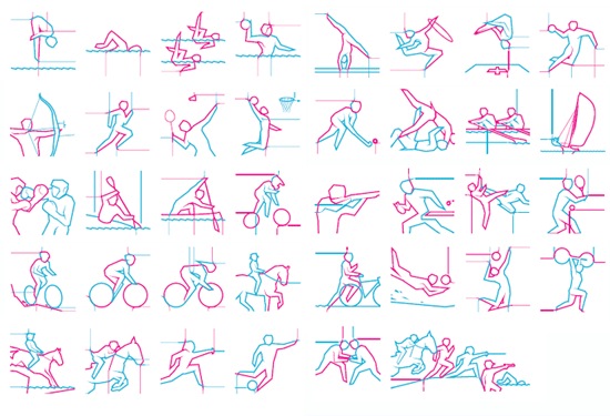
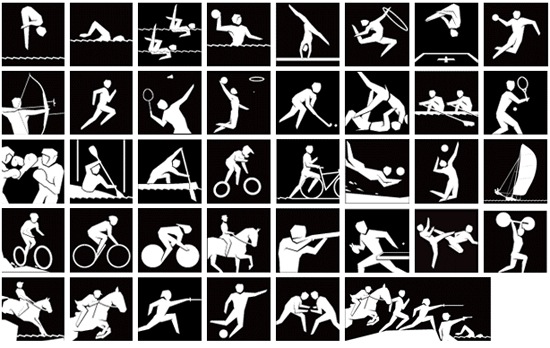
Some of the design around the London games is pretty horrible — like the logo, ugh — but the examples of usage on SomeOne’s page are quite effective:
There an unembedable video on the SomeOne page that shows how the logos can be rendered in 3D as dynamic shapes. There’s also this useful quote:
If you create something to look good on the back of a bus, it’ll look good anywhere!


Proof that a little bit of simple goes a long way in design.
Full library found here:
http://olympic-museum.de/
(Scroll down for the mascots, one of which was designed by Disney!)
The Germans were the first to use iconography in 1936 (London also had icons in ’48), as well as inventing the torch relay for Berlin.
Well, actually, the ‘fellow named Otl Aicher'(thanks to whom the pictograms “attained a cleaner, more Saul Bass-like effect for Munich in 1972”), happend to be one of last century’s most celebrated graphic designers, German designer and design theorician Otl Aicher (also deogners of Lufthansa’s German airline corporate identity, a classic case in graphic design history). Aicher aslo was one of the founders of the Ulm School of Design (Hochschule für Gestaltung Ulm). I wish there were more nerds like good old Otl…
Comments are closed.