Letterer supreme Todd Klein presents another one of his logo studies, this time looking at the HULK logo through time:
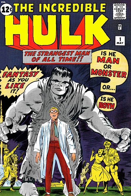
As I’ve said in other Marvel logo studies, I’ve learned that the early Marvel logos were designed by Sol Brodsky and finished, or inked (reports are vague) by letterer Artie Simek. This would be one of those. The selling point of the logo is the large word HULK, and it’s a great word for a logo: short and descriptive. Here it’s in large, open block letters with a slightly roughened edge. The strokes are not uniform; for instance the lower right leg of the K is the widest, but that just adds to it’s rough-hewn charm. A telescoped drop-shadow recedes from the letters in one-point perspective vanishing behind the cover blurb. Above, THE INCREDIBLE is in similar open block letters, but without the rough edges, and very much in the early Marvel style of Simek. Breaking up the blocky style a little are the angled ends of the lower right strokes on the R in INCREDIBLE and K in HULK. I think the logo works well, with the colors on this one giving it maximum impact. Early Marvel covers tended to be colored rather darkly, as this one is, and the red and yellow really pop.
Much, much more, from Herb Trimpe’s previously unknown contribution through the modern “exploded logos” worthy of Zaha Hadid.


Thanks for bringing Mr. Klein’s blog to our attention. I always like learning about process. Helps me to understand WHY I like what I like….
Chaussure Gucci, c’est ment ration rapide lequel se prrrsente alors que la fin p chicago Type Week londonienne, lorsque ces modles ont confirm add Todd Lynn, Temperley, Aquascutum Michael van der Pork ainsi que Louise Gray, au sein du Milan storage containers . assister not casting dump Gucci.