This week’s main review is Morning Star #1. Plus, the Wednesday Comics Team has its usual rundown of the new #1s, finales and other notable issues from non-Big 2 publishers, all of which you can find below … enjoy!
 Morning Star #1
Writers: DB Andry and Tim Daniel
Artist: Marco Finnegan
Colorist: Jason Wordie
Letterer: Justin Birch
Publisher: Mad Cave Studios
Review by Khalid Johnson
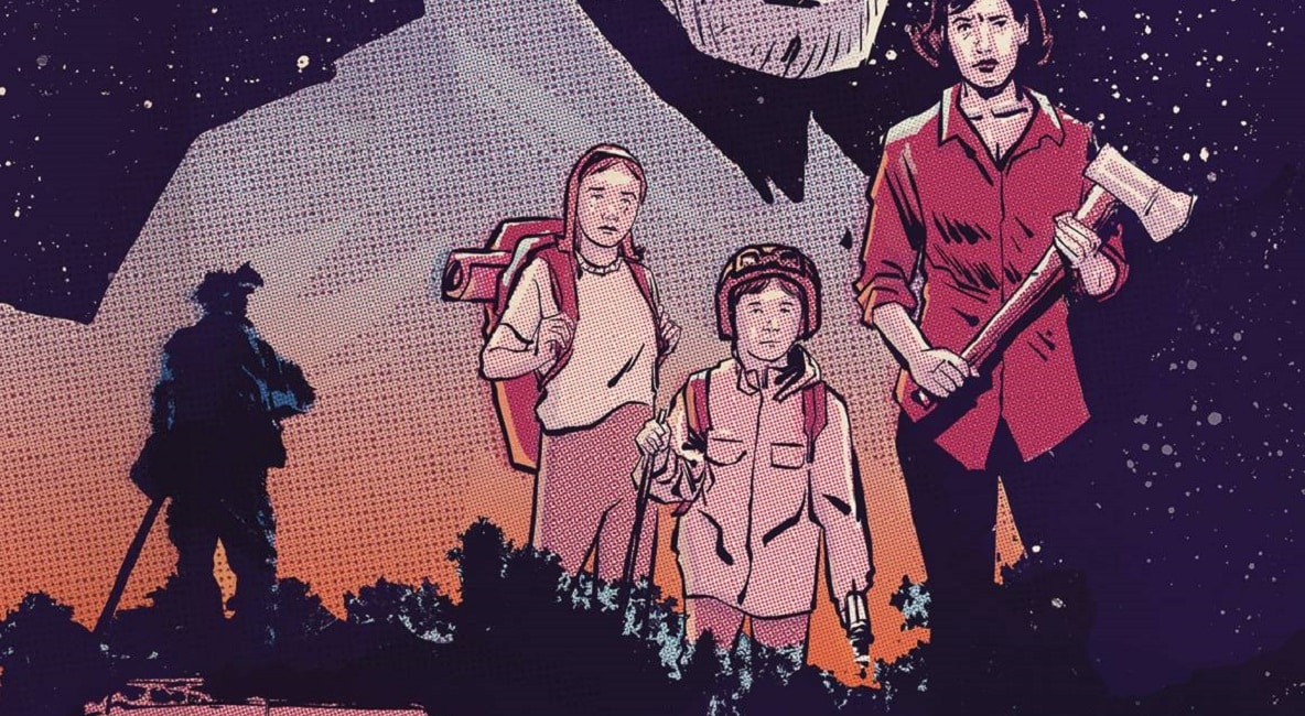
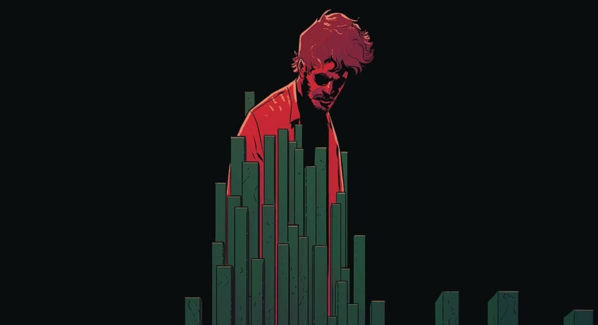
Morning Star #1 really sets up a lot of intrigue, opening in 1956 on an eerie and quite concerning phenomenon as Kootenai National Forest is ablaze and a crew of smokejumpers all end up in a horrifying kind of stasis. This is a sci-fi period piece that really sells you on that feeling and sense of nostalgia for older comics. After an intense opening, writers Tim Daniel and David Andry introduce us to the family we’ll be following, a family left behind after the death of a husband and father, caught in the wildfire. There are very interesting character dynamics here as there’s clearly some friction and some very big imagination as they have to consider next moves in the one year wake of their loss and grief.
Certainly everything isn’t what it seems as the visuals, the artwork of Marco Finnegan captures a pulp feeling that draws you in and doesn’t let go. His style and sense of mood really helps push the feel of this story as a period piece. The characters are distinct and expressive, the balance of blacks on the page is inspired and the linework is clean and harkens back to the work of those older comics. I think that visual feeling is a triumph in and of itself, especially as the book gives us big imaginative moments.
The colors of Jason Wordie bring that classic style together, working with limited and saturated palettes. Everything is so vibrant and wow do those big moments just fly off of the page, especially the last three pages as there’s a great visual play between dark and light values and the color choices here. Justin Birch’s lettering is a great complement to the visuals on the page, moving us through the emotional conversations that are happening, bouncing us from one panel to the next.
Everything comes together to make this first issue work as Morning Star #1 captures the feel of pulp while doing some interesting setup with a strong family of characters.
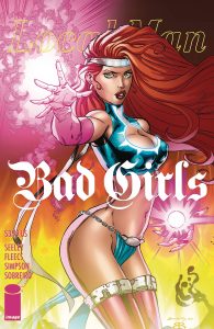
 Local Man – Bad Girls #1
Writing: Tim Seeley & Tony Fleecs
Illustrated: Tim Seeley & Tony Fleecs
Color: Brad Simpson, Felipe Sobreiro, Brian Reber
Publisher: Image Comics
Review by Michael Kurt
It’s a foggy morning in Portland, Oregon. I’m at a coffee shop, picking up a few reviews over the weekend, and shaking my goddamn fists in the air, yelling NOW THIS IS COMICS! Is Local Man Bad Girls Special an excuse to depict a lot of busty ladies half naked? Yeah. But is it a well-written, emotionally dense story? Definitely.
Lately, I’ve been thinking about the ways backstories are introduced, transitioned in and out of, and what their purpose is for an overall plot to feel like it has history and place for new characters. Then I read Local Man Bad Girls and it turns out Tim Seeley and Tony Fleecs are just out here giving a masterclass in condensed, personalized storytelling! It’s ridiculous.
There is so much care taken to make a transition between one scene (and time period) make sense, and feel seamless, next to another time period. In Local Man Bad Girls Special, Local Man’s ex-girlfriend Inga Johanning comes face-to-face with Neon, another super heroine from the Local Man universe. But what unravels from there is an entire generational history of powerful, superhero stories.
Thirty-four pages of dense, well-written, emotionally deep characters doing flawed and human things (even if they are sometimes superhuman). With colors by a team of Brad Simpson, Felipe Sobreiro, and Brian Reber, this comic is packed with so many wild character designs and big set piece scenes, but never confusing. The time periods are distinct, the powers are bright and unique, and the world feels real, which has a lot to do with the expert care taken by this powerhouse coloring team.
Local Man Bad Girls Special is the best one-shot I’ve read this year so far. Definitely check it out.
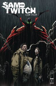
 Sam and Twitch Case Files #1
Writer: Todd McFarlane and Jon Goff
Artist: Szymon Kudranski
Colorist: FCO Planscencia, Shelia Saldana
Letterer: Tom Orzechowski
Publisher: Image Comics
Review by Jordan Jennings
From the pages of Spawn, fan-favorite detectives Sam and Twitch get another spin-off series with Sam and Twitch: Case Files. In the first issue we witness the detectives getting suspended due to Sam going too far and assaulting an informant. A rift forms between the duo as Sam’s actions strain Twitch too far.
I am an ardent Spawn fan. Sam and Twitch represent the people on the street as they must deal with the more twisted world of angels, demons, and hellspawns. They are also representative of Todd McFarlane’s view on police. Meaning, they are an extreme Good Cop/Bad Cop, but in this case both cops are pretty dirty. I like Sam and Twitch.
That said, this is a middling first issue. It is a mediocre attempt by Todd McFarlane and Jon Goff to introduce readers to Sam and Twitch. There just isn’t much to the story. This issue mostly revolves around Sam’s beating and the subsequent suspension. There are hints of a plot, but that plot doesn’t really have any sort of hook. There is nothing here but Sam and Twitch bickering with each other, and it isn’t fun. McFarlane’s dialog is stiff and carries little heft.
The art by Szymon Kudranski is interesting but doesn’t work for me. They use a photo reference heavy style that isn’t on the levels of Greg Land but it isn’t for me. The colors by FCO Planscencia and Shelia Saldana don’t do it any favors, either. The comic is extremely bright especially for a story whose tone is striving for a gritty detective story. The overly-abundant highlights and flare just makes the comic look worse than it really is. There are moments that work. There is this neat Jigsaw page transition when the story transitions from the detective drama to the actual crime scene, but it is few and far between.
I cannot recommend Sam and Twitch: Case Files #1. It is a lacking story with some harsh art. It left me feeling empty and I found no joy in the comic. Avoid this one.
Wednesday Comics Reviews
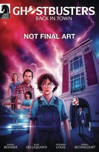
Ghostbusters – Back in Town #1 (Dark Horse Comics): After watching Ghostbusters: Afterlife, the movie from 2021, I understand a lot more about why Ghostbusters: Back In Town #1 feels weird. In the film, which this comic picks a thread up from, there are characters named “Podcast” and “Lucky” that are friends/side-kicks and serve as a bouncing-off point for anything the Spengler kids need to know about how their new hometown works. They lead the characters around, provide extensive town history, and are constantly asking and then answering questions. There’s a frustrating level of overtly obvious plot hooks that push the characters from mishap to callback opportunity. I point this out because that is where Ghostbusters: Back In Town starts. The Ghostbusters Firehouse has its old sign restored, the Echo-1 is in the garage and it is looking fresh, and Winston is there to greet the Spengler family outside, drinking a coffee, ready to fill them in on everything they need to know about New York City. The kids are carted off to school as soon as they arrive and, missing their friends, rely on text messaging to try to find something familiar. But don’t worry, before long there will be hijinx at the old firehouse! Ghostbusters: Back In Town is for an audience of 12+, which I think is important to point out because there were many points where I felt frustrated by the plot. I know David M. Booher can write an emotionally complex and interesting story (see Specs). I know the art team of Blue Delliquanti and Mildred Louis can create a wild ghost booming through the firehouse basement. But I can’t help but feel that this story is kneecapped by its IP and its requirement to speak to a certain, younger audience. Maybe that’s just an IP fatigue on my part. At the end of the day, this comic is fine. It will tell a story that will connect to other worlds of stories in the franchise. People who want to pass on Ghostbusters to their preteens will have something to point them towards, which is cool! But I wish IP holders would allow the creative teams to create more complex stories because I know the audience can handle it. —Michael Kurt
-
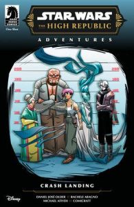
Star Wars: The High Republic Adventures – Crash Landing (Dark Horse Comics): The Crash Landing one-shot continues the narrative of Phase III of The High Republic publishing initiative. Taking place in the aftermath of the Nihil infiltration of Corellia, Crash Ongwa and her team seek to purge what remains of the raiders on their homeworld. Growing tired of the fight, one last job presents itself to Crash that would allow her to finally have the normal life she feels she deserves. As with his other High Republic Adventures stories, writer Daniel José Older has a penchant for writing complex and ever-changing young characters dealing not only with complex emotions as they mature, but how they must balance this growing up in a galaxy that doesn’t seem to care they’re having a hard time. The art and colors by Rachele Aragno and Michael Atiyeh respectively effectively captures the emotions of these characters, the dynamic of the action they’re involved in, and a color palette right at home in Star Wars. Letters by Comicraft’s Tyler Smith and Jimmy Betancourt provide clear direction across Aragno’s pages, and also provide those key Star Wars SFX you would expect to see that give the finishing touches to the book’s action set pieces. —Bryan Reheil
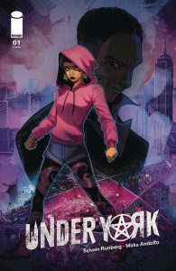
Under York #1 (Image Comics): I don’t know about y’all, but when I pick up urban fantasy, I want my lore and worldbuilding upfront and a complex amount of it. Unfortunately, Under York oversells in its ad copy and underwhelms in its delivery. Featuring an outrageously unrealistic portrayal of foodtruck manual labor, a mysterious past, and a tragic flashback, writer Sylvain Runberg overexposits in single word balloons, and gets to the point far too late in the book’s runtime. Surprisingly, always on-point Mirka Andolfo known for her likeable character expressions and slimeball skeezy types falls short of charming here with the one stereotypical depiction of an Irish person I can conjure with the description, “magic and Irish.” While Andolfo usually crowds layouts with vibrant character acting, the switch to representing so much background detail and multiple characters shows the limits of such an approach. Add Carmelo Zagaria of Arancia Studio using a thinner stroke to Andolfo’s work than Western audiences are possibly used to, and the results feel night and day with her usual work. I will say Arancia Studio’s Piky Hamilton sets a crystalline palette that may not have the easiest to understand lighting, but throwing a smoky vignette over every panel does give “urban fantasy.” With compositions packed to the brim and next to no negative space to work in, Fabio Amelia does his best to pack in some fairly long dialogue, but I would’ve loved some more creativity for Under York’s magic language than the same black-stroke white-balloons used by non-magical dialogue. I don’t know, maybe #2 will feature more of what draws me to urban fantasy, but until then I’m over it. Sorry. —Beau Q.
The Prog Report
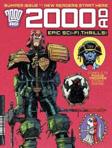
2000AD Prog 2375 (Rebellion Publishing): Well, here we are at a jumping on point for new readers with Prog 2375. This is a big issue with a lot for readers to really sink their teeth into. Some of the current ongoing series are in there — one of which is a finale — but the headliners are probably the new Judge Dredd story and the Rogue Trooper story, which is basically self-contained, if you know even a cursory bit about Rogue Trooper. As a still relatively-new Prog reader, I found this issue enjoyable. This is really my first Rogue Trooper story, and I’m intrigued to read more, with both a movie and an Essential Rogue Trooper book on the way. All in all, I think this functions well as a good jumping on point, or at least, a sampler you can check out to see if keeping up with the weekly mag is right for you. The Judge Dredd story here is by writer Rob Williams, artist RM Guera, colorist Giulia Brusco, and letterer Annie Parkhouse. The Rogue Trooper story is by writer David Barnett, artist Paul Marshall, colorist Pippa Bowland, and letterer Jim Campbell. As always, you can nab a digital copy of this week’s Prog here. —Zack Quaintance
Read more entries in the weekly Wednesday Comics reviews series!
