
This week’s review slate once more races backwards and forwards through time – we’ve got Skybreaker #3, which came out a short while back, along with an issue of Liberator that had bunnies on the front cover, as well as Tom Strong and the Planet of Peril #1.
Skybreaker #3
Michael Moreci (w), Drew Zucker (a), Ryan Ferrier (l), Jack Davies (c – cover)
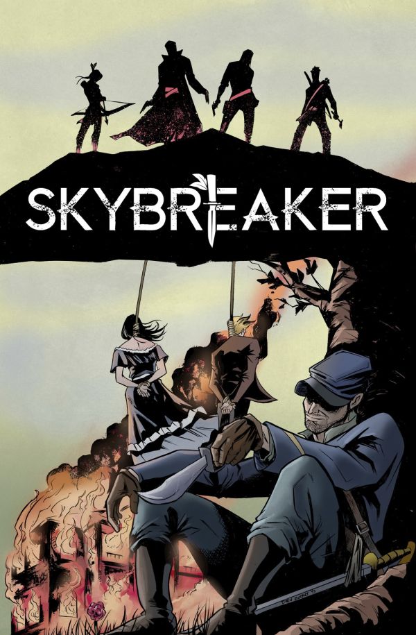
A black and white Western from Michael Moreci and Drew Zucker, Skybreaker’s third issue takes a plethora of characters and pushes them into place for a bloody finale. What caught my attention most was the cover, however, coloured by Jack Davies and shown above. In it, the scene we see spotlights one of the villains of the piece, after a bloody act of revenge he’s undertaken. This scene does appear in the issue, but only through a very quick flashback – the cover is basically forcing the reader to linger on just why the villain is to be loathed, and just why one of the protagonists wants him dead.
I’m surprised more comics don’t do this. Rather than spoil a surprise from the issue, or give us a generic hero pose, the cover works to subtly push the reader before they even open the first issue. It pre-conditions the reader so that when they come across the scene again in the issue, recounted as flashback, it has far more of a heft to it than it might do otherwise. It’s a smart piece of work, and Zucker’s interiors are just as well-designed.
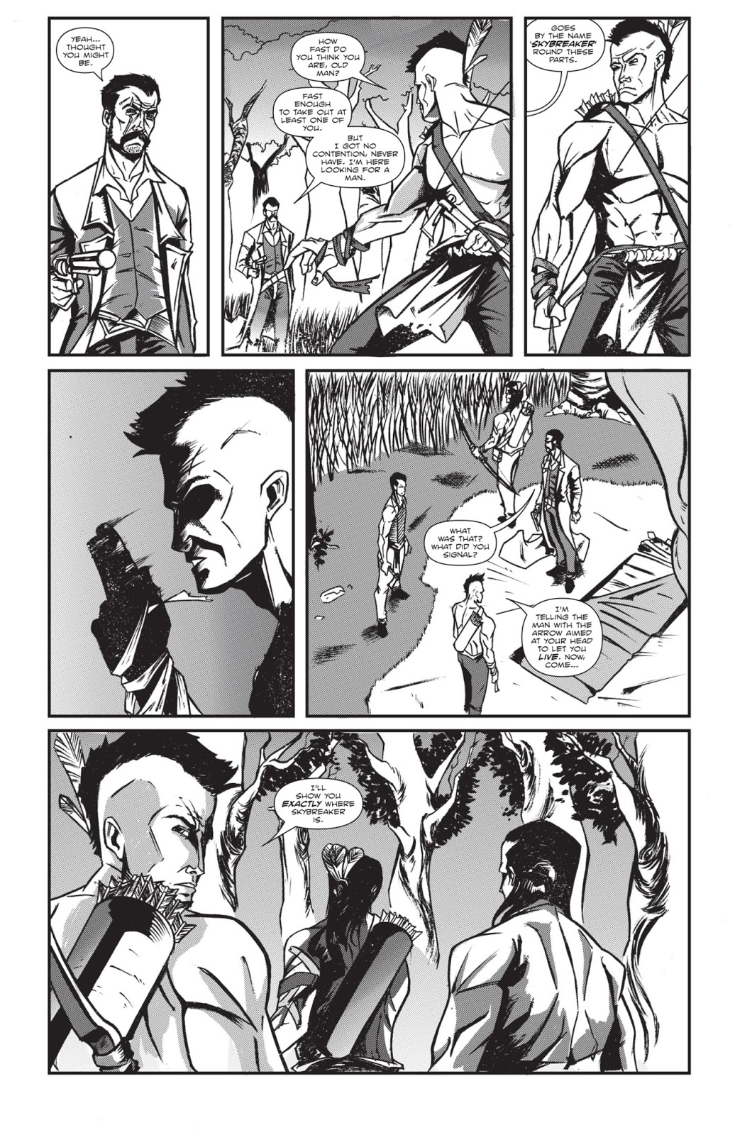
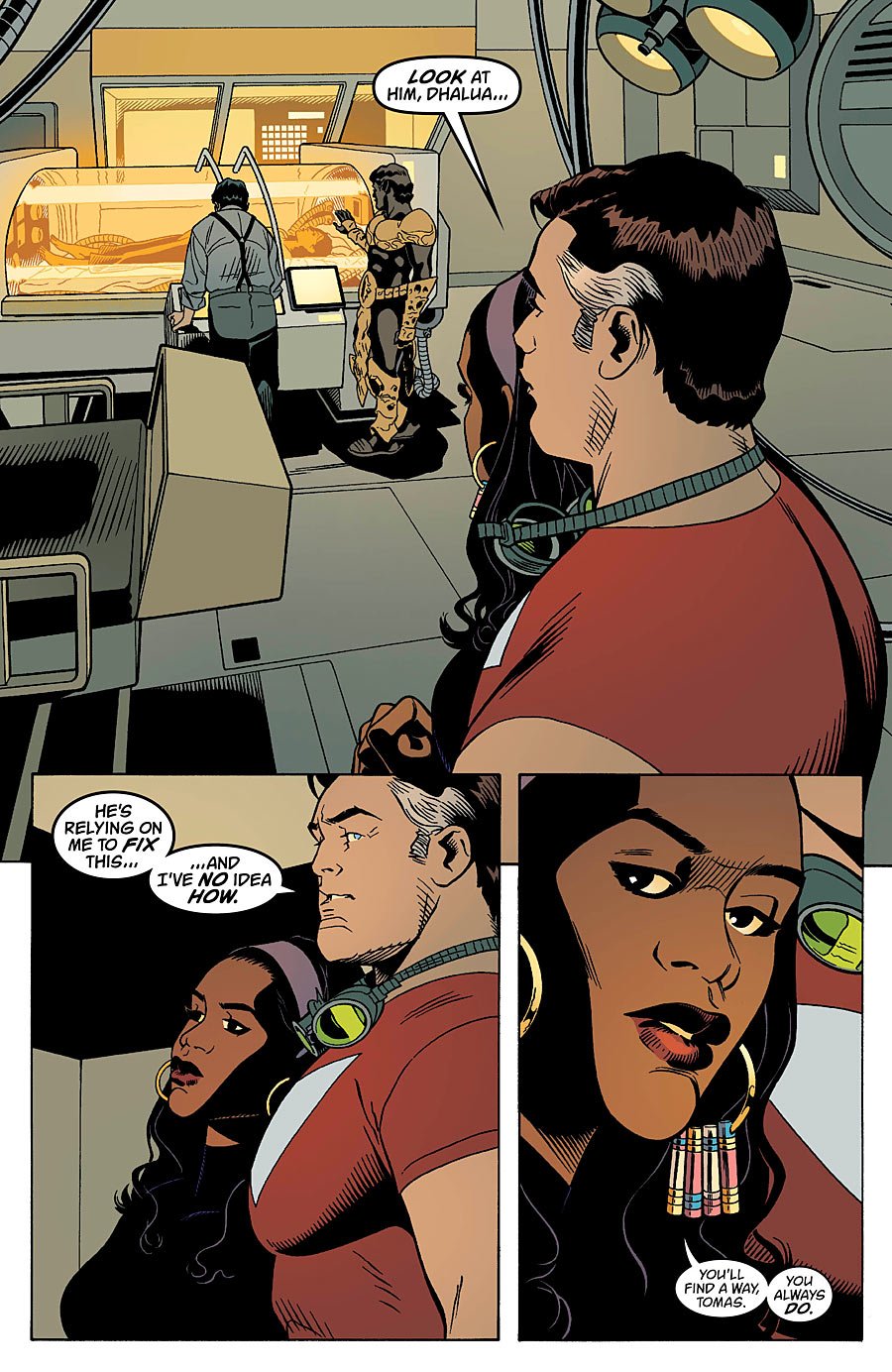
This third issue of the series essentially spends the first half of the story collecting characters together as they regroup both mentally and physically with other members of the cast. Things then head off to an ambush between three parties, who crash into each other and bumble their way into some rather nasty violence. Up until this final act of the issue, I found I was following the story nicely, with Zucker ensuring that every member of the cast has a distinctive facial feature which allowed me to tell each character apart. The final scene, however, still confuses me a little.
This is because the scene holds tight to the characters as they engage the ambush, shooting each other in the back and, well, through the head. As each new ambushee pops up, I lost count of how many characters are actually meant to be in the scene – and once the shooting stopped, other characters showed up whom I hadn’t seen beforehand. I understand the general idea of the battle, but because we didn’t get a wider shot during the fight itself, I was left confused about who was left at the end, which side they were on, and what had just happened.
Everything up until that point was highly enjoyable, however – and perhaps this is just me not having read the previous two issues. Moreci’s dialogue feels rough and real, but his best move in the issue is to ensure that we don’t know which character we’re meant to completely root for. There are three protagonists in the book, and all three of them seem to have understandable goals and ambitions. When placed next to one another though, as happens in this issue with two of the three…. things become palpably tense and suspenseful.
It was a decent issue. This is a western which seems to have a larger narrative than just a revenge thriller, and benefits for it. Zucker’s artwork has some really inspired touches, which elevate the characters and bring on the tension. It has a somewhat confusing ending, but I imagine issue #4 will help clear things up somewhat for me.
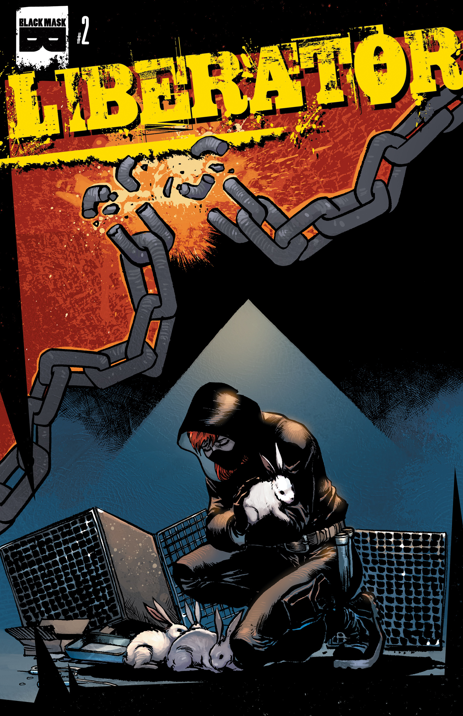
Liberator #2
Matt Miner (w), Javier Sanchez Aranda (a), Joaquin Pereyra (c), Vito Delsante (l)
The idea of Liberator is of a social justice comic, wherein vigilante-types dress up in ski-masks and track down and rescue animals who are being used as lab subjects. To that extent, issue #2 reads somewhat like a far more toned down and realistic version of Kick-Ass, as main characters Damon and Jeanette treat their ski-masks and black clothing as a type of superhero costume, and view themselves as heroes on a noble mission.
The key to Liberator, as a series, will be if it knocks them off their perch, or if it actually believes in them. For the time being things are left vague, although the comic does seem very eager to overhype the scientists who experiment on animals as evil and cruel. The artwork from Aranda shows the lab workers beaming with sadistic glee as they inject animals with chemicals — not exactly a fair portrayal. The final page hints that the story is going to balance things out a little more in future issues, which I’m interested in reading.
But coming at the issue purely as a comic rather than a message, this is a fairly decent comic. Technically it’s all rather good, with naturalistic and funny dialogue from Miner, as well as some great work from letterer Vito Delsante, who is especially good at conveying tone of voice. He represents the flow of conversation very well in the issue, and handles action and conversational scenes strongly. The issue actually drags a little once it reaches the more action-driven sequences, which speaks to the strength of the conversational sequences.
For a comic with a political message, I didn’t feel like I was being fed exposition. Miner makes sure that his script keeps things focused on the characters and situation rather than pausing to shunt in consecutive pages of message. Things flow nicely enough, after a slightly shaky opening sequence, and the characters are realistic and natural.
At the same time, there’s an article right at the end of the issue from animal rights activist Shannon Keith, which reads like straight unsourced propaganda. I found myself very uneasy with the declarations being made by the issue, politically, given that there’s no references given to back up her assertions. The comic itself can make any claims it wants to make and I have no issue with that — but an article has to source and reference accurately if it’s to be taken seriously.
I thought Liberator #2 was a well told story, with a deft knack for characterisation and well-showcased storytelling from Javier Sanchez Aranda.
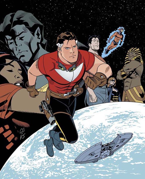
Tom Strong and The Planet of Peril #1
Peter Hogan (w), Chris Sprouse (a), Karl Story (i), Jordie Bellaire (c), Todd Klein (l), Ben Abernathy, Kristy Quinn (e)
Review written prior to Laura’s interview with Peter Hogan!
I thought this issue was terrific, in honesty. Reviving the Tom Strong character for a new storyline, this first issue is dominated by two things: the strength of the established cast, and the artwork of Chris Sprouse. Despite having never read anything about this series before, I found that Peter Hogan’s script did a masterful job of bringing me bang up to date with who is who, and what’s going on. There’s exposition, but it’s handled deftly and pushed to one side.
Tom Strong was a character created by Alan Moore and Chris Sprouse at the back of the 90s, a ‘science hero’ who travels around space with his family and friends – one of whom is an elitist cockney gorilla, joy upon joy – and maintains an optimistic, positive attitude about life. The issue immediately sets up the threat of the series within two pages, before spending the rest of the page count establishing the premise and narrative we’ll be seeing as we head forwards.
It’s startlingly well paced, even though the majority of the issue is spent with characters talking and planning. Despite the lack of action here, Hogan and Sprouse keep the attention through a number of well-choreographed character moments. The dialogue gets to the point but also shines the spotlight on the main character, and gives us a look at the mind of a well-intentioned superhero… something I’ve been missing in regular comics recently. Sprouse draws a classically-styled superhero in Strong, emphasising him as a leader and guardian who commands the respect of his friends and family – and interestingly, Todd Klein’s letters are far larger for Strong’s dialogue than for any other character.
Maybe that’s something which has always been the case in Tom Strong stories, but I did like how clearly this simple trick marked the character out as somebody to pay attention to. I felt that he came across very well, a likeable protagonist who has a admirable cause which most people will immediately root for. Sprouse’s art is clean and bold, boosted by the colours of Jordie Bellaire. One thing which really popped out was the clinical feel of any scene set inside a spaceship. Sprouse leaves massive gutters between the panels, which Bellaire uses to great effect in her colouring. She leaves them white and makes sure that the panels pop out from that blankness, tightening the characters into their frames.
Whenever the narrative leaves that spaceship though, the gutters vanish or are filled in, as if to emphasise the vastness of the images and setting the characters find themselves within. Again, that’s a very subtle effect, but one which I found massively effective in the issue. I really did enjoy the issue – I thought it was crisp, fresh, light and well-meaning. The characters came across as decent people doing the right thing, and the final few pages have me hooked in for the next issue – it might not be big and bold and splashy, but it was a solid, enjoyable comic.
No swearing, either! This was a very PG Vertigo comic.


Comments are closed.