This will be the last By Its Cover for a few months, so I thought I’d do something special. Today we’re going to look at the Image Expo teaser images shown at SDCC 2014.
To be clear, these aren’t necessarily covers. In theory, they’re teaser images intended to get people interested in each series, though half of the teasers look like they just used the first issue’s cover art.
When Torsten Adair suggested the topic, I was initially hesitant. I made a conscious decision to focus on the best covers each week – partly in hopes of inspiring people to create more visually diverse covers – but these Image Expo images range from great to distinctly not-great. Though it’s possible for us to learn just as much (or more) from seeing people’s failures as their successes.
I guess what I’m trying to say is that I almost feel like the column you are about to read needs a warning. I was going easy on the covers before; we’re about to go critical.
Methodology: I purposely avoided reading the descriptions of each book until after I’d looked at the corresponding teaser image. I then showed the images to a couple of friends who also knew nothing about the books, to see if their impressions differed. What follows are the results.
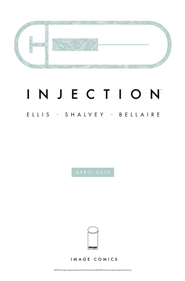
I’ve decided to go through these in reverse order from how the books were announced, because I wanted to start off with an example of perfection. Sleek and stylish, this teaser doesn’t say much, but in a tantalizing way that makes me want to know more.
The way the syringe icon doubles as a pill is perfect. The texture inside the icon wasn’t really necessary, but it works regardless. Futura is one of those sturdy, timeless fonts that’s ridiculously overused, yet never gets old. And like any proper teaser, it tells me the month and year it’s coming out.
That said, based on my own experience, I’m betting there are a lot of non-designers out there who consider this image boring. But I’m not sure that can be helped.
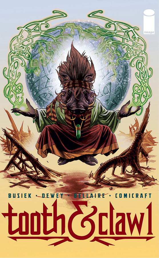
Tooth & Clawl? Tooth &…Crawl? Crawl? Clawl?
It took me two minutes looking over this image before I realized it said “Tooth & Claw 1.” I can understand putting the “1” in there so that the ampersand is centered (and it’s a great ampersand, by the way), but the number’s similarity to the lowercase “l” hurts the title’s readability. Plus, what do you do with Tooth & Claw 2 and beyond? Since all other numbers are wider than “1,” the ampersand will either no longer be centered, or the title is going to look cramped.
Also, the lowercase “l” looks weird with the upper serif coming off the wrong side like that.
But the title treatment isn’t the only problem. My friends and I all found this cover to be visually boring, and I couldn’t figure out why. I’m a fan of Busiek’s writing, so I want to like this. The image is well drawn and well composed. I dig symmetrical compositions. And it’s an image of a warthog doing magic! So why does it make me want to scroll away quickly to something more visually pleasant?
The problem is the colors. Instead of being used to create depth, they’re flattening the image out. The old staple of warm-and-cold contrast is being used for the background, but the gradient meets in the center as a dull gray. The blue orb sits in the cold area of the gradient, where there is the least contrast, and likewise all the brownish red elements sit in the warm area of the gradient.
The warthog, who should be the focus of the piece, is colored entirely in very desaturated colors that push the focus to the less gray background elements. Even the glowing light in the character’s hands is gray, instead of a vibrant white. The glowing objects around the character are separated from the light blue background with a strange warm gray glow that flattens them out, making it look like the character is sitting (well, floating) in front of a painted wall instead of summoning light. From a distance, the image balances out to dull gray and brown.
A better approach? Glowing objects are hard to convey against light backgrounds. A lightsaber doesn’t look as good in front of a white or pastel wall as it does behind dark colors. If the warthog was floating in front of a black background, everything lit only by the green objects emanating from the character’s hands, that would be one dramatic image.
(Yes, I realize Jordie Bellaire just won an Eisner for Best Coloring. Feel free to tell me I’m wrong.)
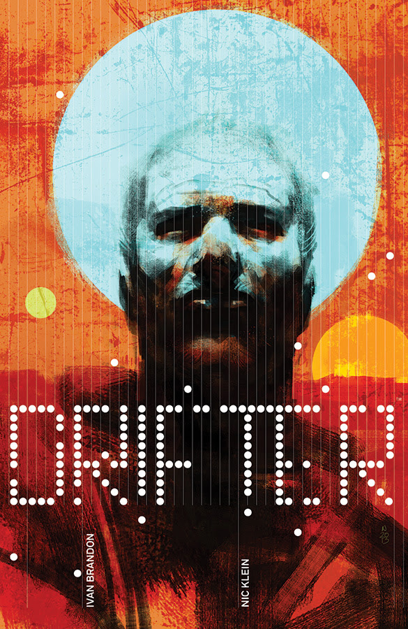
Whoa, look at that title logo. That’s crazy. I never would’ve attempted something so wild and chaotic, and that’s why I love it.
I also love the expressiveness of the painting, and the color palette is solid. I don’t quite get the light blue circle (sun? moon? something else?) that’s overlapping his face, but since they’ve already consciously broken all the rules with the rest of the composition, I feel like I should just go with it.
My first guess as to the story was “a western set in space?,” and the description pretty much confirmed it, so it’s a success there too. All it’s missing as far as teasers go is a date. It doesn’t count if you hid it in those seemingly random dots, guys.
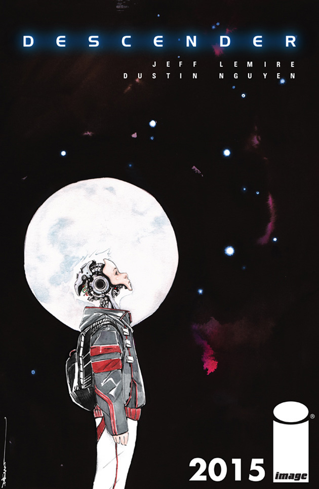
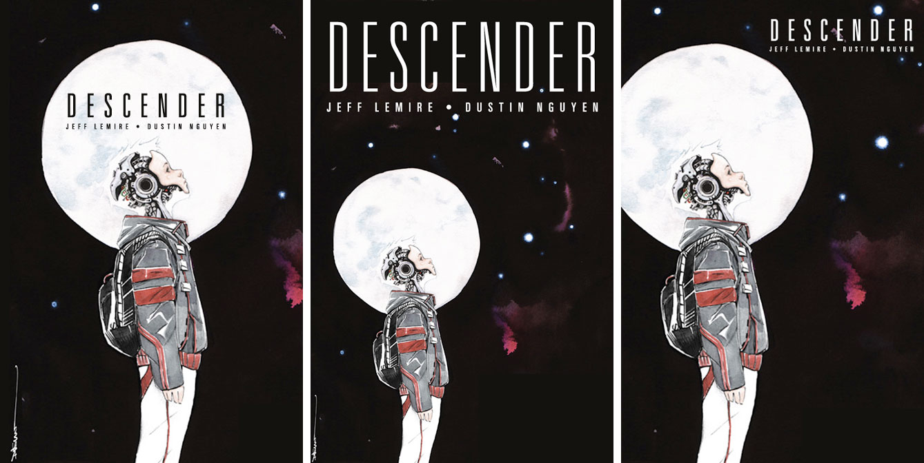
The image of the kid behind the moon works really well when I’ve seen it cropped down on other sites, but otherwise the composition is a little awkward. I kind of want the kid’s eye line to be pointing to the title and credits, rather than just under them and over to whatever is to the right of the image.
There are a few different approaches that I think might work a little better. I don’t think the typeface used for the title works very well spaced out like that. A taller typeface would probably work better, like the one used for the creator’s names. But there’s so much space for a title at the top of the image, you could go even taller.
Or, the image could be cropped in so that the moon is centered horizontally, and the title and creator names could be centered within the moon. Or, the image could be cropped in so that part of the left side of the moon is cut off (the kid being places on the left side of the rule of thirds), and the title and creator names placed small in the upper right corner (not overlapping the moon).
I’m not sure if I’m making sense, so here are examples.
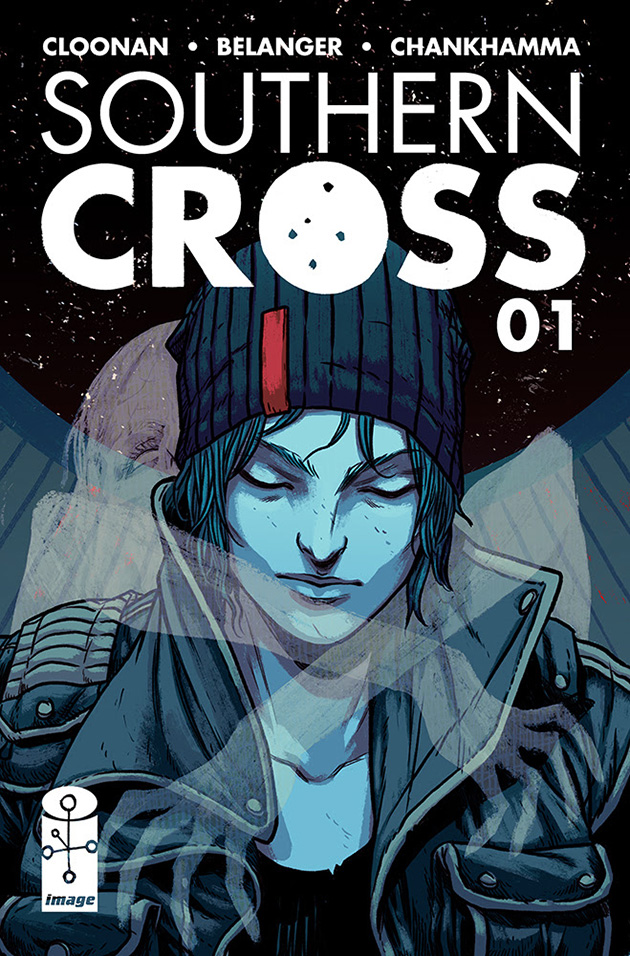
Am I the only one who hadn’t heard of the constellation the Southern Cross? Maybe that just shows how ignorant I am of astronomy, I don’t know. I initially thought the dots in the “O” were an attempt at making it look like a moon, until I saw the symbol in the Image logo, and still didn’t realize it was a constellation. Make fun of me if you want.
So my first thought looking at this teaser is that the story takes place in the south, and is about some sort of angel or winged main character who is transporting a ghostly corpse a la Hellboy. After I was informed about the constellation, I still figured it was the same story, only set in the southern hemisphere.
The story description tells me I couldn’t be more wrong. It doesn’t even take place on earth! It’s about a tanker flight heading to Titan called the Southern Cross, and what I took to be wings are probably the frame around a window. The corpse might be hitching a ride, as I thought before, or it might be trying to strangle the character.
It’s well drawn, but isn’t quite getting across the concept. It’s described as “The Shining on a haunted spaceship,” but I got neither a spaceship nor The Shining from this. The look of internal peace and calmness on the character’s face does not convey a horror vibe.
In terms of type, it’s kind of distracting to me how “SOUTHERN” is in very clean Futura, while “CROSS” is in Futura that’s been roughed up to look hand-drawn. They should either both look hand-drawn, or both look clean. Or maybe the hand-drawn word should look more hand-written (instead of a roughed up geometric font), but it might be tougher to get that to work. I also kind of want to see the Image logo moved up below the logo and resized to the same height as the “01,” to balance out the top half of the image.
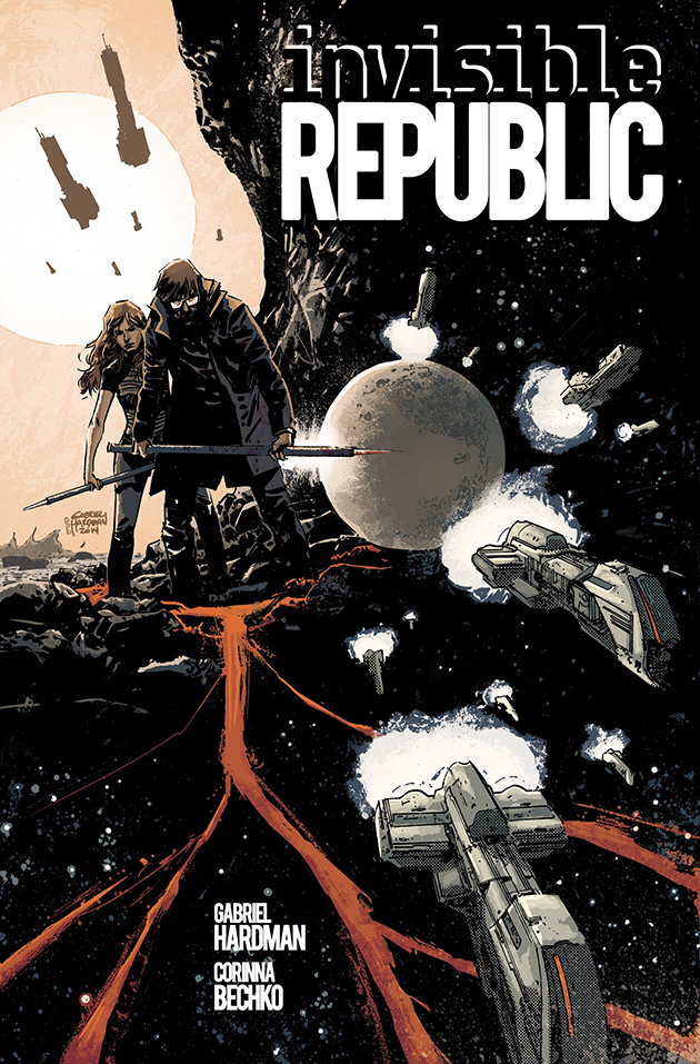
A collage like this could’ve completely fallen apart, but I think it works. I immediately get that this is two locations combined into a single image, rather than two people finding a cave filled with ships flying away from a tiny planet. I think the ships flying overhead behind them helps a great deal in terms of that.
The only thing I’m not sure of is the stream. Is it lava? It looks like they’re standing in it, so I assume not. Is it just water colored red because artistic license? It’s the one element that isn’t really working for me, because I don’t really like how it flows behind the ships.
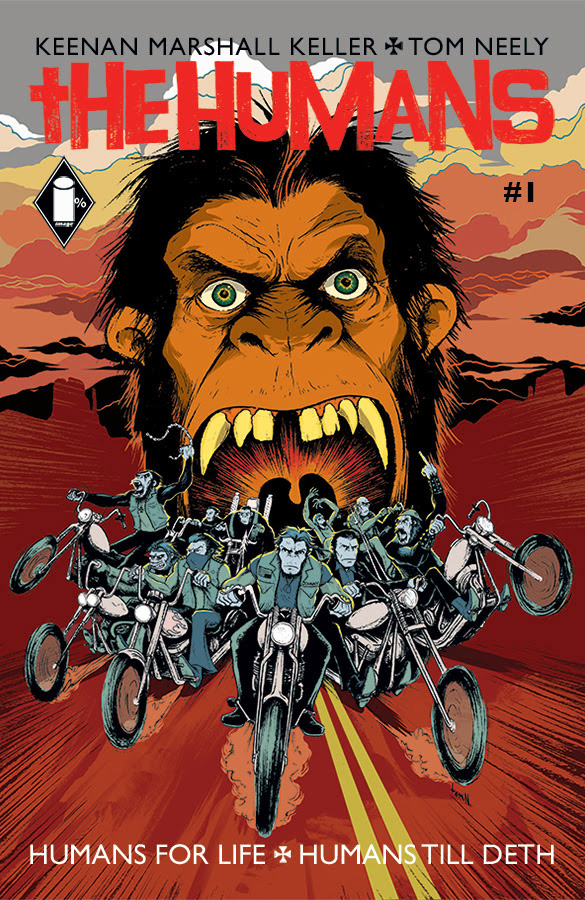
It’s not an elegant cover, but it does a perfect job of getting across the concept, assuming that concept is “Planet Of The Apes meets The Wild Angels.”
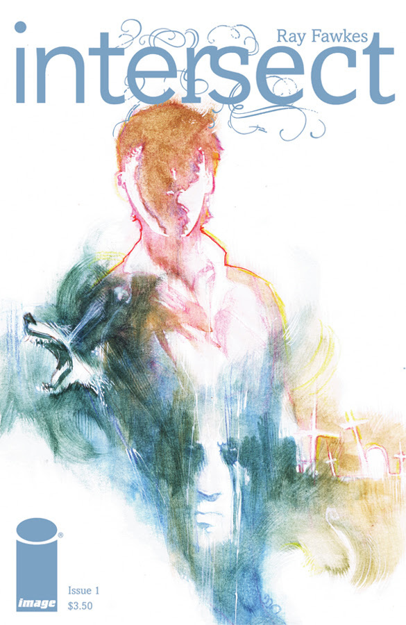
A critic who likes to be cruel for the sake of comedy might say: “Intersect is about a boy with a wolf for an arm who encounters Alice Cooper,” but I like to think I’m above that.
I like the texture of the painting, but the composition isn’t working for me. Then again, it perfectly matches the book description, which opted for text with a lot of flavor that doesn’t actually tell me anything.
Please tell me this is going to be a really tall comic.
This image certainly has a lot of energy, though it seems strange to have this exciting lightning bolt! and exciting title! and then this person just standing there looking bored. Normally I like contrasts, but his boredom in the face of excitement makes me feel like I’m going to be bored.
I don’t understand why those decorative flourishes are only on the right side of the page, unless they did it just to drive people like me crazy.
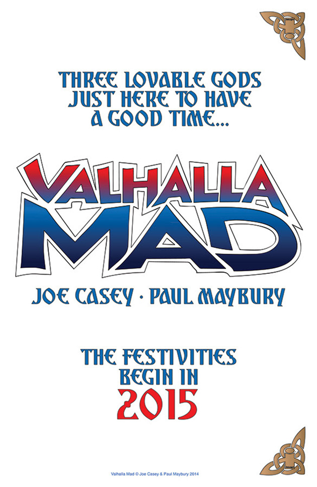
Let’s talk about the logo first. I get that the looseness of the letters is meant to convey that this is going to be wacky, but it really just looks sloppy. While it conveys madness, it doesn’t really convey god-ness. If the word “Valhalla” had been written in that font used for the rest of the text, and then “Mad” was in a zany comedy font, the logo itself would have a visually interesting contrast that better communicates the story.
The teaser would then be improved by having the rest of the text in a plain font, except maybe the year (which could mirror the logo’s “Valhalla text.”
Also, y’know what would be better than text telling us its a story about “three lovable gods just here to have a good time?” A silhouette of three godly-looking people laughing and holding mugs. You could even build that silhouette into the logo Final Fantasy-style, and it’d be perfect.
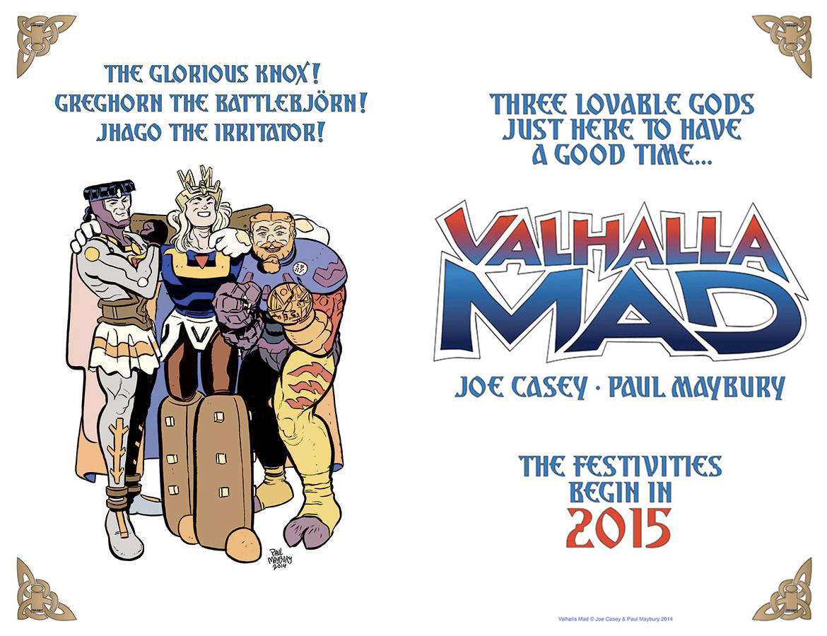
Update: It turns out the above image was actually half of a double-page spread, which makes much more sense. However, I still feel the logo could be stronger.
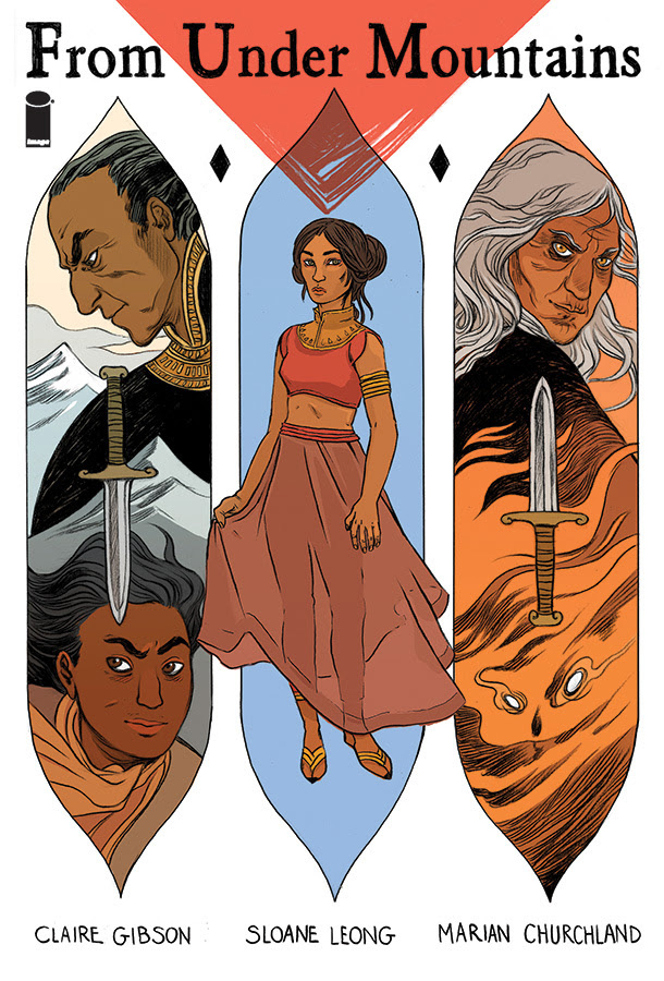
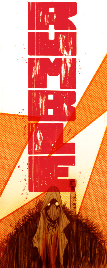
I like the decorative shapes being used here. The knives are a nice touch, if they represent that one character wants to backstab or is the enemy of the other. If that’s not what the knives are communicating, then I would’ve left them out.
The title text needs work. Serif fonts like that work well for small text, but they make for extremely plain logo text, even when hand-traced to give it an indie look. As much excitement as the illustration tries to convey, the plain non-logo title undermines it.
The red shape behind the title looks nice, except the hatch lines inside it don’t quite fit with the fully filled in colors in the backgrounds of the three main shapes. Instead of looking artsy, it looks like “I was filling this in with a marker, but got impatient and gave up.”
The placement of the Image logo looks like an afterthought, or a “I don’t know where to put this now, I’ll just wedge it in here.” A better place for it might be centered in the shape created by the overlapping red and light blue, or centered below the feet of the central character.
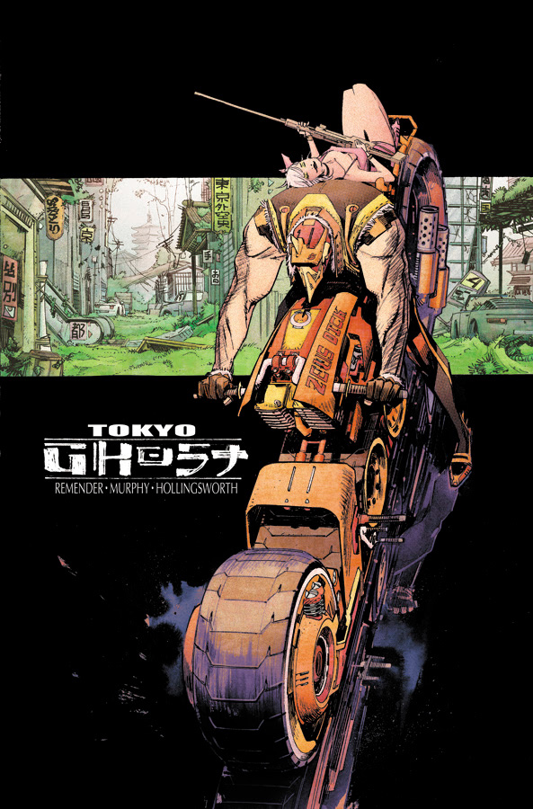
My first impression of this image was that it was two people sitting on the nose of a runaway bike as it was popping a wheelie. It seemed pretty clear to me what direction they were moving, from the speedlines behind the back tire, and their relation to the horizon.
After staring at it for awhile, I realized a few things. What I thought were speedlines was actually the reflection of the bike on a shiny black surface. In fact, they’re not moving at all – the guy’s legs are firmly planted on the ground, not on the foot pegs, and the background image represents a completely different view angle. The only thing I’m still confused on is why there are bits of krackle to the left of the front tire if they’re not moving.
In short: this cover isn’t working. Even if the intent was to confuse, my question is “why?” It doesn’t make the cover more interesting to look at, it just makes me want to look at an illustration that makes visual sense.
If you removed the bike and left just the strip of background, with the logo filling the black space below, I would love this image. If you removed the strip of background, moved the bike up a little so it’s more clear that there’s a reflection under then, and moved the logo to the upper left, I would call this a strong image. As is, it’s not working.
See you in a few months.
Kate Willaert is a graphic designer for Shirts.com. You can find her her art on Tumblr and her thoughts @KateWillaert. Notice any spelling errors? Leave a comment below.


Great insight on these covers/preview images, Kate!
Thank you for another great week of BIC. I look forward to this all the time. If you need to take time off I understand, I’m just glad that you will return to it later. See you then.
Much appreciate this column. That Injection cover is sweet.
Hadn’t seen The Drifter promo before- great image and looks intriguing. Rumble and Invisible Republic look cool too. I’d disagree with you about Tokyo Ghost, but your suggestions would be strong too. Especially like your mock-ups for Descender. Lots of sci-fi to look forward to it seems.
Still LOVING this column, Kate — my favorite regular feature on the site! You are spot-on regarding the coloring and the number one on the Tooth & Claw design. It’s so fascinating how just a couple of elements can torpedo what could otherwise be a really striking drawing/design. The Drifter cover is stunning and I’m also in total agreement with you about the rather confusing at first glance Tokyo Ghost image. I love Sean Murphy’s art, but that’s a bit of a tough one to grok. The design for Rumble is probably my favorite — feels audacious and poppy — the chap in the hood looks less bored to me and more mysterious, I would say. Anyway, keep up the awesome work! I think you’re doing a lot to remind people that DESIGN can often be more crucial than DRAWING, especially when it comes to comic book covers.
Comments are closed.