
If you’ve been reading comics for more than a few years, you’re probably familiar with the traditional comics trade dress layout: publication information at upper left, maybe a character image or some floating heads, and title logo centered in the remaining space to the right.
For many of us, that’s just how comics always looked. But have you ever wondered why that layout was so widely adopted?
Any seasoned pros reading this can correct me if I’m wrong (or confirm whether this is true), but the way I heard it is that the reason was directly linked to how comics were displayed on the newsstand.
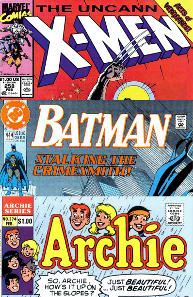
The important information was all located in the top third of the cover, of course, because that’s often all that was visible when displayed on the newsstand or in a spinner rack. But some newsstands would maximize space by overlapping the issues, resulting in only the left side being visible. For this reason, publishers placed all the publication information on the left side, and the character images functioned as a shorthand to help fans quickly find their book.
The question is: now that newsstand sales make up roughly only 1% of comics sales, why does anyone still use this layout at all? The floating heads have become a thing of the past, but many publishers are still tied to this upper left placement that nudges the title logo off-center.
Logos look great when they’re flush left, flush right, or centered, but having them just slightly off-center often makes the whole composition feel off-balance.
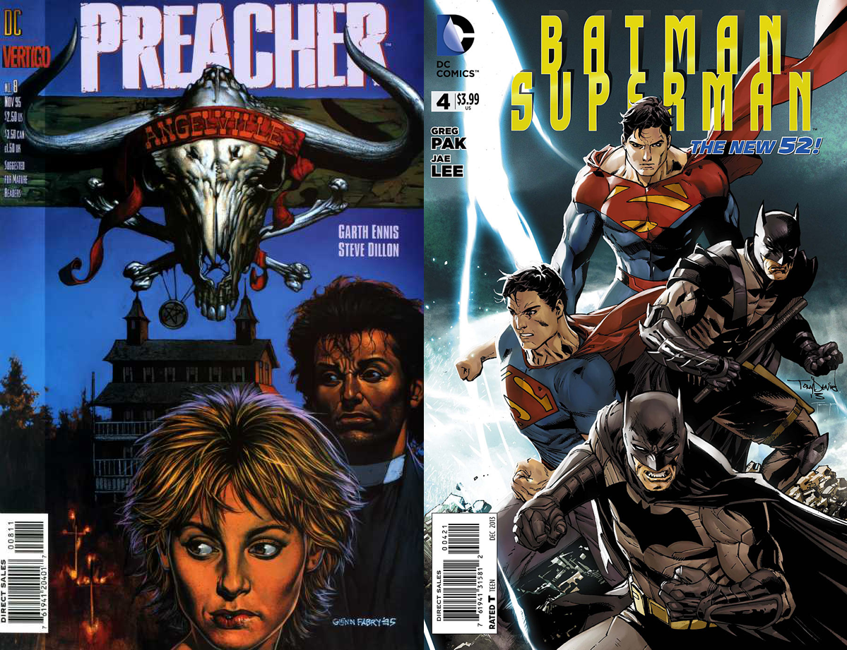
It becomes particularly noticeable when the artist has created a composition that contains elements which are clearly centered. Take for example this classic Glenn Fabry cover for Preacher #8. The word “Angelville” on the skull was clearly meant to be centered beneath the logo, but instead it highlights how the logo has been pushed off-center by other design elements.
Artists can try to preemptively fix this by designing their composition to be centered with where the logo will appear, such as the above right cover for Batman/Superman #4 by Tony S. Daniel. But unless a solid vertical bar is added along the left side to fill the extra space, the result feels like the entire cover is off-balance.
The simplest thing would be to just drop the traditional trade dress layout altogether. Marvel appears to have (mostly) moved on, but DC still clutches tightly to the past.
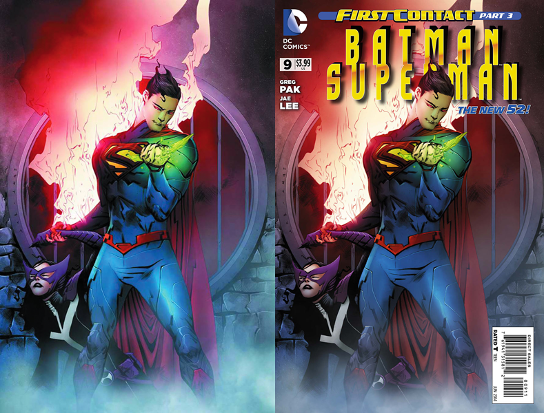
Jae Lee managed to work around it somewhat in this cover for Batman/Superman #9. Superman is standing roughly in the center, with a centered grate behind him, but his head is tilted in such a way that it’s almost centered with the positioning of the logo.
Unfortunately, the image is hurt by a few other problems. Placing the logo behind Superman’s head would normally be a good way to create a sense of depth, except that adding a soft drop shadow over the flame breaks the illusion and makes the whole thing look flat. On top of that, the bright yellow logo clashes a little with the eerie color scheme of the illustration. Making it look silver instead of gold – or maybe just flat white with a solid black drop shadow behind it – might’ve looked a little more elegant.
Now let’s look at some books from earlier in the week:
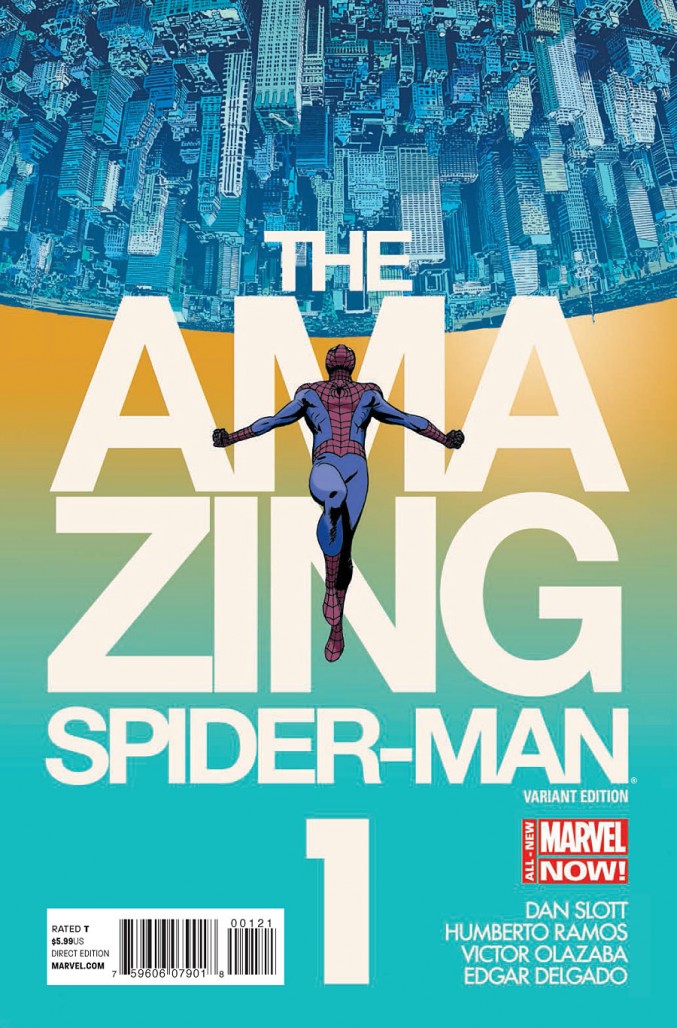
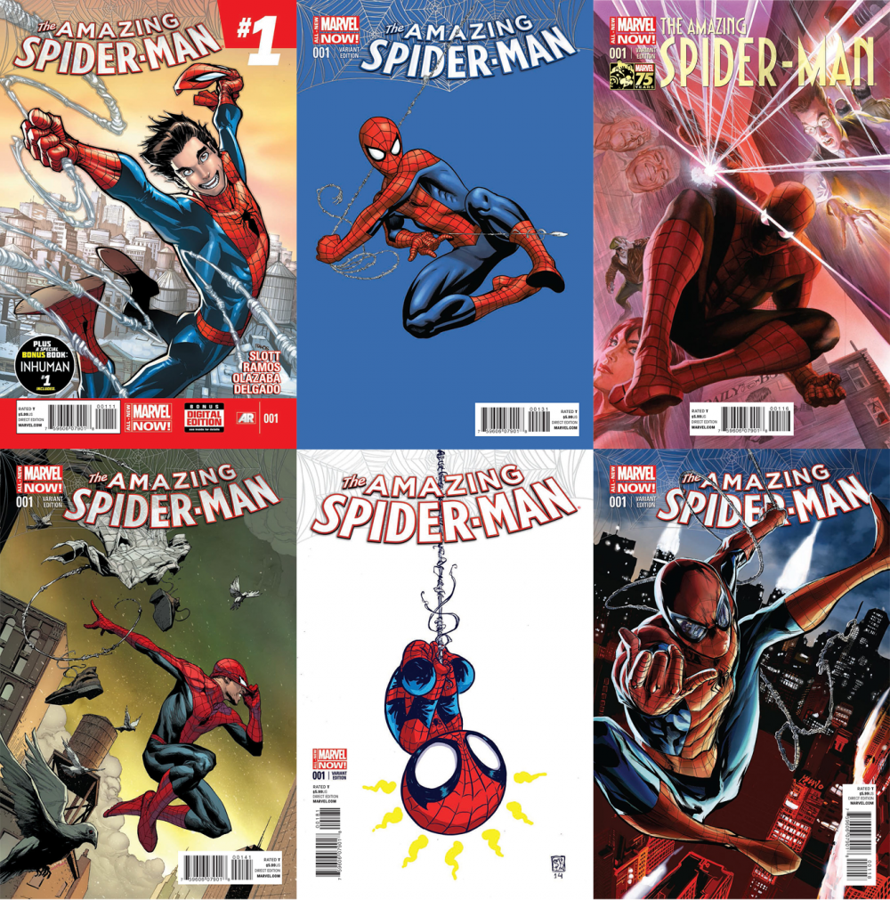
AMAZING SPIDER-MAN #1
Amazing Spider-Man relaunched with a smattering of variant covers this week, but there was one that clearly stood out. Which isn’t to say that the other one are bad, but Marcos Martin’s cover does something that none of the others do: it integrates the title into the overall design, rather than just placing it in an empty spot somewhere at the top.
Even Alex Ross’s fantastic illustration looks like it’d work better sans-text, as a print on my wall. The text in Martin’s version, on the other hand, is so essential to the composition that it’d seem a little empty without it – which in my opinion is a sign of a strong cover design.
Have you ever seen any of Drew Struzan’s posters without text? They look beautiful, but they also look like something’s missing. Struzan balances his compositions against a logo element that is put in place later, and they don’t look complete until the logo is there. The strongest covers are more than just illustrations with text laid on top; they take the logo into account as a crucial element of the composition.
That said, this cover isn’t perfect. I apologize to whoever set the type on this cover for being the one to point this out, but the kerning between the Z-I-N is really bugging me. For those of you who aren’t familiar with the concept of kerning, here’s an xkcd comic on the topic. Take a look at the space between the “C” and “E” in that strip, and I apologize to all of you in advance.
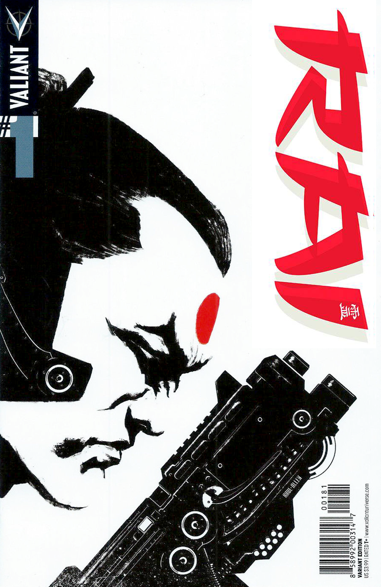
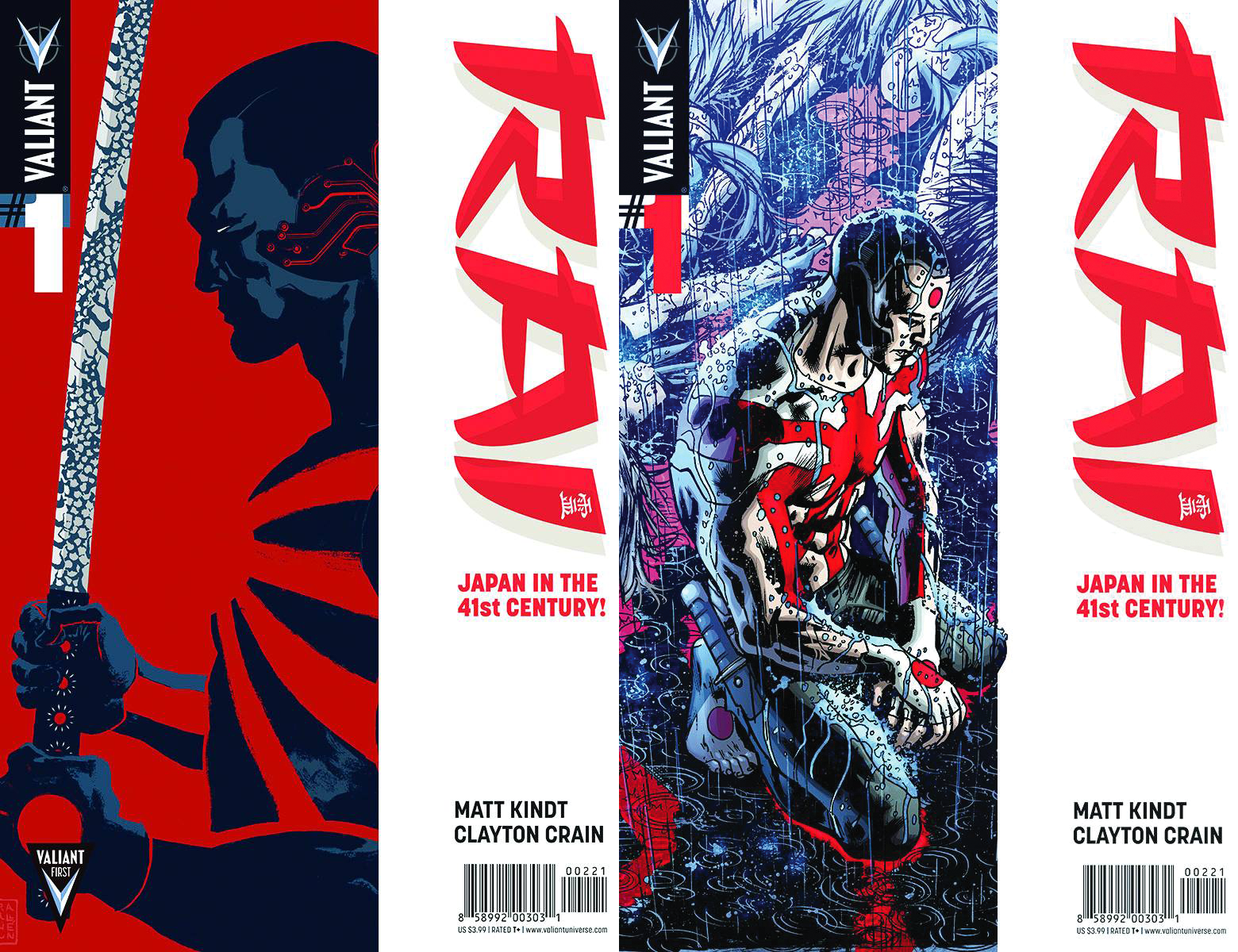
RAI #1
The first issue of Rai also shipped this week with approximately a bazillion variant covers. I’m not going to post them all here, but there’s a thread where fans are attempting to catalogue them (it’s gotten that out of hand).
My favorite is the David Aja/Raul Allen variant, in part because of the way the sparse use of color brings out the red elements. I also like how the gun points you to the logo.
The other two make use of a Lone Wolf & Cub-style white vertical bar. The Raul Allen solo cover (bottom left) simplifies the image down to basic shapes and textures, and the white sword on a red background balances nicely against the red logo on a white background.
I also really like Bryan Hitches cover at bottom right, which is possibly the only variant that conveys some sense of emotion.
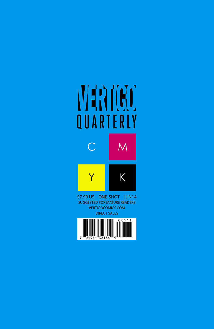
VERTIGO QUARTERLY: CYAN
It’s like, how much more blue could this be? And the answer is none. None more blue.
Most comic covers are so illustration-heavy that it can be pretty easy to stand out by doing just a purely graphic cover, like this design by Jared K. Fletcher. It’s especially striking when it’s large area of flat color, though this sort of thing would get old fast if everyone started doing it. My one nitpick is that I kind of wish he’d put the URL and “Direct Sales” on a single line so the entire design would be justified left-and-right except for the open space of the “C.”
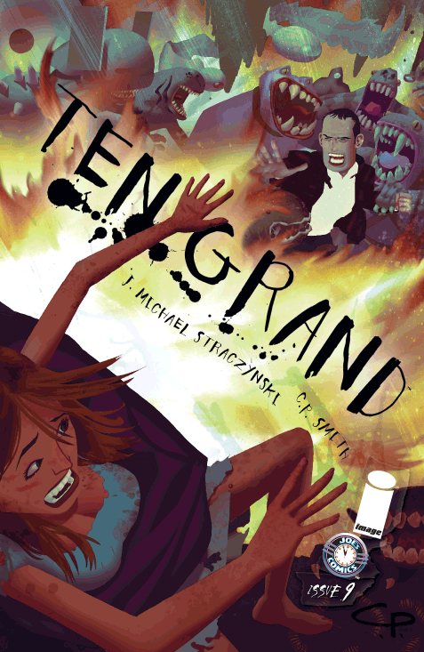
TEN GRAND #9
What a fantastic cover! Not only does the diagonal logo enhance the chaos of whatever’s going on in this scene with those creatures, but it also places one more obstacle between the two characters reaching out to each other. I’m not sure what’s going on with the other cover element looking like they’re taped down, but I’m willing to ignore it.
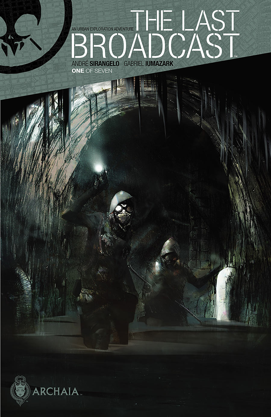
THE LAST BROADCAST #1
This is just plain sharp. The contrast between the very clean text design and the moody painting of a grungy sewer is really striking. I’m definitely curious to see what this book is about. The solicitation says the cover is by Gabriel Iumazark, but I’m not sure if that refers to the illustration or the design (or both).
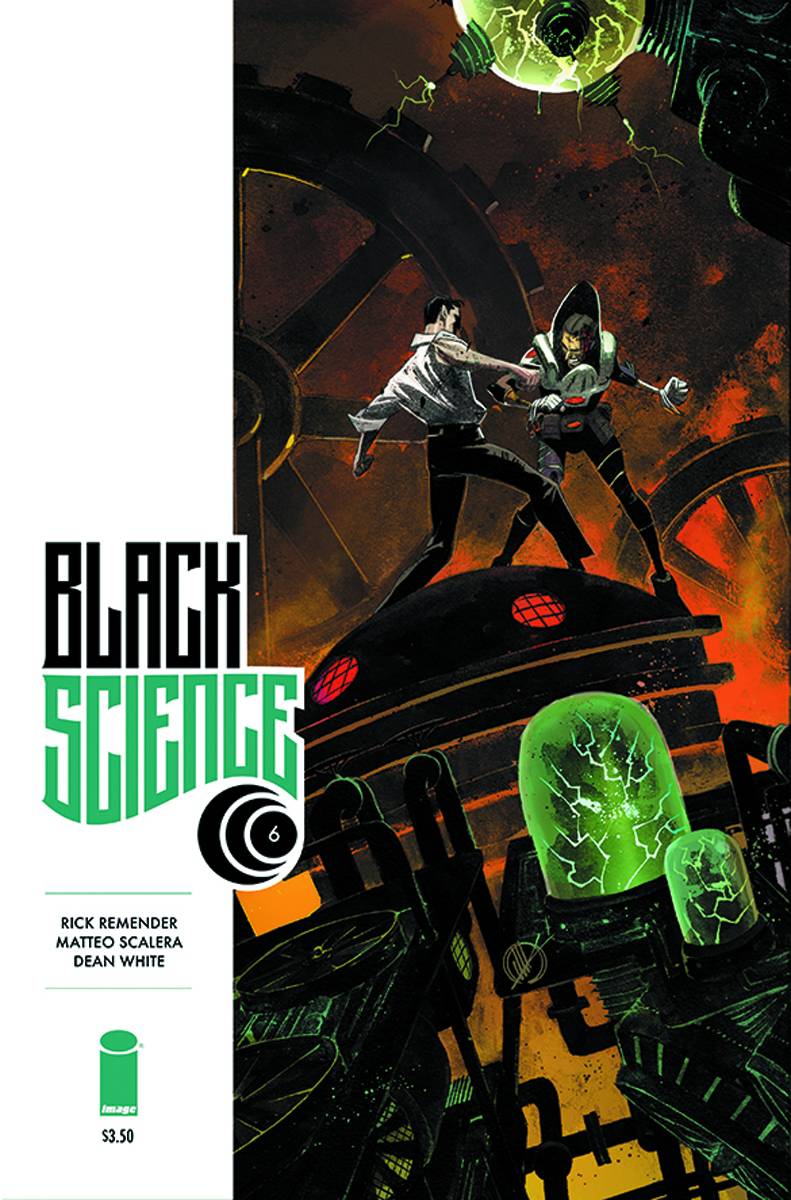
BLACK SCIENCE #6
White vertical bars could one day be considered overused, but I don’t think we’re there yet. I particularly like the logo for this series, with the contrast between the very blocky “Black” and the curves at the bottom of “Science.” The trade dress is very clean and not afraid of white space, which helps put more focus on the illustration by Matteo Scalera.
Kate Willaert is a graphic designer for Shirts.com. You can find her her art on Tumblr and her thoughts @KateWillaert. Notice any spelling errors? Leave a comment below.


terrific piece! i really love looking at beautiful covers, and your critique of them is really sharp.
I should add, I sure do love looking at all the lovely variant covers. I can’t afford to buy any, so seeing them online and making them my phone background is the way I get by. :)
Very much enjoying this column. A great addition to The Beat.
Great Column.
Brian Hibbs talks about cover designs with an eye toward in-store display, here:
http://www.comicbookresources.com/?page=article&id=47059
The short version: According to Hibbs, the information that sells the comic should appear in the upper-right third of the cover.
(I think you meant upper-left?)
Thanks for the link. I guess I hadn’t considered that angle since I’m thoroughly spoiled in Minnesota by comic shops that never overlap new issues (and a few that usually display the full cover of new issues).
Maybe I’ll address this next column, and discuss on what points I agree and respectfully disagree.
This is a wonderful new column! I am totally a geek for this kind of design stuff and it is clearly the kind of thing that comics publishers need to be thinking about a lot more. This column reminds me of the glory days of Dave Johnson’s old comic book cover review blog, which I have sorely missed. Kate, I have especially appreciated your nuanced observations and critiques on things that I never would have noticed, like the “kerning” on the Spidey cover and your spot-on criticism of that Vertigo CMYK cover. Would love to hear your thoughts on the Marvel covers of Mike Del Mundo on the X-Men LEGACY book, as well as the cover designs of Tom Muller on Image’s ZERO.
Thanks. :-)
I did briefly discuss a ZERO cover in the previous installment. I’d like to eventually take a look at some runs of series as a “spotlight on” sort of thing, but it really depends on how much I’m able to do in what free time I have.
I still prefer the logo and issue number at the top.
Yeah, I meant left… My mistake. Based on my experiences w/comic shops, there’s a good deal of variation in how books are displayed. So I’d probably hesitate to make design decisions based on racking.
Nice feature. is this a weekly thing? If so, where I can find the previous weeks? I don’t see it listed in the categories or tagged anywhere…
It can be easy to miss, but the tags appear right above the word “Comments.” :-)
Kate’s new column is a breath of fresh air. Count me as another fan of this cover series of critique and commentary. Well done! Do you plan to look at hardback comic covers, too? They seem to have a slightly different set of design rules — even with what they do on the spine.
The covers should always have the title of the book at the top so that they are identifiable when displayed in magazine racks. This is just common sense. Not every comic shop is located in Oklahoma where you can rent a 5000 sf store for next to nothing, allowing you to display all comics with the full cover showing.
Some of us operate stores in malls and other high end locations in large cities where rent is extremely expensive and magazine racks are a necessity.
Don’t forget that this is a business after all. Not displaying the title at the top of the comic is sales death for a comic. It is hard enough making a living selling comics as it is without the publishers working against us.
Covers without the logo at the top are just another example of the utter lack of professionalism at publishers run by fan boy management and not real business people.
@ Ed Sherman – I’m happy to hear you say that. I agree that cover titles / logos at the top make more sense for the *discovery* purchases in magazine and shelf racking. However, I wonder if some of the lower-tier books have that problem when so many C-list titles are pretty much only on pull lists and ordered in such low amounts (sometimes hardly getting space on a shelf)
Perhaps (for some books) allowing art & design to stick out at the top is a way to attract people beyond the status quo of books? I dunno. Just guessing. Or maybe the people making the covers with logos on the bottom are thinking of how they stand out in stores where they are racked face-front, since they know they have little chance of competing against the established big name titles who are recognized by name / logo only.
Or maybe the big titles are so confident that they will get ordered in large amounts that they can break the rules in cover design. Again, I dunno.
Like I said, I agree with you… a title on the top works best, but I can also see the other side of the coin where indy titles are throwing everything they can at the wall just to make an impact in the two-and-a-half seconds that the average person scans on an unfamiliar title.
Art and commerce are sometimes strange bedfellows. Hahah!
Beautiful covers. The Black Science one is my favorite, with Ten Grand a close second.
I also like how hilariously appropriate it is that JMS’s cover credit (the one ugly element) on Ten Grand is literally shoving his artist’s name out of the spotlight. Quite appropriate.
It would be really cool to see a comparison of covers from direct market and from traditional book trade. Comics pubs have a habit of throwing a lot onto the cover while traditional houses like Abrams, Random House, Scholastic, boil it all down to a simple iconic image.
Not that the comics guys have it wrong, Their covers work as they should for the direct market. For the book trade(retail, library, schools) the cover is competing with the rest of the bookshelf visuals.
The other critical element is what you have written on the back. Traditional houses never assume you know any of the story or character history. There’s a paragraph describing the character and story outline. Maybe there’s info about the author included but that’s more likely to be on the inside cover.
The title above are all pretty strong. Archaia have been doing more book trade design than a lot of folks. The Image and Veritigo covers do rock. That Amazing Spider-Man is one that belongs on a hardcover anthology! It really pops!
Great post! Love this kinda stuff! Please Miss, may we have some more?
http://pulpcovers.com/wp-content/uploads/2013/08/Amazing-Stories-March-1933.jpg
The old pulp magazine AMAZING STORIES experimented with its logo, sometimes running it vertically across the cover. There were many interesting art-deco style covers by A. Sigmond in 1933. Eventually, the publishers returned to the conventional logo, and scenes of rocket ships and googly-eyed monsters terrorizing insignificant, fleeing humans. I don’t know if this was a special theme tied in with an event — a world’s fair for instance — but it’s interesting to see a magazine experiment with logo placing back in the day when newsstands accounted for nearly 100% of sales.
Comments are closed.