

THIS WEEK: The Bat-Man First Knight #3 wraps up an interesting historical Batman comic with stunning detailed art. Plus, our usual round-up of blurbs about other DC books this week!
Note: the review below contains spoilers. If you want a quick, spoiler-free buy/pass recommendation on the comics in question, check out the bottom of the article for our final verdict.
 The Bat-Man First Knight #3
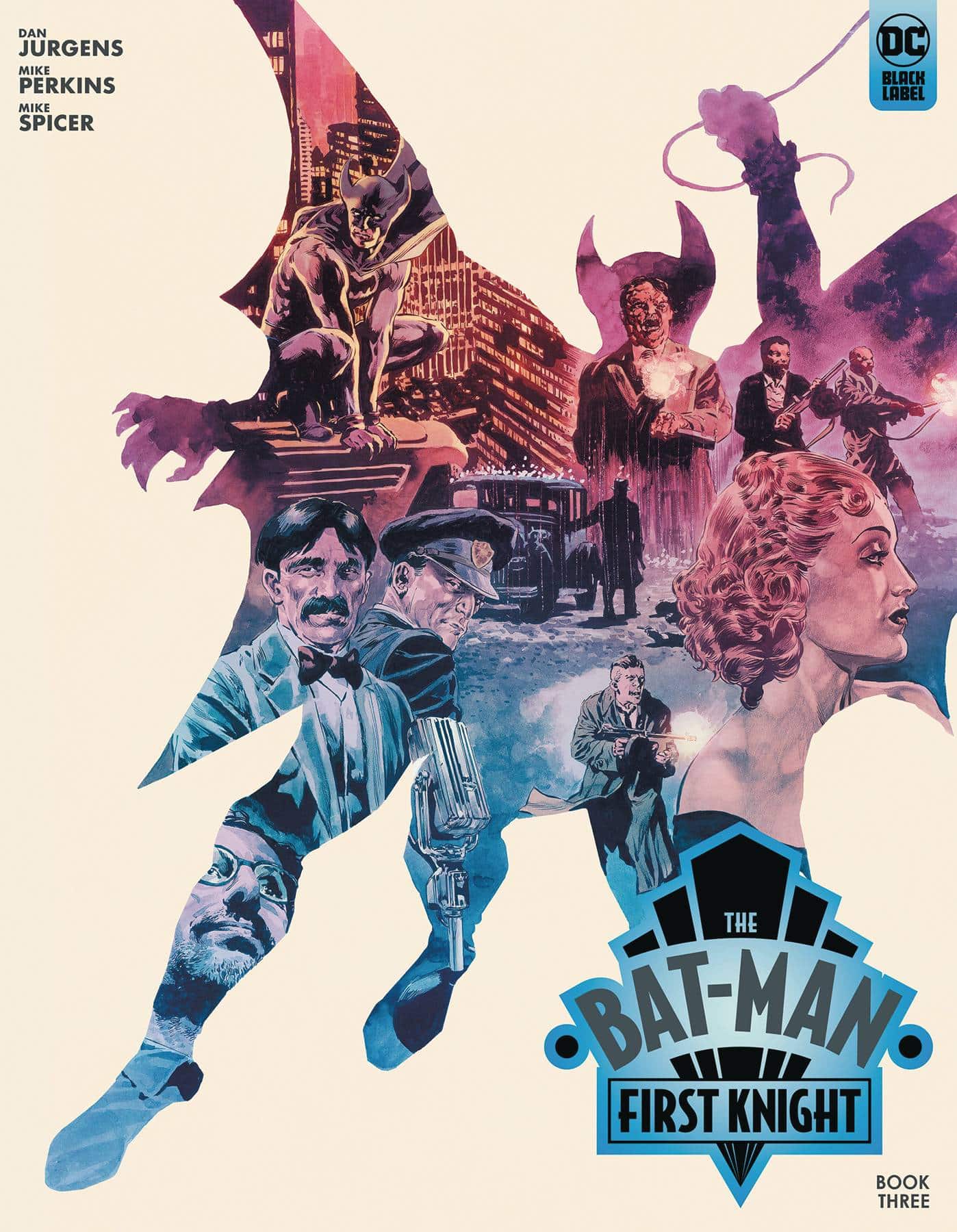
Writer: Dan Jurgens
Artist: Mike Perkins
Colorist: Mike Spicer
Letterer: Simon Bowland
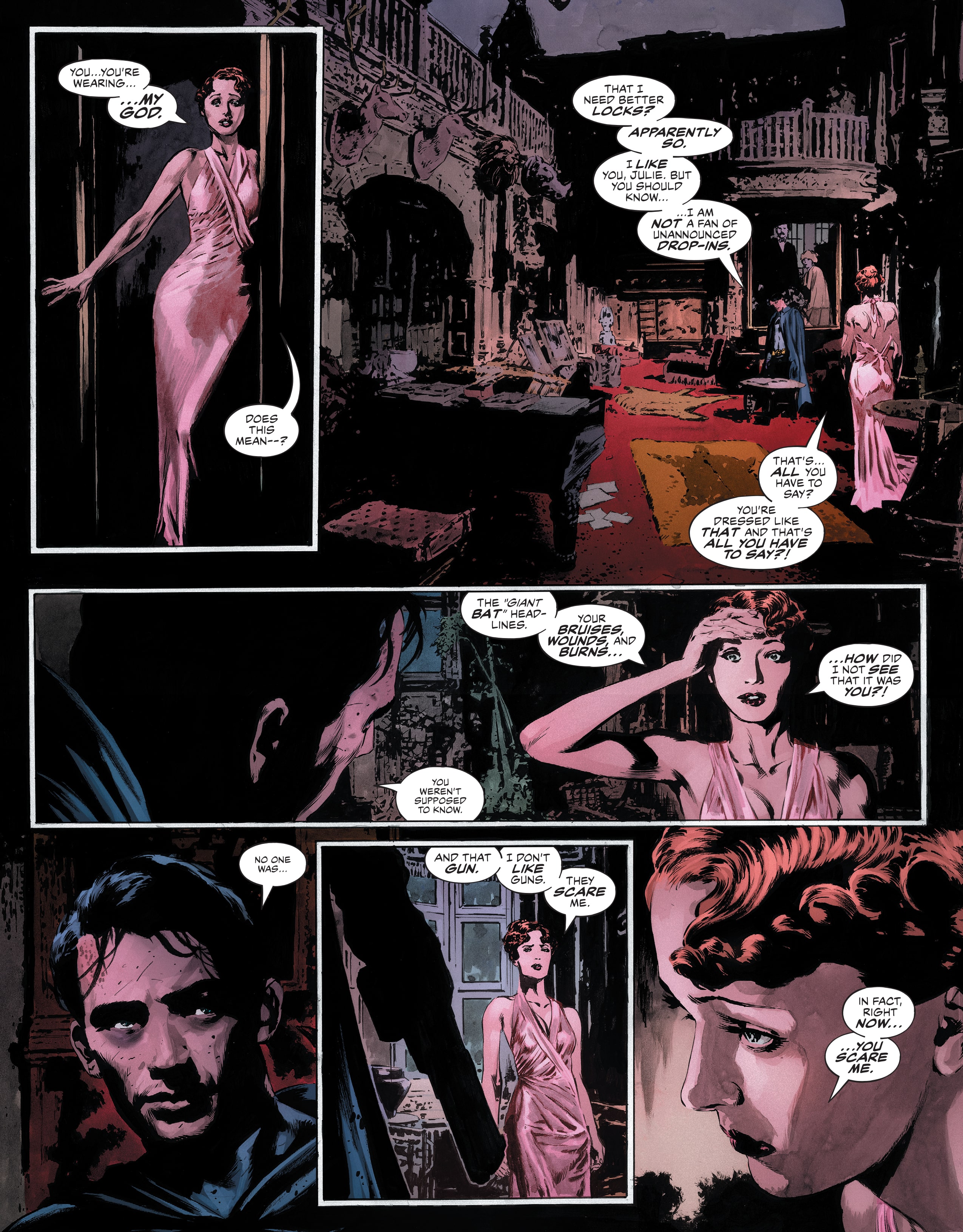
There’s a lot to like about The Bat-Man First Knight, which concludes its three-part story this week. If you’ve missed this title, the premise is that it’s essentially a new Batman: Year One (-ish), just set in the world of 1939, when the character first appeared. This proves a really interesting time period within which to tell a Batman story.
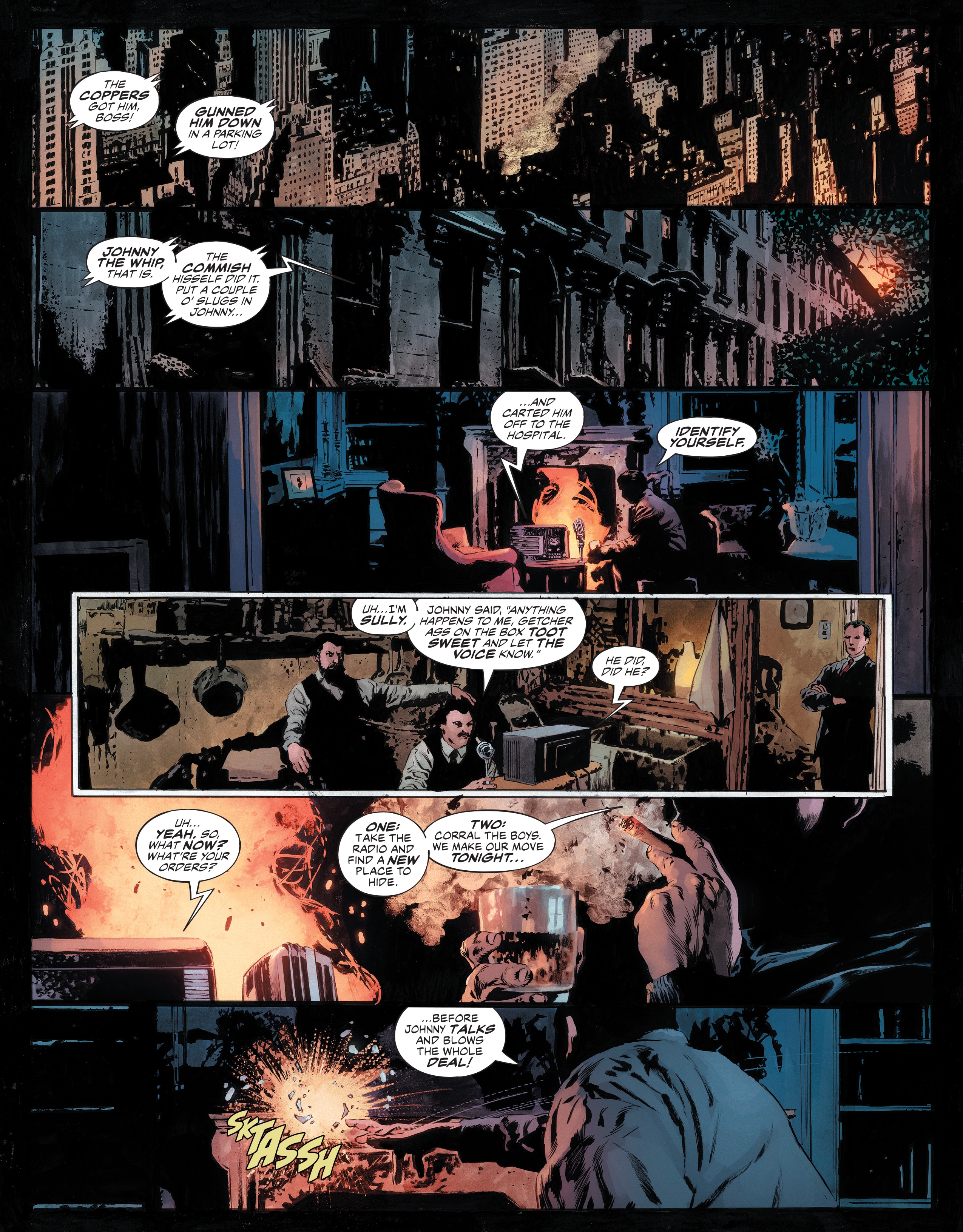
And one of the most interesting elements of this story, for my money, is Batman’s relationship to WWI. The script is really interested in this, in telling a Batman story that raises questions about the character emerging in the time between WWI and WII. It seems to want to know what that says about that particular moment of history and (maybe) how it prepared the character to endure well past it. I’d almost like to read the book again in one go, to parse the layers of Batman’s complicated relationship with the era in which he was created.
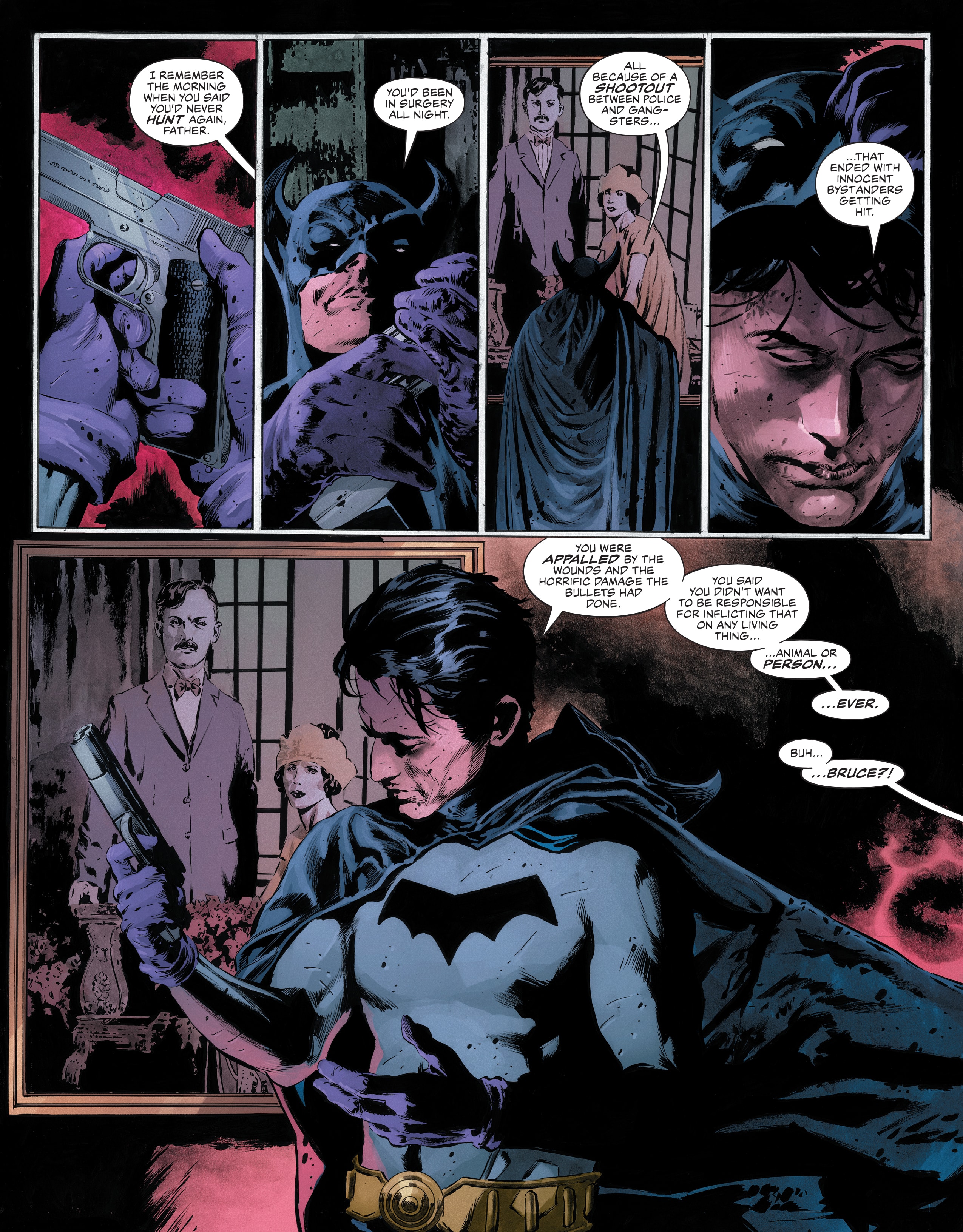
Of course, as a period piece the artwork really has a lot of work to do to establish the times in a convincing way. And man, I don’t think Mike Perkins (colored here to old-timey noir perfection by Mike Spicer) could have done a better job. I’ve written about how much I like the art in this book before, but it really is tremendous. It’s like Perkins put in series time pouring over reference photos until he had command enough of 1939 to generate a city of his own, in this case Gotham. Everything from the clothes to the (many) detailed backgrounds is immersive and well done. It’s really a stunning feat of how to use a setting visual to set tone and time period.
And while the script does obliquely raise those questions about what it means for Batman to have been created in 1939, it does not do so at the cost of any entertainment. At its core, this story feels a bit like a lost midnight movie, complete with monsters and dames and mad scientists…and even the fate of the world at stake. It’s a punchy read, right through its satisfying finish.
The bar to enter the pantheon of Batman classis is a really high one, but I don’t think this book needs to necessarily clear it to be a lasting and worthwhile read. There’s another way to tell a good Batman story, and that has to do with finding an interesting angle no one has done yet. That’s what you get in The Bat-Man First Knight, a good Batman story that plays more with the origin of the character off-page than the well-tread one on-page. I enjoyed it, and it definitely gets my recommendation.
Verdict: BUY
Round-Up
 Batman/Superman – World’s Finest #27 is another blast of an issue. If you’re going to make your comic a ton of fun, this series is basically a blueprint on how to do it. Great character writing, fantastic art, and a reckless abandon for how to use long-standing elements of the DC Universe (without disrespecting continuity). It’s great. This issue was written by Mark Waid, with art by Dan Mora & Travis Mercer, colors by Tamra Bonvillain, and letters by Steve Wands.
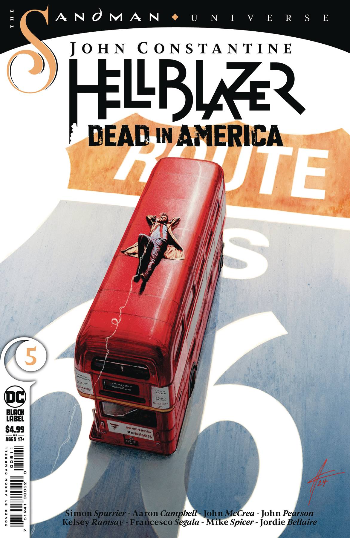
 - I liked John Constantine – Hellblazer: Dead in America #5 so much that I almost made it the main review…again. But I’ve written about this book before (a few times) and hadn’t gone all in discussing First Knight yet. Anyway, this is another just absolutely perfect single issue, exploring yet another part of America as our intrepid heroes continue on a journey that ties all the way back to the original Sandman. This issue sees John Constantine and co. tumbling around the southwest, dealing with some myths, some real world problems, and a poignant narrative that brings it all together. It’s sort of split into vignettes, illustrated by different artists, which adds to the proceedings because all of the artists are so good. Anyway, I am once again insisting that you read this book. This issue was split into four segments, with art on the first segment is by Aaron Campbell and colorist Jordie Bellaire; art on the second segment is by Kelsey Ramsay with colors by Francesco Segala; art on the third segment is by John Pearson; and art on the fourth segment is by John McCrea with colors by Mike Spicer. All of the segments were scripted by Simon Spurrier, except for the third segment, which was scripted by Aaron Campbell. And all the segments were lettered by Aditya Bidikar, except for the second segment, which was lettered by Steve Wands. Phew!
- Finally, there was one book this week that I think set out to do a specific thing…and then went out and did the damn thing. That book is Justice League Vs. Godzilla Vs. Kong #7, within which we get the giant DCU-shaking superhero-on-kaiju fights the title promised…and bonkers (bananas?) moments, like — SPOILER — Kong getting a Green Lantern ring. Fun stuff. This issue was written by Brian Buccellato, illustrated by Christian Duce, colored by Luis Guerrero, and lettered by Richard Starkings and Tyler Smith.
Miss any of our earlier reviews? Check out our full archive!
 with SUMMER OF SUPERMAN SPECIAL #1")


