Sort of.
The comics industry seems a bit becalmed of late but Marvel is working on a freshening rebrand that has been promised in various public statements.
Hard launch 👀 Welcome to @MarvelComicsHQ, where you can find all things related to your favorite Marvel stories.
We’re talking:
• Weekly Comic Updates – Wednesday Warriors, we’re reading and reacting along with you every week.• Reading Recs – The vast Marvel Universe can be… pic.twitter.com/qhVyoq0fX0
— Marvel Comics (@MarvelComicsHQ) June 16, 2024
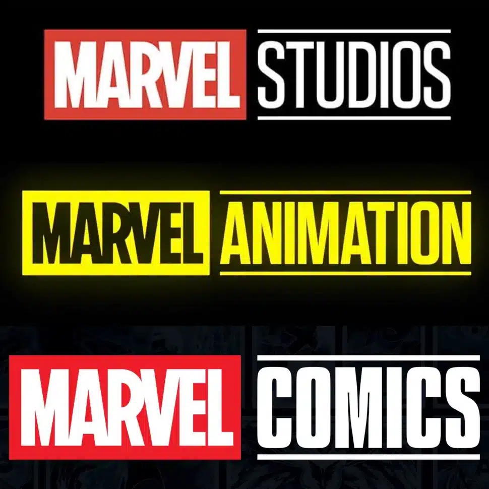
Earlier this week, a newish X/Twitter account for Marvel debuted a new logo for Marvel COMICS – in line with other corporate logos for the resurrected Marvel Television and Marvel Animation….which in turn took off from the Marvel Studios logo. All share a common format: the word Marvel followed by another word in reverse type. All of this is summed up nicely in a piece by Graeme McMillan which points out that while the format is the same, they all use different fonts.
Accompanying this new push is the unveiling of a new Marvel Comics brand logo, which is… not the best. (Rian Hughes, leading graphic designer who has worked on projects for Marvel in the past has already publicly announced it’s not his work.) The logo is intended to match the Marvel Studios and Marvel Television logos (as well as the Marvel Animation logo launched with Disney+’s X-Men ’97 series), but manages to miss the boat by not only failing to match the typestyle of the other logos — which is, to be fair, not standardized across the brand at all, frustratingly: “Studios” is in Tungsten Semibold, while “Television” and “Animation” are in Tungsten Bold;“Comics” looks to be in Tungsten Narrow Black, which is the same font family, but visibly different in terms of shape and spacing — but by accidentally making the COMICS read heavier and bolder than the MARVEL, accidentally de-emphasizing the actual brand.
Marvel also has been repurposing its social media accounts, and – brace yourselves – launching their first Instagram account. Good lord, what’s next, TikTok?
Yes, there is a long running Marvel instagram account, but it’s for Marvel ENTERTAINMENT. It does include comics materials, but also movie and animation related “fun stuff.”
As of this writing, the Marvel Comics account has a petite 13,000 followers…so jump on to be one of the OG fans!
As for the Marvel Comics logo, it will not appear on comics, and is just for company branding. But top notch designer Rian Hughes – who designed the MARVEL part of the logo – already disavowing it is a bad sign and design blogs got in on the tut-tutting: “it seems Marvel didn’t get the memo that minimal logos aren’t doing brands any favours right now.” Gizmodo came right out and declared that it “sucks.”
Look at the care with with Hughes redesigned the Marvel logo. Sometimes the little things matter.
![]()
But let’s also look on the positive side: Marvel is launching some efforts to connect more with fans on various social media, and their logo design synergy indicates they are an equal to other Marvel divisions. Could be worse. Could be worse.


To me the good news is it means Marvel intends to keep making comics. Because there’s no guarantee of that.
Sometimes I actually almost wish Marvel would stop making new comics, and DC as well…. Yes I know, wouldn’t be ‘nice’ for actual comic book shops who have a tough time anyhow, but browsing the Catalogue of either Marvel or DC lately must not have been fun for retailers either. Just sticking to reprints and having those reliably available might be an altogether more viable business model.
Rian Hughes’ changes to the Marvel logo were excellent, other than the registered trademark symbol. I’m not clear why he needed to make the circle into an oval, but I guess it’s less obnoxious than it was because it’s smaller.
Comments are closed.