This week’s main review is Teenage Mutant Ninja Turtles #1, a great jumping on point for an ongoing run. Plus, the Wednesday Comics Team has its usual rundown of the new #1s, finales and other notable issues from non-Big 2 publishers, all of which you can find below … enjoy!
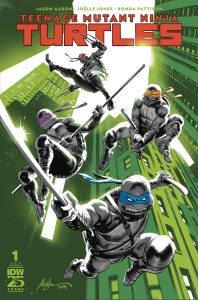
 Teenage Mutant Ninja Turtles #1
Writer: Jason Aaron
Artist: Joëlle Jones
Colorist: Ronda Pattison
Letterer: Shawn Lee
Publisher: IDW Publishing
Review by Jared Bird
I’m almost certain I’ve been a TMNT fan since I’ve been conscious of my own existence. It’s been something intrinsically tied to my taste in entertainment for the longest time, my childhood defined by the various animated series, as I’m sure many can relate to. However, embarrassingly enough, I only checked out the acclaimed 2011 IDW run of Teenage Mutant Ninja Turtles last year. I blazed through over one-hundred issues in a short span. It’s a dense saga with lots of set-up and even more pay-off, with dozens of named characters all with subplots of their own and roles in the story. It’s fantastic around the board, too, but it debatably succumbed to the weight of its own continuity at times. Following up on over 100 issues by Kevin Eastman and Tom Waltz, and 50 issues by Sophie Cambell, a new relaunch begins under the creative leadership of Jason Aaron, known for his extensive work with Marvel Comics.
You certainly don’t need to have read the whole IDW saga up to this point to appreciate this first issue. While it of course adds to it, Issue #1 stands alone, and kicks off the beginning of a new year-long story arc which will begin with the titular turtles-in-a-half-shell separated and down on their luck. The first issue focuses on hot-headed Raphael, trapped in prison for unclear reasons and dealing with the shenanigans of The Foot Clan ninjas. Aaron’s narrative voice for Raphael wears its neo-noir inspirations on the sleeve, and reminded me a lot of the internal narration of Dashiell Bad Horse from Aaron’s previous series Scalped. Gritty, angry, but never excessively so. Raph’s always been a stand-out in IDW’s canon, and that trend continues here. Aaron also builds the mystery well, utilising a timeskip after Campbell’s run to aid in the establishing of a new status quo for the TMNT. I’m not usually a fan of timeskips, but it works relatively well here and I’m interested to see how Aaron and company flesh it out.
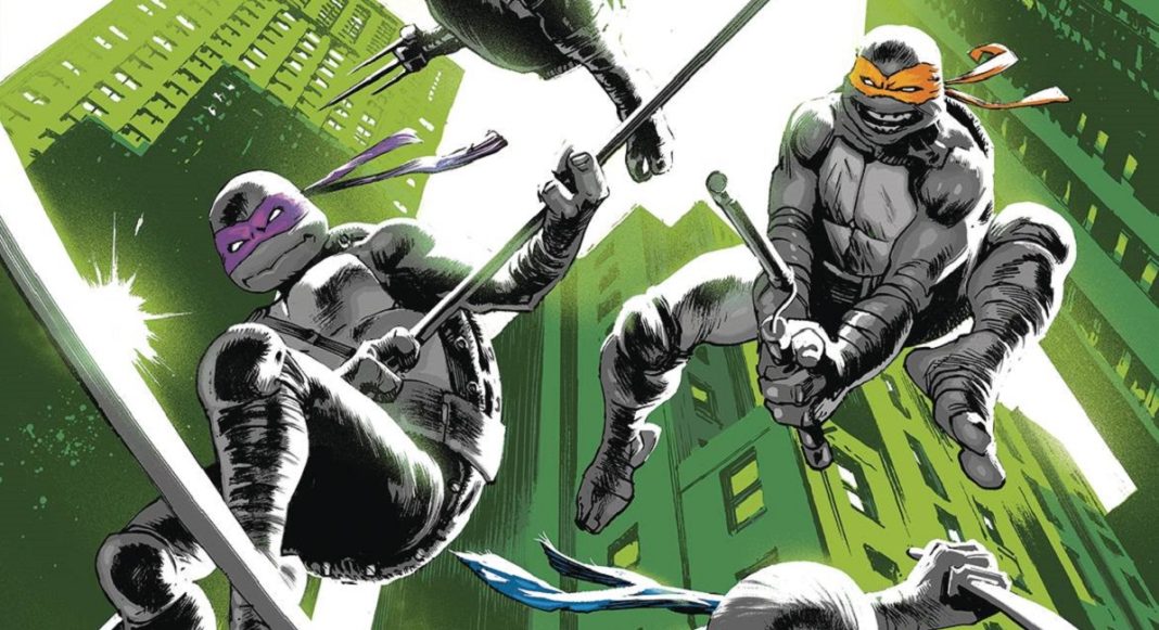
The art by Joëlle Jones, with colours by Ronda Pattison, was my favourite aspect of this issue. It’s the right mix of heavily detailed, action-oriented linework and an exaggerated, comic-book style which fits Raphael’s prison journey perfectly. Aaron is working with a number of insanely talented artists on this relaunch, and I would be happy if Jones continued to regularly do pencils for the series. The action scenes towards the climax of the issue flow are incredibly readable, with a good sense of flow and direction.The colours by Ronda Pattison are more muted than one might expect a story about mutated ninja turtles to be, but it matches the noir tone they are going for with this issue, so Pattison understood the assignment well. Complete with Shawn Lee’s lettering, the neo-noir atmosphere is fully established and effective.
One thing consistently clear across this issue is that the team involved love these characters and this world. Fans of TMNT, in particular the IDW continuity, are going to be pleased as it’s clear everyone involved is prioritising telling a good story with these characters. Whilst it’s a bit early to say, I do think that we will be headed in a good direction for these characters, and I’m excited for the story that would take place. There were fan concerns about the hiring of well-known comic professionals as opposed to independent talent, but it’s clear that everyone involved cares about the property and telling as good of a story as they can. Even if you are new to this specific iteration of Teenage Mutant Ninja Turtles, or these characters in general, I think it’s fun and exciting enough to be worth checking out, and you don’t necessarily need to do a ton of advanced reading to understand it. I think it’s going to be a hit with readers, so why not get in on the ground floor as the journey kicks off?
 Epitaphs of the Abyss
Writers: J. Holtham, Chris Condon, Stephannie Phillips, and Brian Azzarello
Art: Jorge Fornés, Peter Krause, Phil Hester, Travis Hymel, and Vlad Legostaev
Colors: Dan Jackson, Michelle Madsen, Marissa Louise, and Brittany Peer
Letters: Richard Starkings and Comicraft’s Tyler Smith
Publisher: Oni Press
Review by Clyde Hall
I came along a bit too late for the classic EC Comics horror anthologies, but I’ve tried making up for lost time. Mostly that’s taken the form of reprints, lesser comics anthologies on a similar theme, Warren magazines like Creepy and Eerie, and adaptations or variations in film and television shows. Throw in historical accounts from the 1954 Senate Subcommittee Hearings into Juvenile Delinquency with the testimony of EC publisher William Gaines, and I became a young comics fan who grasped the rise of those Comics Code Authority stamps. Also one appreciative of the magazine format horror titles that worked around the system.
The writing and art of those groundbreaking graphic horror stories held real creative power. Power which led publishers to hobble their medium as a business survival strategy. Potency of expression that refused to wither and die despite parental disapproval and attempted community standards restriction. Graphic stories which leapt from the pages and for half a century continued inspiring other forms of entertainment not hindered by such a Code. Storytelling power often imitated but seldom elevated.
This appreciation stoked great anticipation for Oni-Lion Forge’s announced resurrection of EC Comics with all-new titles and a notable retinue of creative talents. Full disclosure, I feared it might be more hype than result, with a final product of warmed leftovers instead of anything seriously, suspensefully exceptional.
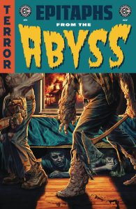
The first issue of Epitaphs from the Abyss puts the majority of those fears to rest. It’s not only top quality horror, but also cleverly evolved horror. Horror that acknowledges the legacy which spawned it while forging its own boneyard pathway. The title isn’t a lazy lift of easily recognized and iconic books or hosts from the original line. The creative forces forging the new EC laudably work hard making this addition worthy of taking a rightful place beside what’s come before.
Four tales comprise Epitaphs, the first being “Killer Spec” scripted by J. Holtham and with art by Jorge Fornés. Writing is torture for Dylan, a struggling scribe with towering ego and even loftier ambitions. It gets worse when he encounters an amateur Mozart of wordsmithing. This is a smoothly paced portrait of a small talent seeking industrial- sized fame by any means necessary. Fornés’ illustration carries a slick and vivid vision of nihilistic dissatisfaction festering in relatable workaday surroundings. We live in Dylan’s world, but hopefully not in his head.
Writer Chris Condon and artist Peter Krause take us through the maze of political flip-flopping in “Senator, Senator”. A reporter seeks answers on why a renowned politician has suddenly switched position on certain areas of her traditional platform. Is it a matter of changing perspectives or is the Senator simply bowing to party pressure? The tone of this story resonates darkly, from the newspaper press room to the steps of Capitol Hill. And given the current election season, it tolls a notably disturbing knell.
“Family Values” involves a combination reality program and game show, with every viewer having a chance to win huge cash prizes if they correctly guess the outcome of the contest. If it sounds as harmless as a round of Family Feud, it’s not…not as told by Stephannie Phillips, Phil Hester, and Travis Hymel. Think instead of The Biggest Loser, but having nothing to do with weight loss. This story is satisfyingly pure Phillips, securing our involvement in the drama immediately and leaving us with a deliciously twisted resolution. Hester and Hymel bring a sharp and edgy style that intensifies a game clock countdown literally hanging over the characters thanks to excellent lettering by Richard Starkings and Comicraft’s Tyler Smith.
Finally, “Us vs. Us” illustrates the monsters we can unleash when taking sides regarding matters of spirituality and science. Brian Azzarello gleefully dives into the ugliness, inner and outer, generated by fundamentally opposing viewpoints in the aftermath of a suggested global scourge. Here Vlad Legostaev on art turns in easily the most unsettling visuals of the issue, nightmares rife with tumorous manifestations and oozing effluvia.
In nearly any anthology such as this, one story is easily identified as the best, the one achieving the highest potential presenting its concept. Occasionally two of four may strike such a successful balance. In this premiere, and over multiple reads, I must admit that each story felt fully realized, and that is an exception as unusual as it is welcome.
Bonus points granted for all stories being set now rather than as a Gothic horror piece or in an undisclosed nostalgic era harkening to the time of the original EC tales. Whether dealing with entertainment, creative endeavor, the media, or political flashpoints, the takes and thus the takeaways were all contemporary. This in no small way amped up the degrees of horror.
Perhaps the biggest question remains: Is this true to the original EC Comics? It deviates in varying ways as described, and no doubt some aficionados will bemoan that it’s not a closer carbon copy of what’s been done before. Readers will cast the final verdict of course, but for me it’s hard imagining a higher quality modern continuation of EC’s horror brand. For those who’ve explored the superb foundational Crypts and Vaults and who want new catacombs plumbing 21st Century themes of the supernatural, let Epitaphs from the Abyss and the Grave-Digger be your guide.
 Greaser: Gemini Blues #1
Writer: Darick Robertson
Artist: Stephen B. Jones
Colorist: Marcus Collar
Letterer: Shawn Lee
Publisher: Magma Comix
Review by Christian Angeles
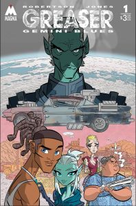
GREASER: GEMINI BLUES #1 combines the essence of a Cowboy Bebop with the apocalyptic setting of something like Fallout. All sci-fi with loads of western-like action.
It starts with Darick Robertson’s signature style: a throw down. Where a big tough guy leading a gang of outlaws, comes face-to-face with Buddy, a small framed good-hearted greaser mechanic. Buddy here is the series protagonist. He’s a daydreaming GREASER mechanic putting together the car of his dreams while working at a diner alongside his fierce and no bullshit taking grandmother.
A lot that happens in issue one, which introduces the series’ themes, cast of characters, and even, hosts a charming little love interest subplot. Interactions between characters are well-written and there’s enough here to give a distinct voice to flesh out the people in Greaser. As for world building, I like what Robertson’s done with the Earth as it’s been ravaged by environmental disasters due to humanity’s recklessness and the resulting climate change. This first issue is so packed with action, unique characters, but what I also really liked, was the surprising amount of exposition. Robertson is the last person I’d expect this from but I will say, he’s crafted a compelling universe.
It should also be noted Greaser: Gemini Blues #1 marks Darick’s debut as a writer after a 30+ year career. Though it’s his writing debut, I found this script equal parts engaging as it is thought-provoking, all for a surprisingly well-balanced story. For instance, one creative choice I think deserves attention is the creation of the Gemini, alien beings who’ve kept humanity alive with advanced technology. The Gemini are tired of our relentless desire for self-destruction. There’s a deep metaphor at play here in how The Gemini see themselves as superior which plays into both classism and race, but also, how deeply true their beliefs are about us. We are the cause of our own demise. We need help from greater beings.
As for the artwork, GREASER stands out with its gritty, outlaw on the road setting. Marcus Collar‘s soft yet striking colors add a perfect level of depth, while Stephen B. Jones‘ line work highlight every detail that makes the page visually engaging. One particular scene I think worked was a vomiting onomatopoeia, adding a dynamic element to the comic. If that wasn’t enough, the covers also shine, featuring a variant by Darick himself, along with an incentive variant Las Vegas cover by Dan Panosian.
The only bad thing I can say about Greaser is that there are moments where the writing feels dense. Lot more words for a creator I figured would be all-action. I’ll say though, that the strong characterization makes up for it, as Buddy is portrayed as a kind-hearted dreamer. A refreshing change from the typical action hero I associate with Robertson.
Overall, Greaser: Gemini Blues #1 is a fantastic kickoff to what promises to be an exciting series. It’s a unique blend of genres, strong characters, and thought-provoking themes, setting up intriguing possibilities for the future. This is a great science-fiction kickoff of a story.
 The Six Fingers #5
Writer: Dan Watters
Artist: Sumit Kumar
Colorist: Lee Loughridge
Letterer: Aditya Bidikar
Designer: Tom Muller
Publisher: Image Comics
Review by Sean Dillon
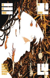
Overall, this is a fantastic work of neo-noir cyberpunk with an apocalyptic finish that is sure to leave the reader asking for more. But then, such is always the case when it comes to an incomplete picture. We hope in vain that someone will complete it. And yet, the mystery is what always brings us back, not the answers. Answers are just another kind of ending.
Wednesday Comics Reviews
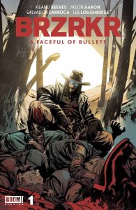
BRZRKR – A Faceful of Bullets #1 (BOOM! Studios): There’s a fun problem in entertainment now where if you put an assassin or a Keanu Reeves on a revenge action trip, it’s “John Wick if [insert genre convention here].” Again, fun problem to have. So with BRZRKR being another John Wick style vehicle where Keanu is an immortal revenger, the tales can get redundant if the proper care isn’t applied. A Faceful of Bullets takes B the Berserker west to aid a damselled bride reaching the Kansas border away from her violent father. While there’s a tale of redemption vs retribution here by issue end, Jason Aaron strips away almost all agency from the sole female character such that she spends the trip at the behest of a violent male character, and only allowed a choice because he gives it to her– quite a misogynistic frame to that narrative! I’m not much a fan of stern uber-violent guardians that grouch about, but ultimately provide salvation at the end. Basic human decency is actually really rewarding to read in a hardened action genre! Veteran Salvador Larroca’s greatest strength is riding that fine line between realism and comic art, so it’s great to see he had more time to add hatching to his mega violence! Besides utilizing widescreen panels and wide vistas, Larroca uses multiple double-page spreads with 4-5 inset panels to underline each scene as if in montage. Layout aside, the leftover negative space gets chewed up by colorist Lee Loughridge who keeps the palette at a bleak sunrise just over the horizon. We follow this pale rider through soft gradient backdrops that Loughridge hits with a granular paper texture that’s less appealing than effectively reinforces the narrative. Not a great season to paint a pallid western when Ain’t No Grave is sharing the shelf week-to-week! Same can be said of Ed Dukeshire’s letters that feel more comical superhero western than relating to western aesthetics. Dukeshire’s caption and dialogue splits keep the verbal pace of Aaron’s wordiness afloat even if it has to compromise the visual pacing due to sometimes stuffy inset panel stacks. Suffice to say, this ride was full of some untrue grit, but I guess I’m just not for machismo paraded around as “actually a female main character’s battle with anger.” —Beau Q.
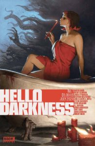
Hello Darkness #1 (BOOM! Studios): This is an excellent anthology that showcases the strength of this comics storytelling format. This issue presents a few creative teams telling different stories that are all pretty dark in their own way but that’s the connective tissue. They’re thought provoking and atmospheric. There are seven short stories here and we’re kicked off with a thoughtful bang (Contagious- Jude Ellison S. Doyle, Letizia Cadonici, Alessandro Santoro, Becca Carey) as something is making the children kill and then later we visit the first part of Something is Killing the Children short (James Tynion IV, Werther Dell’edera, Miquel Muerto and Andworld Design.) There’s a lot to enjoy with Robert Hack’s I Can’t Take You Anywhere, a gruesome bowling story about reckless moments (Stay In Your Lane- Dave Cook, David Cousens, Angel De Santiago, Nathan Kempf.) We then get a haunting remix of a familiar premise in The Siren excellently done in three pages by Sarah Andersen. Steve Orlando, A.L. Kaplan, Marissa Louise and Jodie Troutman make a beautiful drawn and darkly poetic story about doing a good thing for superficial reasons and to close out this first issue, I was pleasantly surprised by Garth Ennis and the writing for The War, Part One, and I was in love with Becky Cloonan’s art, Tamra Bonvillain’s colors and letters by Pat Brosseau. On every level, this is why anthologies work; these stories range in their subjects and provide the room for the creative teams to play and experiment while being connected through this idea of darkness and elevated by excellent and haunting art. Bryce Carlson developed and curated this anthology project and certainly deserves his flowers. I hope this continues for a long time. There is always room for more anthologies! —Khalid Johnson
Read more entries in the weekly Wednesday Comics reviews series!
