This week’s main review is Babs #1, an absolutely hilarious new take on barbarian comics. Plus, the Wednesday Comics Team has its usual rundown of the new #1s, finales and other notable issues from non-Big 2 publishers, all of which you can find below … enjoy!
 Babs #1
Writer: Garth Ennis
Artist: Jacen Burrows
Colorist: Andy Troy
Letterer: Rob Steen
Publisher: Ahoy Comics
Review by Ricardo Serrano Denis
Not enough is said about how hard it is to make a genuinely funny comic book. You have to plan out timing and rhythm while simultaneously making sure the punchline is worth the setup. Very few creators manage to accomplish this in the medium. Mark Russell is one of them, a master of satire and joke writing (see The Flintstones). Darrick Robertson is another great example, especially when it comes to capturing the ridiculousness of a situation through facial expressions and exaggeration (see The Boys). Then you have Kate Beaton with her excellent Hark, a vagrant comic strip series, where history, sexism, and human contradiction get caricatured in a way that makes you think about all that’s wrong with the world to then point and laugh at it.
Garth Ennis, though, might be the best to ever do it, and his and Jacen Burrows’ new comic Babs is the perfect example of why he’s so good at it.
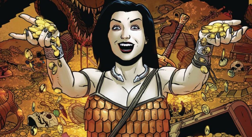
Babs is a fantasy/comedy tale that follows the titular female warrior as she hunts for treasure in a world filled with out-of-shape dragons and sexist orcs, all of which are loose at the tongue when it comes to raining down misogynistic insults on her. The first issue is essentially a primer on Babs as a character. She’s presented as a force that is capable of turning men of God onto “the study of the porno-gospels” and of calling insecure enemies “Hobbit-cocks.”
If you’ve kept up with Ennis, you know his idea of funny incorporates crudeness and vulgarity. What makes it standout is that it’s always in service of something greater that justifies the take. In this regard, Ennis is in top form here. With Babs, there’s certainly a desire to hold a mirror to our current social predicament and mock it, to really laugh at the absurdity of the stupid stuff we still do as a people. In this case (at least as far as the first issue is concerned), the commentary is aimed at toxic men and outdated macho attitudes (something that Ennis and Burrows also explored in the horror book The Ribbon Queen, a decidedly not funny story about accountability).
It’s clear Jacen Burrows understands the kind of humor the book is going for just by looking at the sheer amount of comedic detail afforded each character and creature per panel. Great care is taken to give orcs, humans, and even horses a sense of expression that sells the jokes and the gags without going into full cartoon territory. It’s especially noticeable in the way he illustrates eyes. A painful hit elicits very funny wide-eye reactions that amplify the sensation to great effect. Ennis’ punchlines hit harder because of it. Burrows just knows how much funny he needs to give for a particular line or sequence to work.
While the comedy pokes fun at male views of women and in the “incel” culture that drives it (to a degree), Babs still manages to feel like a legitimate fantasy tale. Whereas other creators that try their hand at comedy in comics fall too freely on quippy, ‘Twitter talk’ exchanges, Ennis and Burrows find that characterization is key in making their characters be naturally funny. Babs feels like she belongs in the fantasy world she inhabits. She doesn’t come across as a modern character given a sword and chainmail armor. The same goes for every other element, including a talking sword she possesses that is vocal about her decisions as they travel the lands. Writers take note, comedy has a greater chance of hitting the mark if it communicates well with the world you’ve decided to put your characters in.
Babs is one of the funniest comics to have come out in recent years. Ennis and Burrows are very attuned to the problems they want to address, and very eager to make sure readers laugh their way through them. Embrace the absurd, determine whether the comic is laughing with you or at you, and then adjust accordingly. If it’s laughing at you, then maybe take a good hard look at yourself and make sure you don’t become the source material for any future comics about all that’s wrong with the world.
 Defenders of the Earth #1
Writers: Dan Didio
Art: Jim Calafiore
Colors: JUANCHO!
Letters: Carlos M. Mangual
Publisher: Mad Cave Studios
Review by Clyde Hall
One thing King Features Syndicate has never shied away from is establishing a shared universe for their properties. This includes crossovers between comic strips, in comic books, and even for animated features. If you’ve any doubts, give the 1972 ABC Superstar Movie Popeye Meets the Man Who Hated Laughter a watch on YouTube.
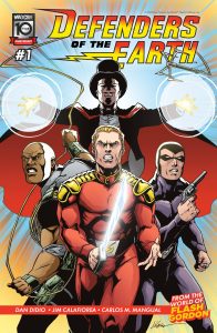
That’s why the 1980s Defenders of the Earth cartoon only seemed unusual if you considered the four major components of the team were cut from a very long-ago era of heroes given its 21st Century setting. Those worthies included Mandrake the Magician, Lothar, Flash Gordon, and the Phantom. It helped that their concepts underwent needed modern revision and that their offspring and wards functioned as part of the team alongside the senior partners.
With this year’s Mad Cave titles chronicling new adventures of these classic characters, a Defenders of the Earth miniseries feels right and nostalgic for wee ones who tuned into that 1986 animated series. It may have lasted only one season, but it was a season of 65 episodes. More than enough for establishing a next generation following.
You certainly get that feeling from the first issue. It’s the same DoE team, updated for adventures in 2024 following the last battle with Ming the Merciless for the fate of Earth in 2020. Elements of that deciding conflict and its aftermath will resonate with the children who watched the cartoon, as will more mature themes attuned for the adults they’ve become.
Writer Dan Didio unpacks the right amount of details uniquely part of the animated series. This includes Ming’s son, Kro-Tan, and a nod to Jedda Walker as inheritor of the Ghost Who Walks mantle. He’s mixed in parts of Flash Gordon’s background fitting for Alex Raymond comic strip exploits but handled lightly for a kid’s show. Didio also grants the Phantom a more Lee Falk flavor than the cartoon allowed, his calling on the ‘strength of ten tigers’ traded for a pair of handguns.
Jim Calafiore’s art presents the Pulp elements well, and the uniformity of style binds the main protagonists together. They appear to share a common reality while Calafiore still makes Mandrake, Phantom, and Gordon recognizable from the wellspring of their original forms. More, the updated Lothar of the animated series comes off equally iconic.
There are a few stumbles. While this is understandably an exposition-heavy issue, Didio has chops. So it’s distracting when Mandrake thuds the “Need I remind you…” club hard and often while the reader is informed using two characters sharing old news they are both well aware of. The Phantom sporting his traditional double holster rig and firearms is more authentic and appropriate given the book’s Teen rating. But Calafiore making them revolvers instead of the sleek twin .45’s the 20th Century Phantom is usually depicted with seems a curious choice.
None of these are deal breakers. In fact, all will be forgiven if Didio folds in a Prince Valiant cameo the way the animated series did. The mystery factors behind Earth’s rapid recovery from Ming’s last invasion is a solid foundation for raising the team’s concerns. Add in personal matters pending attention for all our protagonists, and this launch makes putting the second issue of Defenders of the Earth on your pull list an easy decision.
 S.I.R. #1
Writer/Artist: Fell Hound
Colorist: Eleonora Bruni, with assists by Freddie Tanto
Letterer: Becca Carey
Publisher: BOOM! Studios
Review by Bryan Reheil
 Jonny Quest #1
Writer: Joe Casey
Artist: Sebastián Piriz
Colorist: Lorenzo Scaramella
Letterer: Tyler Esposito
Publisher: Dynamite
Review by Jordan Jennings
Synopsis: Following the events of Jonny Quest FCBD, we find the Quest family stranded 30 years into the future. Lost in time and besieged by drones, will Jonny and his family make it back home?
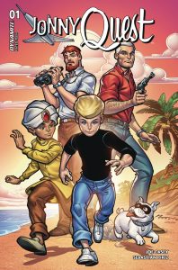
Jonny Quest #1 captures the spirit of the classic Hana Barbera cartoon with a thrilling sense of action and sci-fi tropes. The series seemingly opts for using the classic renditions of the cast from the 1960’s instead of attempting to update and modernize them for the new era like previous re-launch attempts. This is a bold choice, but I find it to be a welcome one given the rise of shows like Venture Bros that offer a satirical update to the classic Quest formula. In a lot of ways, Jonny Quest suffers from similar challenges as Space Ghost, but the folks at Dynamite have proven far more than capable of providing relaunches of classic media that is played straight and not with a hint of irony.
Joe Casey manages to capture the voice and tone of the Jonny Quest cast early on in this run with character motivations and personalities established and explained swiftly and efficiently. This should come as no shock given Casey’s history of writing large ensemble casts and family dynamics with Ben 10, X-men, Superman, and more filling his resume. The overall plot is well constructed with a sense of mystery driving the story forward and an ending that makes you want to see what is next.
Sebastián Piriz art is quiet a beauty. It keeps with the overall stylistic direction of the original show with the minimalistic and clean line work. The action is dynamic as Piriz explores a variety of panel layouts and page compositions. The drone attack scene was one of the more exciting sequences I’ve read in comics this year in large part of how the layouts were structured. The layouts also serve the quieter moments by shifting in size and scale. There is a tight pacing to this comic I really enjoyed.
Lorenzo Scaramella’s coloring is where the biggest departure from the show’s original art style can be found as they provide shading and shadows to what was largely a flat colored tv series. This is a great thing though as it allows for that clean line work to exist all while establishing mood and shape to the scenes. There are several scenes in the jungle around the Quest compound that is beautifully colored that further cement that pulpy-popular science feel that the show was known for.
Overall, Jonny Quest #1 is another hit for Dynamite’s growing list of licensed comics. There is an excellent sense of action and pacing that is complimented by the mystery of the plot. The art is stunning and is in the spirit of the show all the while updating it with modern techniques. Excellent start to the new series and well worth checking out for fans of Jonny Quest or action-adventure comics in general.
Wednesday Comics Reviews
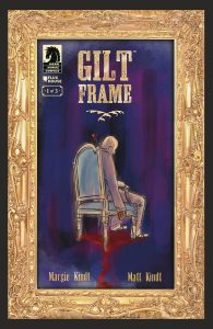
Gilt Frame #1 (Dark Horse Comics): This first issue is a solid introduction to the duo of Aunt Merry and Sam and the crime that they have to solve. Setting up so much, the joy is in the moment to moment storytelling and how well we get to know the characters in just a single issue.They jump through time in a way that flows seamlessly giving you character background into our duo of crime solvers. It’s a demonstration of just how well artist Matt Kindt knows the comics medium, while working alongside Margie Kraft Kindt to tell this story. There’s some nice back and forth dialogue, lettered by Sophia Hilmes that feels right at home with Kindt’s art. The watercolor work really brings something to the story and I can’t rave enough about the two page spreads in this issue. Each one does something very interesting either in flow or style that makes me want to spend more time with them and the book in general, which I think is worth your time if you are looking for a character driven mystery. —Khalid Johnson
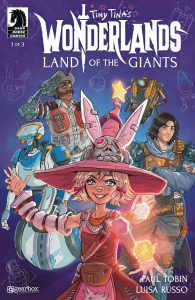
Tiny Tina’s Wonderlands: Land of the Giants #1 (Dark Horse Comics): With Borderlands making the silver screen transition, how delightful is it that the Borderlands’ venture back to comics is not with Vault Hunters, but instead at the tabletop of Tiny Tina. Based on the 2022 videogame, Tiny Tina’s Wonderlands, wherein the player character joins Tiny Tina’s “Bunkers & Badasses” campaign to wage adventure on schlocky ttrpg fantasy tropes, Land of the Giants picks up a different adventure with nigh the same cast [ie. You, the player character were not invited this time]. What follows may be scribed by Paul Tobin, but amounts to verbal nonsense as every panel is overstuffed with lol random prop jokes that aren’t contextually funny or exist out of order for the cast– this madcap world is completely normal in canon. While we unnecessarily start in media res to jumble the sequential order for no narrative reason, illustrator Luisa Russo and inker Michele Pellegrini’s ability to translate the iconic Borderlands cel-shaded look into inks is near seamless. Russo and Pellegrini’s lineweights and detailing are thick enough to indicate it’s Borderlands without darkening the overall playful vibe of TTW:LOG, though being drawn so carefully means Tina et al come off less visually dynamic as stiffness overtakes the force of movement in their inks. As well, TTW:LOG’s backgrounds come across lifeless as Russo and Pellegrini seem to have used a ‘build the BG, then dirty up the place’ approach, but did not go far enough to add energy to the environments. This matters less when Heather Breckel lightly adds chalk, splatter, and stain textures between the foreground and background planes to build a lovely atmosphere which otherwise wouldn’t be there. Colorists mostly complement a warm palette with a colder shadow, but it seems Breckel is slightly raising the temperature with a warmer blue to communicate that Tiny Tina’s games are inviting if nothing else. By now, there’s little room leftover for letterers Deron Bennett & Andworld Design, so they must make due with what they have, especially at the behest of overly florid dialogue that doesn’t necessarily justify balloon splitting. I will concede that the decision to mixed-use-case all the prop comedy text brings an encyclopedic vocal quality to the gag that helps push it over the top. If you’re fond of Tiny Tina’s or Borderlands’ particular brand of irreverent humor and madcap worldbuilding, look no further than Tiny Tina’s Wonderlands. Now, if you’ll excuse me, I best be getting out of here before Tiny Tina murders m–! —Beau Q.
The Prog Report
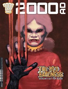
2000AD Prog 2395 (Rebellion Publishing): I was struck this week by just how thoroughly the story Silver has evolved since it debuted. Silver is now on its sixth part, written by Mike Carroll, illustrated by Joe Currie, and lettered by Simon Bowland. In part one, this story felt like a pretty simple horror comic, following a group bent on unearthing a buried vampire from a grave. I thought I loosely knew where it was going to go, but then at the end of the first chapter, some aliens showed up and we learned the entire world was oppressed and controlled by them. What a hook. Fast forward all these weeks, and we’re now deep inside a war between human resistance and said aliens (who also have wicked robot-mech battlefield technology). That resistance, however, is being led by the vampire from chapter one. In other words, this story has exploded into an epic and confident genre mash-up, and I, dear readers, had no idea this is where it was headed. But I love it. As always, you can nab a digital copy of this week’s Prog here. —Zack Quaintance
Read more entries in the weekly Wednesday Comics reviews series!
