

This week’s main review is Department of Truth #23. Plus, the Wednesday Comics Team has its usual rundown of the new #1s, finales and other notable issues from non-Big 2 publishers, all of which you can find below … enjoy!
 Department of Truth #23
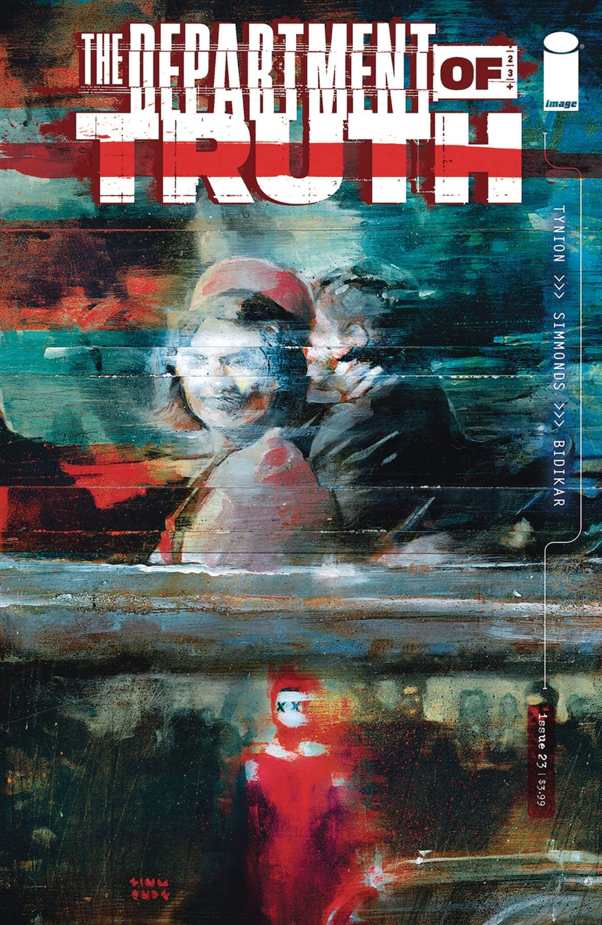
Writer: James Tynion IV
Artist: Martin Simmonds
Letterer: Aditya Bidikar
Publisher: Image Comics
Review by Sean Dillon
Blue Book 1947 #5
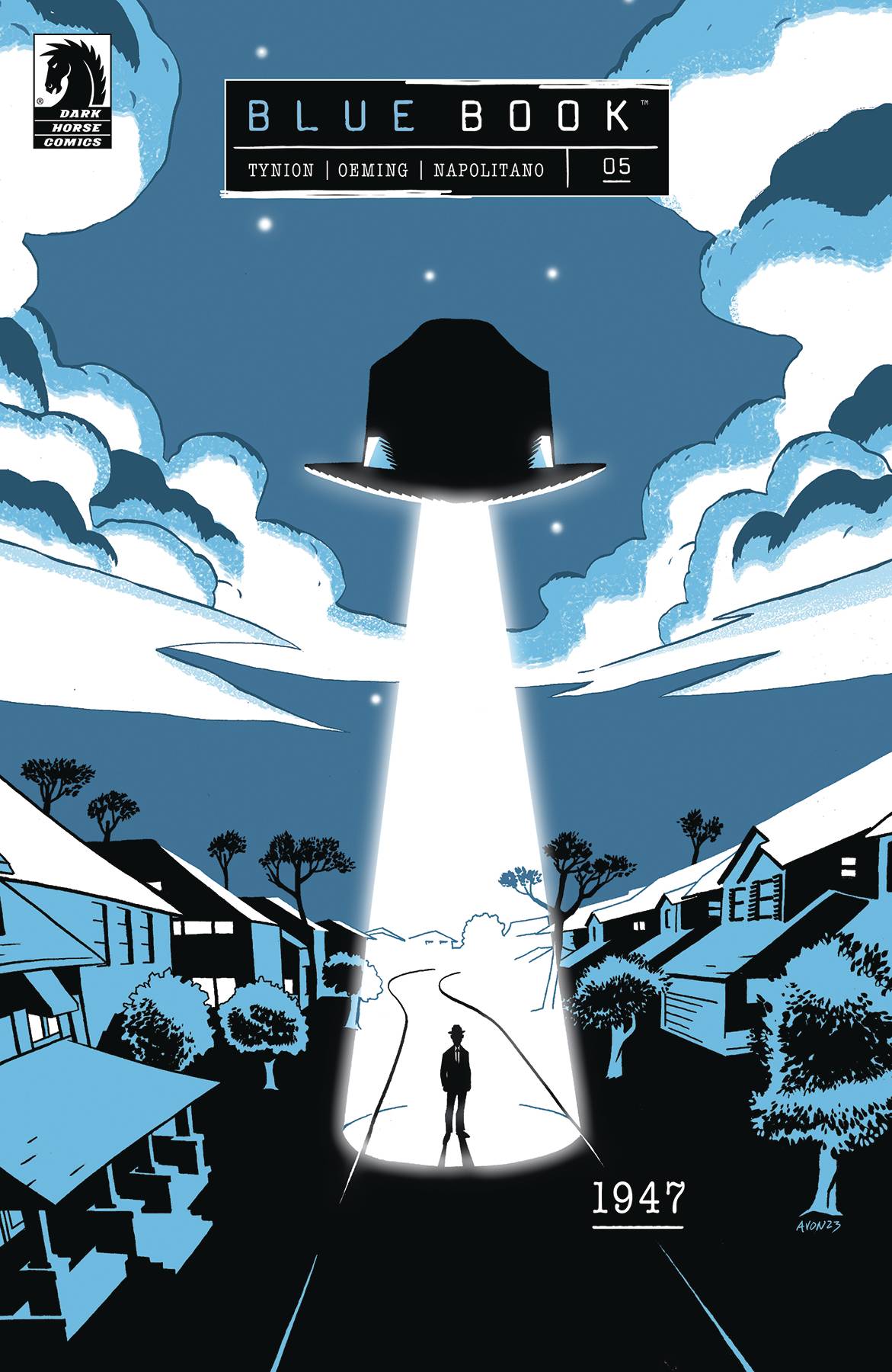
Writer: James Tynion IV
Art and Colors: Michael Avon Oeming
Letters: Tom Napolitano
Publisher: Dark Horse Comics
Review by Clyde Hall
In the 1990s, I attended a few MUFON (Mutual UFO Network) seminars. It was the capstone to teen years reading books like The Case for the UFO by M.K. Jessup and many issues of Fate magazine. And it was a final attempt looking for substantive answers regarding crop circles, flying saucers, and Men in Black. My work as a reporter turned me skeptical, while my partner retained a more open mind. But we shared common experiences of encounters with unaccounted lights in the night skies over our hometowns, so our interest was genuine.
The MUFON sessions left an impression. Members were well-meaning, welcoming, but open to unsubstantiated and unproven claims. There was also considerable profit opportunity in self-published materials. Both these elements, the vendors catering to a lucrative market and buyers eager for material supporting theories they hoped were true, mostly closed the door on the matter for me. At the time Fox Mulder just wanted to believe, I just wanted supporting evidence.
Reading the Blue Book: 1947 series helped rekindle my interest in the subject, though, as has recent UAP footage and Pentagon reports. The appeal of this series rests with James Tynion IV and the balance he’s managed in presenting an illustrated accounting of the UFO phenomenon, it’s impact on U.S. culture, and the internal struggle within investigating government agencies. The first issue begins with by pilot Kenneth Arnold’s sighting of unusual airborne objects flying near Mount Rainier in 1947. Subsequent issues explore pivotal moments expanding the scope of ‘flying saucer’ investigation. Elements which would become part of the lore surrounding UFOs, citizen concerns as the Cold War froze over, and the impact of extraterrestrial visitors on pop culture are presented in ways emphasizing how each overlapped and influenced one another.
By the finale in issue 5, Tynion has charted the progressions each of these areas took. He finishes with an assessment of how the United States government’s attitude regarding UFO reports evolved from Arnold’s first investigations, through the decades of subsequent Projects: Saucer, Sign, Grudge, and finally, Blue Book. Each had its own approach to investigation, its own objectives reflecting military competition with the U.S.S.R., and its own inner tensions between military investigators. Some were willing to entertain all theories up to and including alien life, others refused to look beyond Communist plots or consider veracity in even reliable eyewitness accounts.
While no firm, final opinion is given regarding UFOs, neither is credence to those who spread embellishments which became permanent features of flying saucer lore. Neither are excuses made for military objectives within the different Projects, this issue in particular calling out eventual efforts to disprove all sightings with pseudo- and inaccurate science as part of Cold War posturing and public appeasement.
But this issue also records real effort by members of Project Blue Book toward standardized testing and information-gathering where sightings were concerned. Across the series and culminating in its final entry, a domino effect of connected circumstances is followed. It shows people and politics guiding incidents while it observes the turning points of experimental aircraft, spy technologies, hoaxes, and a place called Roswell.
Michael Avon Oeming is the right artist for 1947, and nowhere is this more prevalent than in the final issue. His sharp angles and spartan styling bring out the military crease in every uniform. Meanwhile, his cinematic perspectives align with the more speculative and fantastic possibilities of the subject matter.
Together, Oeming and Tynion present a timeline for modern Ufology and events we may already be familiar with. But the cause and effect within those events and in their aftermath hold centerstage. That offers a deeper perspective on how and why individuals and agencies acted as they did, while inviting us to still keep an open mind. When we’re gazing into the night sky after grilling out this summer, Blue Book: 1947 reminds us to look up. Really look up. Because not every sighting has been explained, not every official explanation is sound, and because there may yet be Unexplained Aerial Phenomena waiting to be encountered.
Verdict: BUY
 Gatchaman: Ken Deathmatch
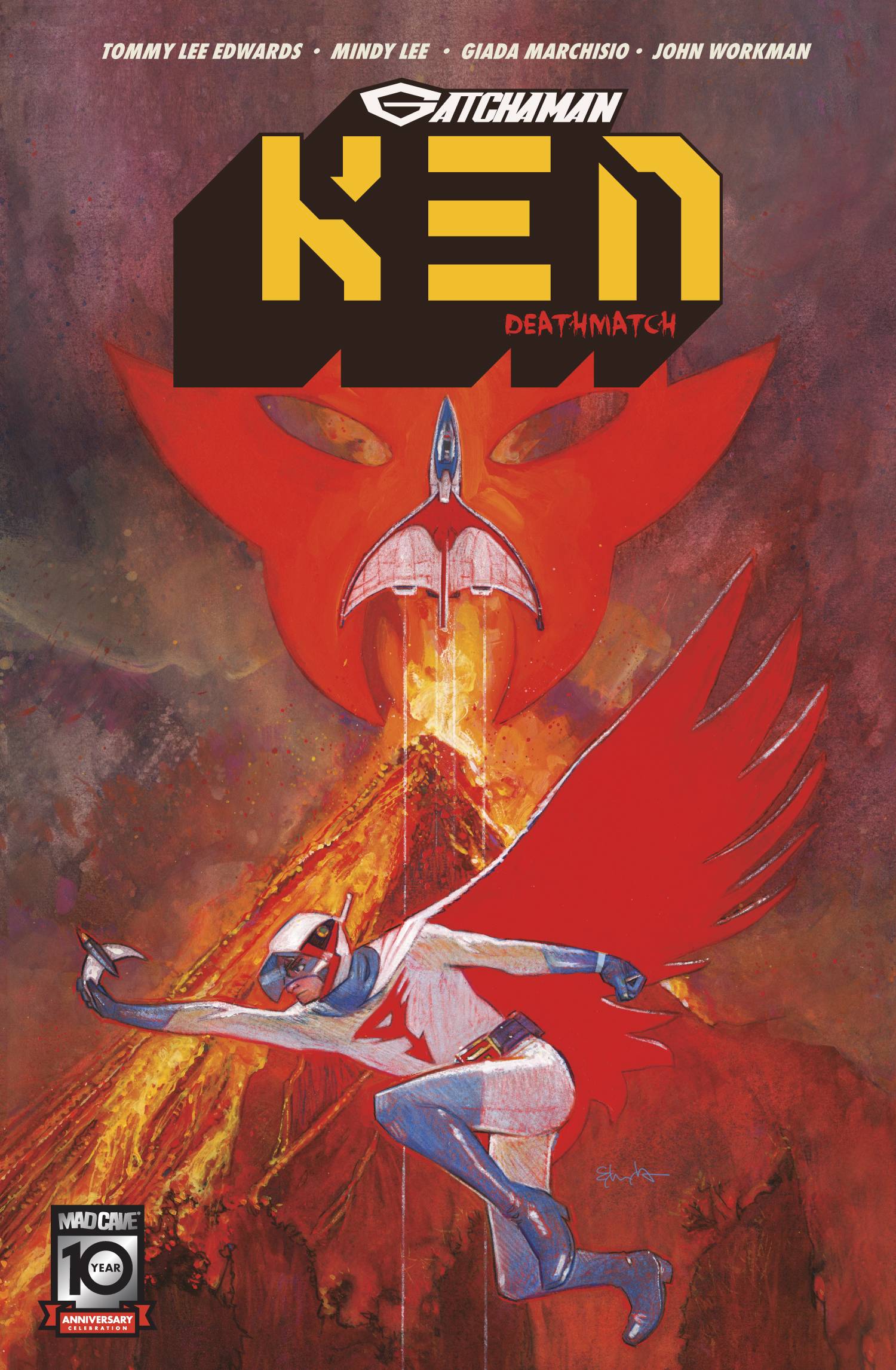
Writer: Tommy Lee Edwards
Illustrator: Mindy Lee
Colorist: Giada Marchisio
Letterer: John Workman
Publisher: Mad Cave Studios
Review by Jordan Jennings
Synopsis: Ken The Eagle, of the Science Ninja Team, has infiltrated a deadly underground Deathmatch Tournament to infiltrate the evil Galactor organization. The tournament has proven to be more than just a Deathmatch as Ken is quickly thrown into the deadliest game against Galactor’s newest recruits. Can the Gatchaman escape?
Gatchaman: Ken- Deathmatch is the first of the character focused one-shots that make up a part of Mad Cave Studios Gatchaman line of books. The one-shots are off to a strong start here with a comic that is a strong mix of action and spy thriller. While I am aware of Gatchaman, I am admittedly a novice when it comes to the franchise. That said elements of Gatchaman, super-sentai style action, mechas, evil organizations, and all the melodrama the world can handle, are my kind of action.
With Gatchaman: Ken- Deathmatch, Tommy Lee Edwards does a wonderful job keeping the book new reader friendly. While there are a lot of name drops and it does feel like a lot of the cast of villains are probably callbacks to the anime, it doesn’t bog the comic down. Instead, Edwards keeps the book moving swiftly as it glides from a Bloodsport tournament to the Deadliest Game. Having the book start in media res really set the tone for the whole issue. Honestly starting with the Science Ninja Team undercover and working this corrupt Galactor Gala is a great way to introduce the team and it creates a sense of a universe that has already been in motion. There is a palpable sense of thrill as you read the title.
The art by Mindy Lee is nothing short of amazing. As I was flipping through the pages, I was taken back by how clean and effortless the art looked. Lee has a command of action and emotion that I haven’t seen a lot of titles today. The varied page compositions and layouts do a great job in controlling the pace of the story, but Lee doesn’t let the actual story get muddled in the action. There is a smooth flow to this book that I just savored at every moment. Each hit and glare has all of the physical and emotional weight, respectively behind them. Lee did not pull any punches here.
The colors by Giada Marchisio compliments Lee’s line work. Marchisio’s cell shaded style not only fits the tone of the book, but it also helps keep the line work clean. The way that the illustration and colors harmonize here makes for an incomparable experience.
While I don’t always mention the letterers in my reviews, I do want to take a moment to bring attention to John Workman’s letters in this issue. Workman does a simple but novel trick to make whispers visually distinct for the reader while still being legible. It is a simple, but novel trick of writing the whipsers in a dark gray that stands out from the black font. I like this trick as the primary way of conveying whispers (shrinking the font size down) makes it hard to read. Workman’s technique? It is clear to read and visually distinct. Simple, but effective.
Overall, Gatchaman: Ken-Deathmatch is an excellent spy-thriller one-shot that has Gatchaman elements. The comic is extremely new reader friendly, which is a huge plus for licensed comics. Edwards and Lee deliver a strong start to these characters focused one-shots, and I am eager to check out the rest of the Gatchaman books.
Check it out!
Neil Gaiman’s Anansi Boys #1
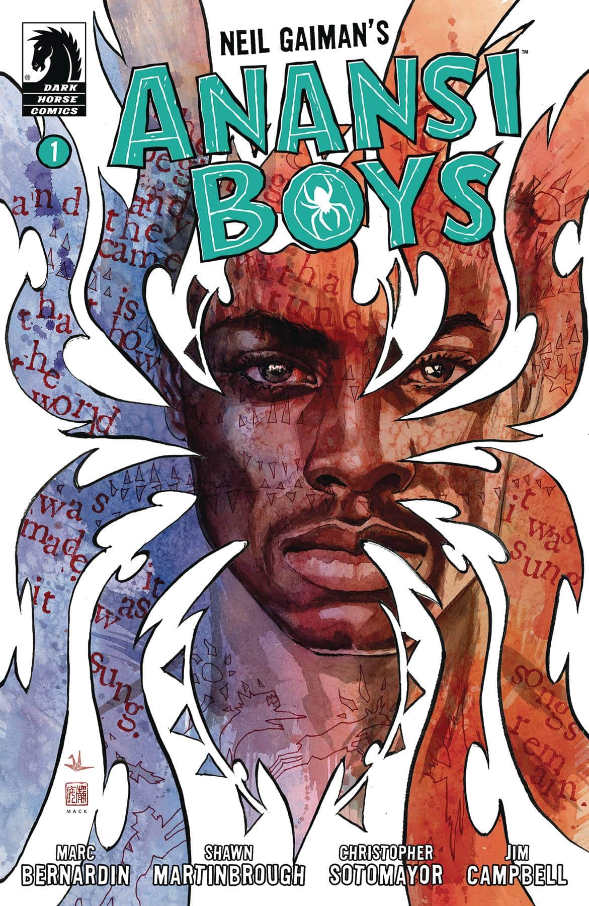
Writer: Marc Bernardin
Artist: Shawn Martinbrough
Colorist: Chris Sotomayor
Letterer: Jim Campbell
Publisher: Dark Horse
Review by Christian Angeles
I’m admittedly one of the world’s biggest Neil Gaiman fans. I’ve read all of Gaiman’s works, and even my own fiction writing style draws heavily from his. So, when I discovered that Anansi Boys was being turned into an 8-issue comic by Dark Horse, following their successful adaptation of American Gods, I knew I had to review the first issue.
And it didn’t disappoint at all. Anansi Boys has always been one of my favorite Gaiman books, not only for its close ties with American Gods, but also because of its unique tone. The story balances the source materials equal parts humor and musical spirit, all while paying homage to what truly made it stand out in its African heritage – the tales and tricks of the Spider-God. In fact, if I had to pick the author of this book out of a police lineup without any prior knowledge, Gaiman would be the last person I would choose.
I mean that in a positive way. You see the writing in the original story plays with the fact that it never explicitly describes Fat Charlie’s race. Instead, it relies on context clues and points of view. How Charlie’s interactions often subtly highlight his perception of ‘the others’ in the room; people who were often, white people, how their descriptions and mannerisms contrasted with how he normally saw himself.
I stress that race is important in this first issue because in a comic book, with its visual elements and most importantly COLOR, you can’t rely on subtle hints and literary techniques like these. This is where I commend Dark Horse for choosing two Black creators for this adaptation: Marc Bernardin, a multitalented journalist, comics writer, and screenwriter, who skillfully collapses the prose into a to-the-point kickoff of the source material; along with artist Shawn Martinbrough, who brings a degree of realism and genuineness to his line work on the page.
Given that Anansi is the god of wit and tricksters, the nature of deception is highlighted pretty early on in how funny yet terrible Fat Charlie’s dad used to be. Much like in Gaiman’s other characters such as Crawley in Good Omens, or Loki and Puck in The Sandman, these archetypes work in that the story becomes less about throwing a punch and more about seeing how smarts can both foil, and get characters into, rather provocative situations.
Much like the book, the story begins with a wedding and then a funeral, a nice polar opposite tug of emotions that flows beautifully in Martinbrough’s art. The covers I should also mention, done by David Mack, are about as beautiful as ever, much like those he created for American Gods as well. One issue in and it’s a wonderful adaptation that ends on a fitting cliffhanger in setting up what’s to come. A great introduction to Anansi Boys that works for fans both new and old.
Rare Flavours #6
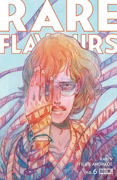
Writer: Ram V
Artist: Filipe Andrade
Color Assists: Ines Amaro
Letterer: AndWorld Design
Publisher: BOOM! Studios
Review by Khalid Johnson
This issue is a perfect culmination to the masterful storytelling of writer Ram V and artist Filipe Andrade in Rare Flavours. Lettered by Andworld Design, this is a masterpiece on every level. Andrade’s art with its colors, exaggerated proportions, contour quality, and expression make every page something to savor. The choice of moments here are grabbing, especially as we’re asked to sit with Mo’s emotions as he reflects on his own personal journey through art and artistry.
Across the series we’d seen glimpses of Mo’ at the theater during the premiere of his and Rubin’s documentary; in issue no. 6, we are fully in the theater, the conclusion to the film and the story. Never really feeling a sense that Mo’ wouldn’t make it, the exploration has been in the journey to the theater, seeing Mo’s art realized while he sits next to an empty seat. Recontextualized, this is an empty seat twice over and where the grief of his initial loss motivated Mo’ to stop making art, through his relationship with Rubin and the grief in his absence, Mo’ found the motivation. What better way to talk about human consumption than through food and consequently humans being consumed. The recipes are such a wonderful piece of this story and the way they are weaved through the story is a testament to the comics medium and how well this team understands the strength of it.
In the theater, reading this or the next story, we consume the works of each other and we are consuming each other. It’s almost meta in the sense that it feels like we’ve been in the theater the whole time; we are the audience and Mo’ through the creative team is speaking to us, the consumer. We are being asked to think about art, how we make it and how we consume it. It’s an emotional and heartfelt conclusion that closes an excellent story that I can’t recommend enough because it is absolutely worth your time to sit with.
Read more entries in the weekly Wednesday Comics reviews series!


