

This week’s main review is The Moon Is Following Us #1, which you might not be entirely ready for. Plus, the Wednesday Comics Team has its usual rundown of the new #1s, finales and other notable issues from non-Big 2 publishers, all of which you can find below … enjoy!
 The Moon is Following Us #1
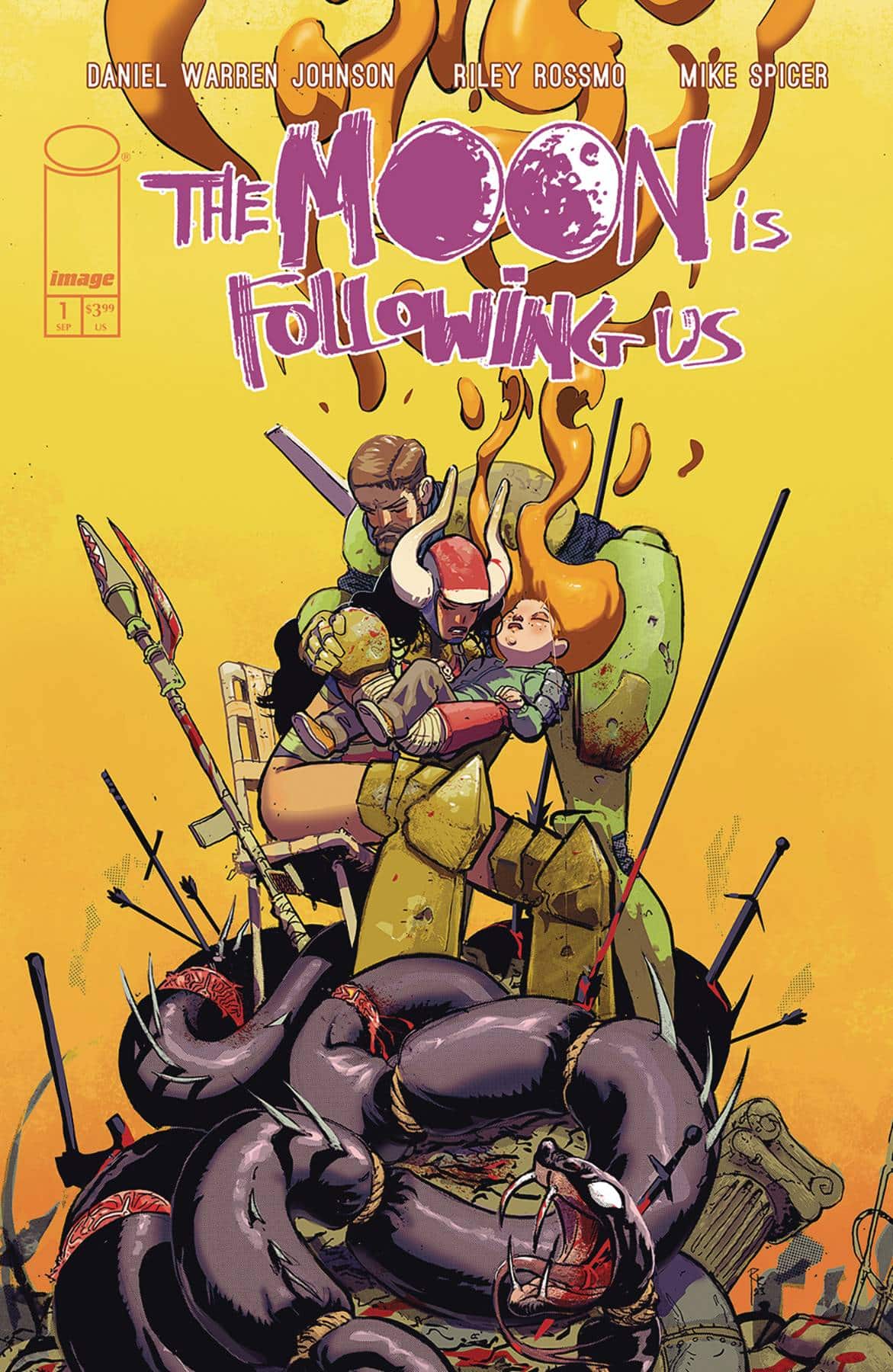
Writer: Daniel Warren Johnson
Artists: Riley Rossmo and Daniel Warren Johnson
Colorist: Mike Spicer
Letterer: Shawn Lee
Publisher: Image Comics
Review by Jared Bird
I would bet good money that I am one of the biggest Daniel Warren Johnson fans on the planet. I’ve been all aboard the hype train since the very first issue of Murder Falcon back in 2018. As he kicks off a new series, co-created by and collaborating with artist Riley Rossmo (Proof), Johnson has more eyes on him than ever, following his hugely successful currently ongoing run on Transformers. With The Moon is Following Us, however, Johnson and Rossmo show the readers just how good they are at what they do.
The series follows married couple Duncan and Tash searching for their daughter Penny across a strange, exhilarating world. It’s a setting occupied by mechanical bat-creatures, frog snipers, science fiction weaponry and dark, lovecraftian magic. This contrast of science fiction and fantasy is not new to Johnson, and I think fans of his series Extremity will be very happy with it. Tash and Duncan are wonderful protagonists, both with awesome visual designs by Rossmo, and are fleshed out well in this first issue. Introducing a couple mid-fight is a bold creative choice, but it pays off, as the reader immediately gets an idea of the profound love between Tash and Duncan and how they communicate in times of difficulty with each other.
Rossmo’s artwork is electric. It’s filled with energy that jumps clean off the page, and he has a great knack for visual layouts that make action sequences easy to read whilst remaining exciting. There’s a certain bounce to his visual style, balancing detail and cartoon-like exaggeration that makes for a very exciting read. His design sensibility is awesome too, giving the characters distinct visual appearances that feel reflective of their personality. Tash will be a highlight for many, but I thought Pigface had one of the greatest designs I’ve seen in a comic in years. I love that little freak already.
I am self-admittedly a huge fan of Johnson’s writing style, but it has been very interesting to see his evolution as he works with more artists outside of drawing the book himself. He’s a writer who creates stories with a beautifully rich empathetic element that I cannot help but love every single time, and that’s the same case here. Late in the issue is a rug-pull reveal that I won’t spoil, but it tugs at the heart strings considerably and shows off how good Johnson has gotten at balancing character and plot. If you like Johnson’s style of heavy metal bombast mixed with heart wrenching stories about family and love, you’re in for a treat here.
The visual style of this book is one of its most compelling aspects. With bright, eye-catching colors from Mike Spicer, fantastic lettering work from Shawn Lee, and Rossmo’s energetic, kick-ass artwork shining across the issue, complimented by Johnson’s dialogue and worldbuilding, it’s difficult to put the issue down. The style reminds me of late 90s, early 2000’s science fantasy works like Final Fantasy VIII, which is very high praise if you happen to know how strongly I feel about that particular micro-trend.
Overall, The Moon is Following Us is one of the strongest first issues Image Comics has put out all year, and commands your attention. It’s a prime example of how comics can balance awesome, fantastical elements with moments of deep, rich empathy and shows a group of creators operating at an incredible level of ability. I can see this series becoming a fan favorite for both creators, and I look forward to the rest of the series eagerly. Tash and Duncan are wonderful protagonists, journeying through an incredibly well-realized world, and I cannot wait to see where their journey takes them. If Johnson and Rossmo keep up the sheer quality of this first issue, it’s going to be one of the best series of the year.
The Graveyard Club: Revenge Game #1
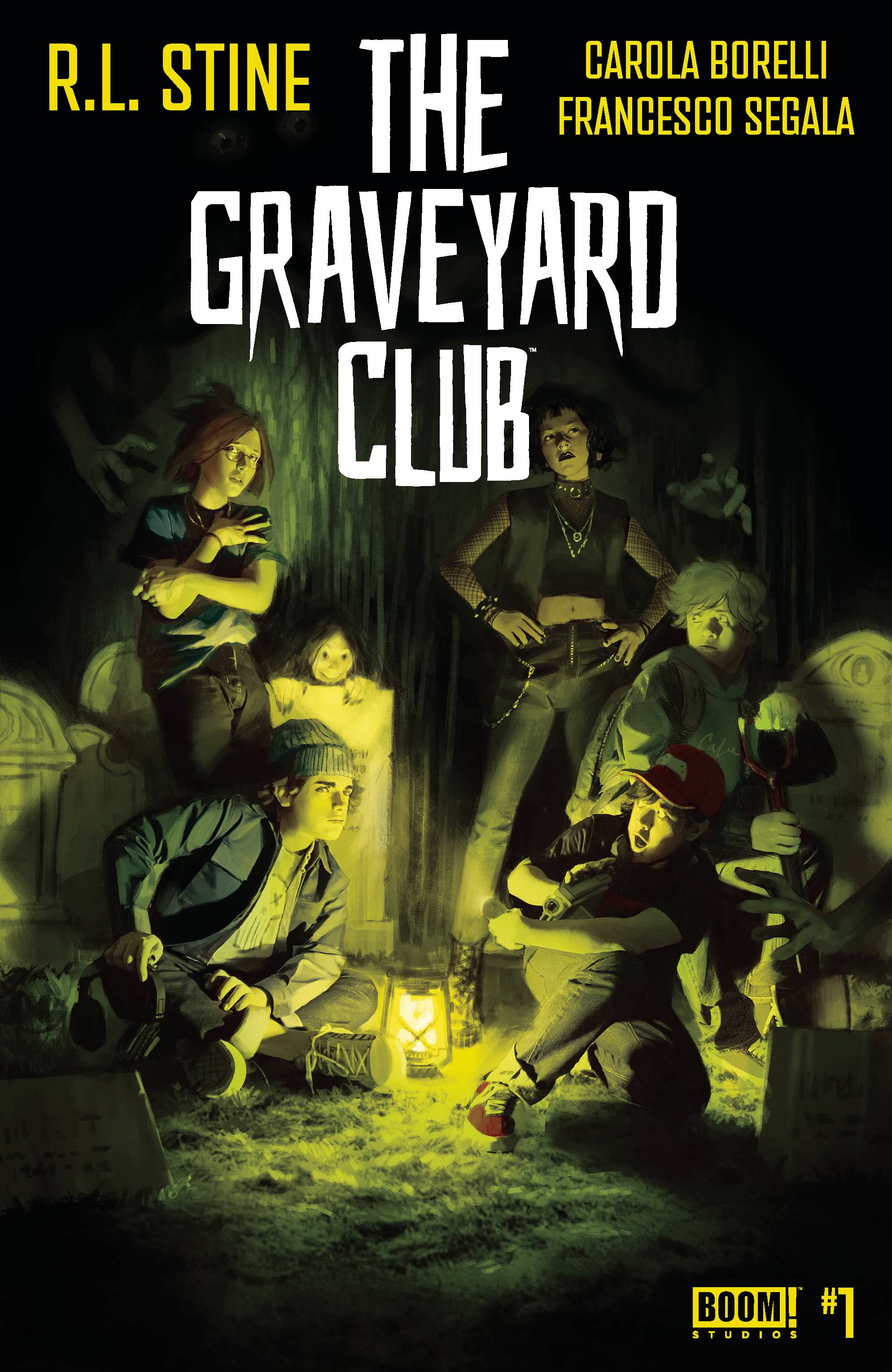
Writer: R.L. Stine
Art: Carola Borelli
Colors: Francesco Segala
Letters: Jim Campbell
Publisher: BOOM! Studios
Review by Clyde Hall
‘Legendary horror author’ isn’t a descriptor to be applied lightly, and BOOM! Studios doesn’t when it comes to lauding R.L. Stine at the helm for their new TPB The Graveyard Club: Revenge Game #1 this week. I know. Thanks to my daughter, ours was a Goosebumps affiliated household during her childhood.
As far as comics work, though, Stine’s scripting has been more average to slightly above based on past critical and reader assessments. At first glance, The Graveyard Club fits in the lower end of that scale. But a closer look may elevate it.
High School seniors Parker and Patti are a couple, a couple clinging tightly to one another as childhood days making the cemeteries surrounding the town of Graves End their personal playgrounds draw to a close. They, along with classmates Caleb, Trip, and Rhonda, are a self-proclaimed Graveyard Club, making the most of their teenage sunsets in anticipation of the adulthood dawn approaching.
Unfortunately, local police officer Ray-Ray Higgins has it in for them, as does his son, football hero and all around bully Billy-Roy. While the Club members are prepping for college, careers, and all that awaits them in misty future days making their own ways, the Higgins’s deliver a final season of pranks, torment, and intimidation against their perpetual prey.
As a parting shot, the Graveyard Club youths embarks on a game of revenge one-upmanship that slowly devolves into horrific brinksmanship. It leads to a confrontation pitting friends against foes, and with a satisfying blurring of those lines before the first arc winds down.
Stine at first registers off-center regarding cause and effect rationale among his cast of characters. Several times, Club members who didn’t seem present when a scene began are suddenly part of it. They blurt out observations which register as a stretch, given what the reader knows in the moment. Characters are described as being one way while their actions don’t quite bear the observation as true. Rhonda, for example, is accused of being ‘quiet’ multiple times, yet seems as communicative as anyone else.
Such as it is her reticent nature, she says, is due to her father having gone missing. Parker’s father also disappeared five years before the story begins, and under suspicious circumstances. And even though Graves End isn’t a large community, when she tells Parker both their fathers disappeared the same day five years ago, it’s news to him.
These elements of the narrative came off as disjointed at first. However, they form a rather dream-like state the protagonists are floating through, one where nothing is quite what it seems or what is expected. As in a dream, people appear randomly, and rationality is suspended in lieu of stream of consciousness. The sort of odd circumstances we accept more readily than during waking hours. The story unfolds with similar unreality. If this is intentional, it’s an appropriate, unsettling touch. If it’s loose creative disconnect between words and panels, less so.
Either way, it doesn’t prevent the first arc from closing the curtain with a character-driven fanfare. And it also doesn’t lessen the mystery of the missing fathers nor the cryptid infestation of red-eyed bats across the community. These will be the fodder for future BOOM! Graveyard Club trades.
The artwork of Carola Borelli adds the right elements of YA horror with teen amour, gum-swapping lip locks, and unrequited love. When it comes to gore and violence, she delivers the full range of what’s going on but successfully reins in visual carnage on display.
The volume is described in solicitations as The Breakfast Club in a graveyard. The first entry lives up to that, with Sun Tzu and Scream-lite added flavor. For readers who tune in to details, the somewhat surreal flow of events punctuated by coincidences may test their patience. Exposition presented for the readers between two characters who already experienced the happening, leaving no reason for their discussion except the reader? That may test everyone’s patience.
But for fans of Stine and for anyone seeking a YA horror title to get them into an autumnal frame of mind, The Graveyard Club: Revenge Game #1 has sufficient funeral procession fuel to take you there.
Ultramega #5
Writer/Artist: James Harren
Colorist: Dave Stewart
Letterer: Rus Wooten
Review by Jordan Jennings
Synoposis: After a 3-year hiatus, Ultramega returns with Ultramega #5. seeks to establish more of the backstory behind the Ultramegas and Kaiju as something of a symbiotic relationship that has become unbalanced over time. Yet, it doesn’t ignore the events of Ultramega #4 as issue five deals with the immediate fallout of Noah, the son of the fallen Ultramega, taking up the mantle and defeating his half-brother, The Kaiju Prince. Meanwhile this is all on top of revelations about the Fall of the Ultramegas event. This is one jam-packed issue, but it should be stated that Ultramega is a triple-sized issue that often features a complete story.
James Harren shows he still has it and has grown even more as an artist and writer since the hiatus. Harren’s influences are very apparent with the manga roots being throughout the art style including techniques often found in the format to demonstrate panel transition and convey emotion. The art is still as kinetic as before as Harren continues to demonstrate his mastery of size and scale. The design of the Kaiju and Ultramegas continue to be delightful especially as the contrast between the more extreme variants of Kaiju and Ultramegas and the seemingly peaceful ones become apparent.
Harren’s writing on this issue manages to find moments of levity and general adventure, while still packing the emotional heft of the early issues. For example, the story moments that take place across the universe have this heft and resonance as it features a world that is on the brink of collapse. These moments are emphasized by Harren’s command of panel layouts and pacing. The art itself complements the writing in a way that, while expected from a writer/artist piece, is powerful. Harren gives time for his story beats to breathe and sink in leading to greater impact.
Then there is the interlude showing the events during the Fall of the Ultramegas from issue one that is just chilling. These quiet moments of contempt and human nature on display gave me chills reading it as the shadowy and cowardly deals between the hero and the villainous Kaiju Queen is disturbing.
Ultramega was one of my favorite comics in 2021 when I was coming back into comics in a serious way. Its initial four issue run was fantastic and a testament to the medium. The triple-sized issue of these comics gives a lot of meat as well as give the space needed for side-stories and emotional impacts. Ultramega #5 is an epic full of love, action, betrayal, and violence. It is the embodiment of manga sensibilities through the lens of American comics. I am glad to see this series back and in action.
Wednesday Comics Reviews
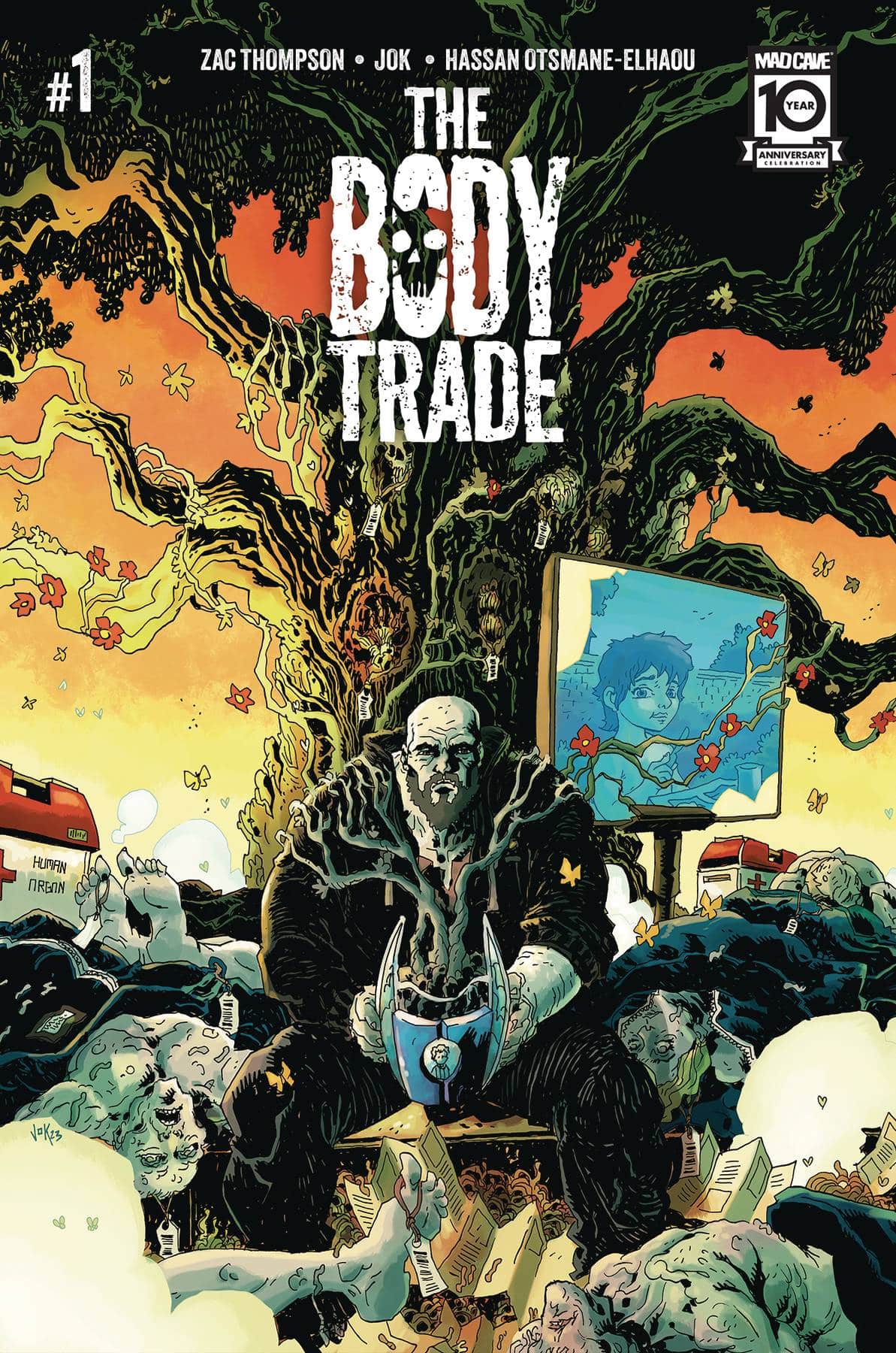
 The Body Trade #1 (Mad Cave Studios): It always leaves a bad taste in my mouth when a character is seeking therapy for a behavior, then backslides into the behavior they were seeking to deal with — often for entertainment value, often ‘anger’ used as a way to propel action or violence into a story. Zac Thompson could just as easily take our ex-con divorcee, Kim Krilic, on a different route to finding out where his son’s body has moved to, but instead he puts Kim on “the only way out is through” path, which is less interesting to me in today’s day and age, but does live up to the meme, “men would rather go on a quest for vengeance than seek therapy.” Jok’s art jostles around with a frenetic energy that reminds of Rob Guillory or Gabriel Bá, and yet the characters feel lifeless in their expression. Maybe it’s how Jok stages a shot that adds fun, extraneous details that ultimately detract from immersion and poignancy; just feels like the facial expressions and body language gets swallowed whole by the world around. Of note are Jok’s colors that dally in grotesque midtones that pop less than blister, which, again, amplifies the liveliness brimming in Body Trade’s world. Body Trade is as good a display for Hassan Otsmane-Elhaou’s creativity as any with multiple signature techniques on display from unique craggy tails to ? and ! only balloons. Vintage Otsmane-Elhaou that I’m a big fan of is a whimper of dialogue escaping from a coward’s mouth as balloon-less text traced with a squiggle to connect the two; it’s become an active tool of Otsmane-Elhaou’s lettering vocabulary and constantly works to push energy where it would beneficially impact pacing. I wish I liked this book more, but it’s just a well-worn topic told in a fun, though inconducive manner. It’s a skip for me. —Beau Q.
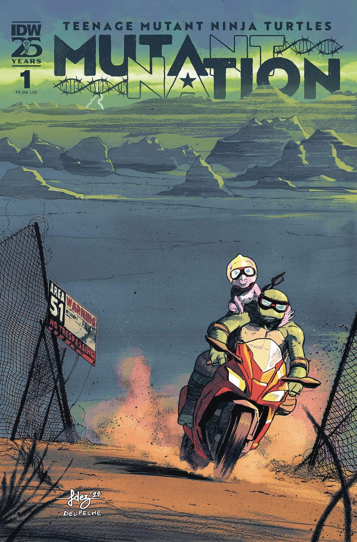
 Teenage Mutant Ninja Turtles – Mutant Nation #1 (IDW Publishing): A TMNT anthology with two shorts; the first following Raphael from being a bouncer to ending up on a mission To infiltrate Area 51. The art of Vincenzo Federici with colors by Ronda Pattinson make Ambush at Area 51 feel very slick as they manage an incredible fight sequence, paired with some solid narration written by Tom Walz. The narration provides exposition and a good look at what’s motivating Raph and how he got here, that carries the story straight through the cliffhanger ending. This story points back to other TMNT stories and continuity as Raph is on his own but it never feels inaccessible even if you’re a casual TMNT fan. The same can be said about Casey Jones Agent of The Foot Clan, written by Erik Burnham with art by Mateus Santolouco and colors by Marco Lesko. So much attention across this first issue is given to the kinetic energy in the fights and that’s a testament to the creative teams. Balancing the action between a conversation with April O’Neil, there’s a great sense of rhythm as Casey’s work for the Foot Clan is called into question. With excellent letters by Russ Wooton, this is a fun first issue full of action, and remains accessible while building on TMNT continuity. —Khalid Johnson
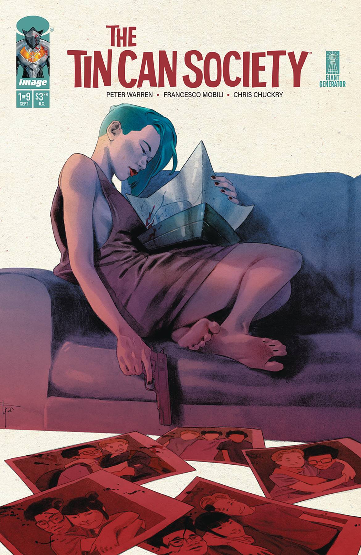
- Tin Can Society #1 (Image Comics – Giant Generator): Tin Can Society #1 combines a pair of tropes I absolutely love. First and foremost, it leans heavy on the ol’ murdered superhero setup (done well in classic books ranging from Watchmen to Powers), which is the inciting incident that drives our action. On top of that, this book also weaves in that thing where a group of kids who grew up together all went on to be sort of influential figures. We get them first as children and then later post-murder, before our story here starts to backwards engineer the complicated relationships and secrets that have taken hold between them. It’s a nice combination of two things I never really get too tired of in comics, and the book as a whole is well-written and very well illustrated, with a script from screenwriter Peter Warren with artwork from Francesco Mobili, colors from Chris Chuckry, and letters by Rus Wooton. It could feel overly familiar, but the creative team seems determined to make sure it doesn’t. There’s a prestige feel to the whole book, and I found it all very intriguing. —Zack Quaintance
The Prog Report
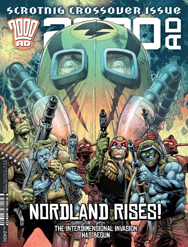
 2000AD Prog 2400 (Rebellion Publishing): This week we hit Prog 2400 (that’s so many!), and to celebrate the benchmark, we get a crossover event that spills into Megazine 472, also out today. The story starts in The Prog, however, with Nordland Rising Part 1, scripted by Ken Niemand, drawn by John McCrea, colored by Mike Spicer, and lettered by Annie Parkhouse. This segment launches a multiverse invasion story that allows for several familiar faces, concepts, and timelines to get involved (or at least to cameo). It’s an alternate history story, wherein The Norts have defeated the Southers…and then gone looking for new conquests, ultimately coming to Dredd and Mega-City One at the height of the classic Apocalypse War story, in an alternate timeline of course. If you’ve read this far, you have surely realized this is all grandiose sci-fi comics hijinks of the highest order, a true spectacle, and the McCrea-Spicer artwork in particular does it justice. It’s a story that goes big and looks even better. And if that weren’t enough, it then spills into the rest of the stories in the anthology. It’s a real editorial feat of coordination this week, and I found it to be an absolute blast. Don’t miss it. As always, you can nab a digital copy of this week’s Prog here. —Zack Quaintance
Read more entries in the weekly Wednesday Comics reviews series!


