

This week the Wednesday Comics Reviews team tackles a finale with Vicarious #5, more comics kaiju excellence with Godzilla Vs. Chicago #1, a new story arc for comics weirdest (complimentary) book with Nights #13, and more. We also look ahead at a new titles eligible for pre-order. Plus, as always…The Prog Report!
 Vicarious #5
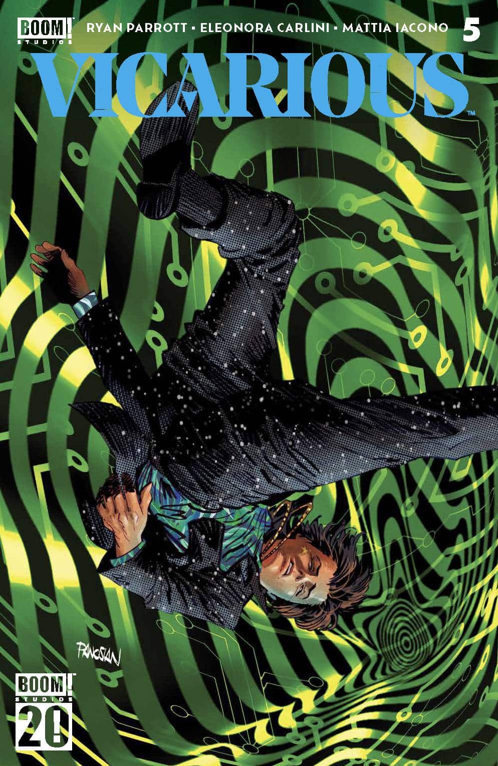
Writer: Ryan Parrott
Illustrator: Eleonora Carlini
Colorist: Mattia Iacono with Luca Mattioni
Letterer: Becca Carey
Publisher: Boom! Studios
Review by Jordan Jennings
Way back in October, I got a chance to review Vicarious #1, and at the time I felt the series started off interesting but was burdened with trying to establish the world. With the final issue of the series out this week, I am able to reflect on what was introduced in the first issue and see how the series played out. I can confidently say Vicarious finished strong.
With Vicarious #5, writer Ryan Parrott delivers a fantastic pay off to the series with Justin carrying out his revenge against his former proxy escort service for leaving him dead in a ditch. Vicarious turned out to be a delightful cyberpunk/grindhouse/revenge story that got me hooked in this world. As I said in my original review, while the concepts at play are nothing unique, Parrott puts them together in a novel way that scratched a serious itch for me. I like watching bad people get their comeuppance even if it is at the hand of a morally dubious person like Justin. The way Parrott fleshes out Justin is interesting. He is a very conniving individual whose moral compass does seem to tilt to a transactional nature. Dude is just straight up a dirtbag, but Parrott manages to infuse him with enough charisma that you can’t help but root for him as he plays his politician father, the police, and his former pimp against each other as he takes the reins of the proxy empire.
Artist Eleonora Carlini really gets to flex their muscles in this issue as we see Justin enter into an altered state of being in the big climax of the issue as the scene flips between psychedelia to the normal world within just a panel. The imagery is fantastic and complimented by Mattia Iacono and Luca Mattioni’s colors, which causes these hallucinatory scenes to pop off the page. Carlini’s character work is fantastic here too as we see each of the characters’ body languages help sell the character moments.
Overall, I found Vicarious #5 to an excellent end to a series and great showcase of a payoff to a well crafted series. Each moment from the previous four issues build into this cathartic release of revenge and victory for the main character, even if he is a dirtbag. As a single issue, I don’t know if this could stand on its own, but as a complete story this is excellent. Definitely check this series out.
 Godzilla vs. America: Godzilla vs. Chicago #1
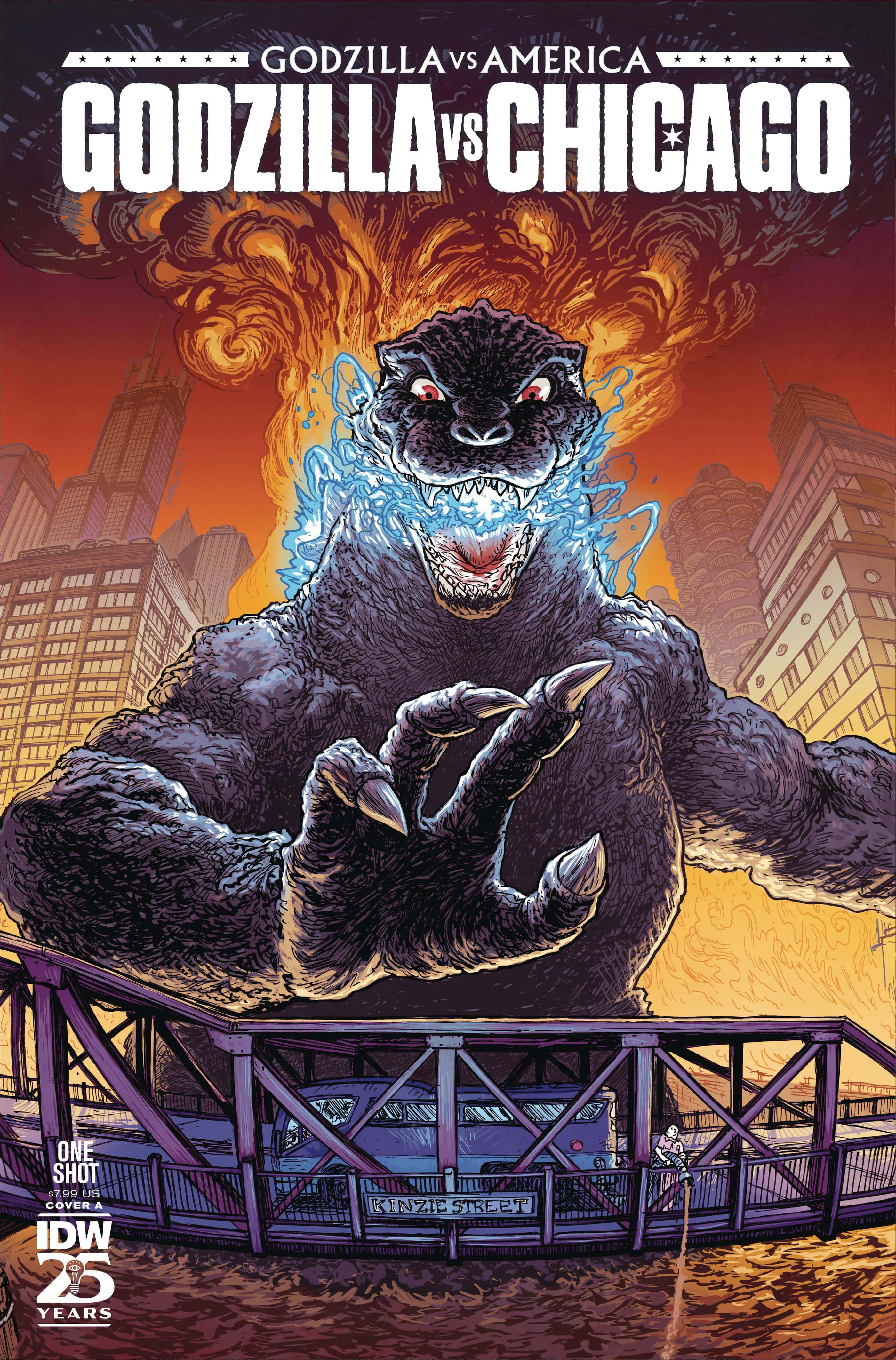
Writer / Artists: Mike Costa and Ryan Browne, Tim Seeley, Ezra Claytan Daniels and Caroline Cash
Letterer: Brian Kolek
Colorists: Kevin Knipstein and Heather Brechel
Publisher: IDW Publishing
Review by Jared Bird
The first of four one shots focusing on Godzilla’s arrival to various major American cities, Godzilla vs America: Godzilla vs. Chicago #1 sees the king of monsters arrive to wreak havoc in the Windy City. With four different creative teams each crafting their own tales, the issue is a total love letter to the city of Chicago, its people, and its unique subcultures, whilst also being a fun Godzilla book to check out for those like me who have no connection to the city.
The first story, ‘Godzilla Does Chicago’ sees writer Mike Costa and artist Ryan Browne tell the tale of the Fan Man, who loses his position as the cities’ most beloved weirdo and desperately attempts to get it back, with the aid of Mechagodzilla. This is a comedic story through and through, and the silly tone works in its favour to add a surrealist lens to the humour that was particularly up my alley. It’s laugh out loud funny, with a whimsical and sarcastic tone that only makes it more so. Browne does a great job with the artwork, utilising great visual comedy in addition to backing up what Costa is doing with the script.
‘Blue Line Sign’, written and illustrated by Tim Seeley, tells the story of a young woman taking the Blue Line of Chicago’s public transport system, looking for a sign to tell her how to live her life. Seeley is a legend in the industry for a reason, and throughout this short story shows off his ability. Funny, heartfelt and relatable, ‘Blue Line Sign’ puts a romantic comedy twist on a Godzilla story to great success. Filled with small moments that’ll make you laugh and warm your heart, it’s a great read and feels like a perfect short story for this kind of anthology book.
‘Chi Godzilla’, written and illustrated by Ezra Claytan Daniels, is the story with the most to say out of the four. Commenting on the displacement of elderly communities by millionaire real estate developers (and in this case, Godzilla), Daniels unique artwork stands out, as well as the dry humour utilised throughout the story. The ending is bittersweet, reflecting the realities of the world whilst still having hope that a better future is possible. It’s one of the few stories in the anthology that really portrays Godzillas a force for evil, which makes it stand out.
My favorite story of the bunch was ‘Godzilla versus Chicago’, written and illustrated by the inimitable Caroline Cash. Ostensibly focused on a girl’s adventures trying to take down a rampaging Godzilla, it feels like a love letter to the silliness of the book’s premise as well as a representation of the spirit of Chicago. Cash’s work as a cartoonist is so deeply unique, and that sensibility is applied here very well. Whilst it might not work for some, one of the best things about an anthology is getting to take creative risks, which in my opinion pays off her. It’s incredibly funny and yet, also oddly affirming.
Overall, Godzilla vs America: Chicago #1 sees four great creative teams tell four unique, fun and heartfelt stories that are both love letters to the windy city as well as interesting takes on the Godzilla premise and concept. Mileage may vary but if you are open to surprises and want a good, fun read, this book will absolutely provide you with just that. It might compel you to visit Chicago as well — hopefully, when it’s not struck by a rampaging Godzilla.
Nights #13
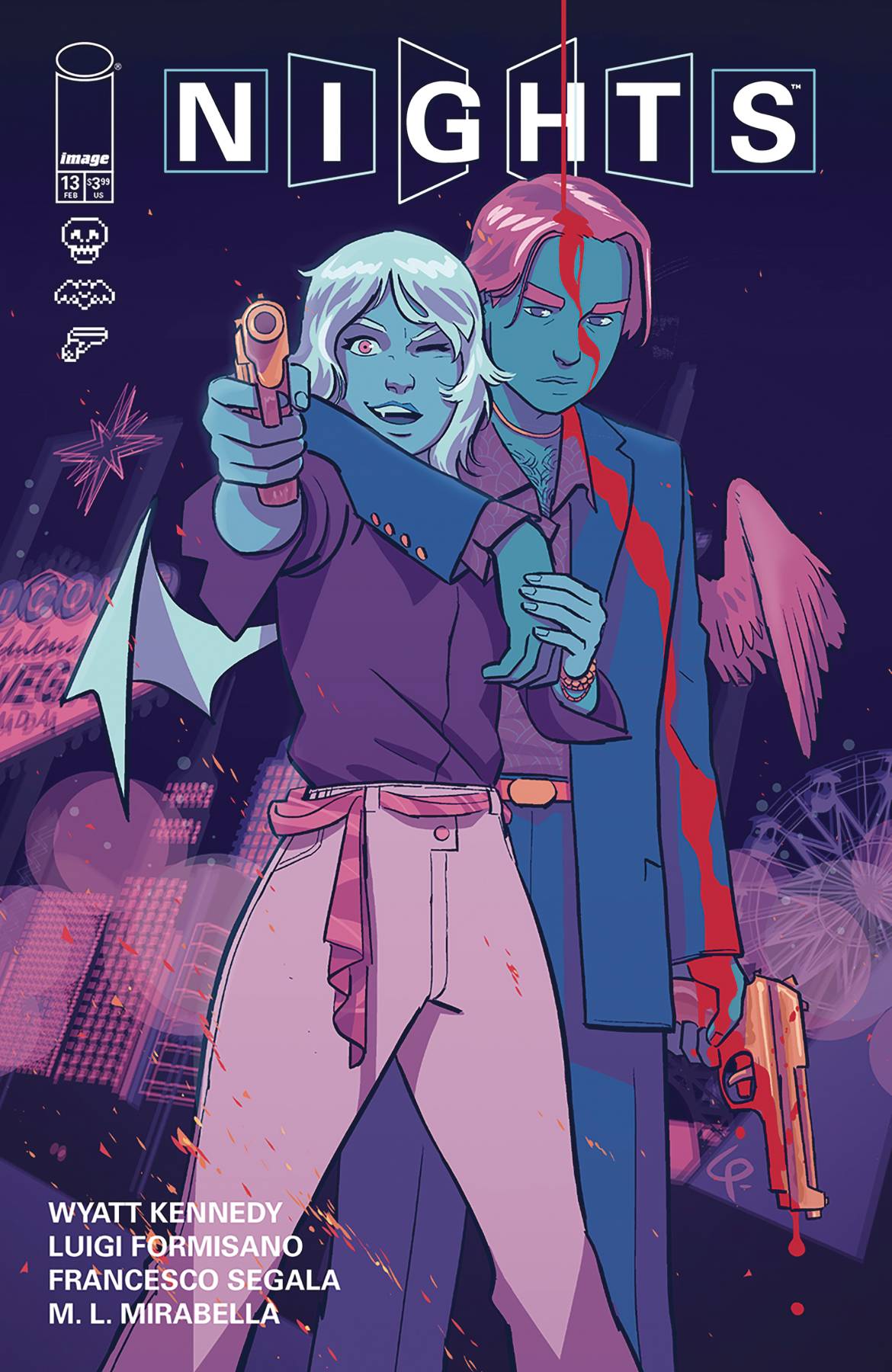
Writer: Wyatt Kennedy
Artist: Luigi Formisano
Colorist: Francesco Segala
Letterer: M. L. Mirabella
Publisher: Image Comics
Review by Jared Bird
Nights kicks off its second major arc in issue #13, following the explosive events of the previous issue and ‘first season finale’. If you haven’t been checking out the series, this is a great point to jump on, because it’s starting a brand new story, focused on new characters and new settings. That’s not to say it isn’t the same Nights that fans love – it definitely is, and it’s still substantially linked to everything that came before – but this issue expands the scale of the series drastically and tries something bold and new. In doing so, it delivers one of the best issues of the series yet.
This issue focuses on the hyper-capable and mysterious Agent Tsukumari, and his early days at Chimera. You could, in a sense, define it as a prolonged flashback, but I chose to see it as a conscious choice to expand the scale of Nights and deliver answers to some of the longstanding mysteries that have been building over the course of twelve issues. It’s bloody and dark, with a markedly different style than much of the series so far, harnessing the aspects of Nights most intense moments in order to kick off a thrilling story. It’s got some of the most intense gore of the series, really pulling no punches, but also has some of the most intimate moments of the series where the smallest things have a massive impact. It also ends on a wondrous and impactful note, leaving the reader hooked and wanting more.
Wyatt Kennedy delivers his most subtle and mysterious writing work for the series yet. This issue has large amounts of visual storytelling, but that’s not to say Kennedy’s presence isn’t felt. The worldbuilding through dialogue in this issue is top notch, setting up mysterious with effortlessly stylish ease. Tsukumari is an interesting protagonist for this arc, and while he is a man of few words, he makes an impression and there’s enough layers to his character for him to feel fleshed out and unique. This issue feels like a maturation of Kennedy’s writing style, pushing it to the next level and trying to challenge what readers might expect from his writing by this point in his career. He seems dedicated to not playing it safe, and it’s an incredibly respectable quality that makes the series as unique as it is.
Luigi Formisano’s artwork continues to be fantastic. He has a great sense for character design and can effortlessly weave pop-culture references with unique, stylish page layouts that make every page feel more than the sum of its parts. He continues to balance the various tones and styles of the series well, aided by the excellent color work of Francesco Segala. Given the tonal difference of this arc to the previous one, it would be easy for Formisano to go too far and make it feel too different to the rest of the series, but it still feels recognisably akin to what came before. His style is such a large part of what makes this series work, and it’s incredible to see him continue to push himself into new places and try new things.
Overall, Nights kicks off its second ‘season’ with a great issue, setting up a dark and thrilling story arc that expands the scale of the series whilst harnessing its best aspects and exploring them to the best it can. It’s one of the most consistently engaging and interesting comics currently being published, trying out unique decisions and combining a wide palette of influences to create something truly unique. This issue is a great jumping on point for new readers, but also moves the pre-existing narrative into new and exciting places that previous readers will enjoy.
Rapid Wednesday Comics Reviews
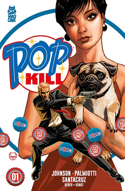
 Pop Kill #1 (Mad Cave Studios): Pop Kill #1 is a mature violence and seduction filled first issue written by Jimmy Palmiotti & Dave Johnson with art from Juan Santacruz, colors by Brian Reber and letters by Sean Konot. The driving conflict is the rivalry between formerly-conjoined twins (Japanese) competing at the top of soda distribution, but that falls into the background as Jon Pyle engages in espionage as the corporate war uses tools of warfare with people caught in the crossfire. What rubs me a bit weird here is the violence visited on people of color by a blonde white guy and the male gaze employed, reducing many of the women present to tools even though the issue is beautifully drawn, colorful and well lettered. That same male gaze is brought further into view when Jon is criticized as “depraved” and a “pervert,” and I think it’s worth noting that Jon is a tool as well, both for his engagement with women and his use as a hired gun. It was hard for me to root for the guy, though there’s something to be said here about capitalism reducing all of us to tools and the team scratches at that multiple times throughout this issue. As the twins weaponize their power, humanity is offered once we spend more time with characters that they would callously have had seduced or murdered and that is never more clear than when Jon meets Dina Deluxe, the woman on the cover — and what would a spy story be without a dangerous woman? —Khalid Johnson
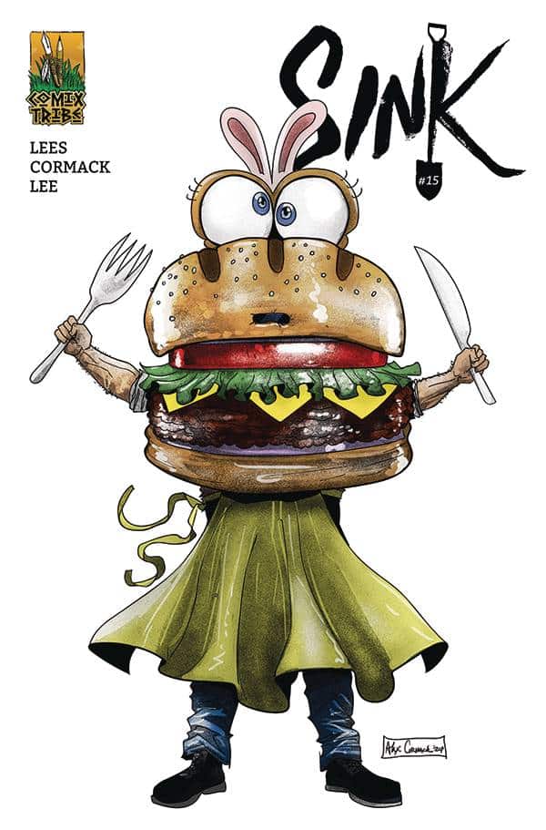
- Sink #15 (Comix Tribe): So, first things first…Sink is currently funding a Kickstarter for its excellent third volume now, which you can and absolutely should support here. This week’s Sink #15 is actually the finale to that third volume, and I’m tempted to call it a different kind of Sink issue, as it goes full on cheeky with the way it incorporates artisan eatery culture and cooking competitions into its pre-established world. That said, it’s still very much a Sink comic, grounded in the (frankly, terrifying) world of Sink Hill and all that has come before it in this book. There’s a case to be made for Sink #15 as the funniest entry in this series so far (I mean, just look at that cover). More over, I wanted to write about this issue this week because I think it speaks directly to what has made this third story arc so interesting. This issue — and the others in this third volume — builds out some of the people and places that we’ve already seen in Sink in new interesting ways. Sink #14 really goes all on this, and the results are horrifying. This issue is a little more understated, and — in the parlance of our culinary themes — a bit of a palette cleanser following the chapter that it does. Overall though, this arc has brought us back a bit to the absolute banger of a first issue that started this series, as well as some of the other early highlights, but it also feels like it’s starting to build momentum toward something. Perhaps it’s not an end game necessarily, but it is an exploration of bigger narratives at work within each of the micro stories these creators have served up so far. Simply put, this is long-form storytelling at its finest. Sink is written by John Lees with artwork by Alex Cormack and letters by Shawn Lee. —Zack Quaintance
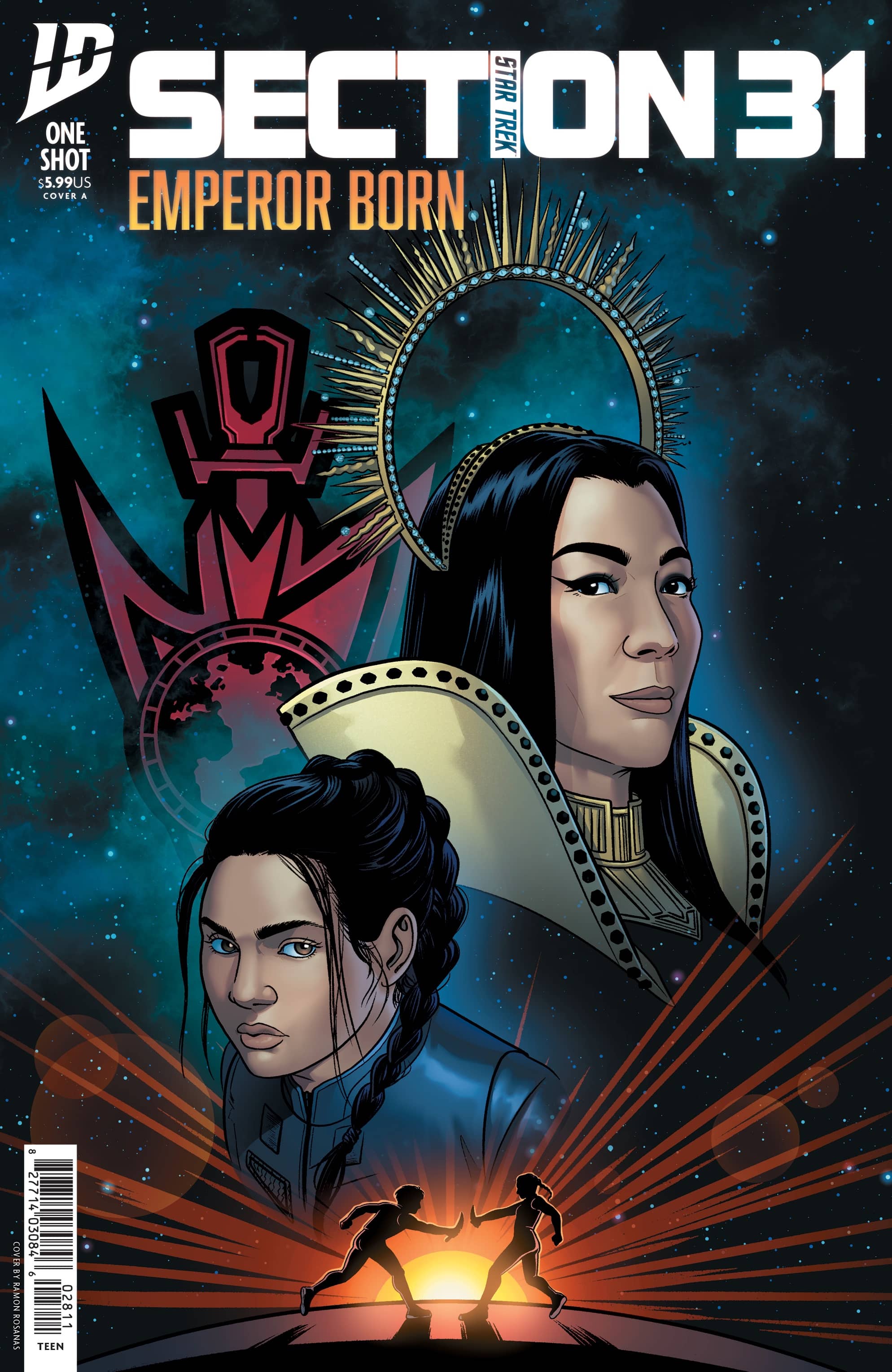
- Star Trek: Section 31 – Emperor Born #1 (IDW Publishing): In this one shot, Phillipa Georgiou’s backstory from the Paramount+ special event movie Star Trek: Section 31 is expanded upon. Star Trek: Section 31: Emperor Born #1 was written by Alyssa Wong with art by Megan Levens, colors by Charlie Kirchoff, letters by Jodie Troutman and design & production by Neil Uyetake. Aside from a brief frame set at the Baraam in 2333, this issue is mainly set in Georgiou’s past. Specifically, it reveals her teenage trial in the Mirror Universe, leading up to the movie’s opening scene. There aren’t any huge revelations in the issue, and the story primarily covers narrative territory that can be inferred from what we do see in the movie. It could serve as a nice prologue for those who haven’t seen the movie yet; but, if you’re interested enough to buy the comic, you’ve probably already streamed the movie. Setting the majority of the comic in the time before the opening scene also seems like a bit of a missed opportunity. There is, after all, a narrative gap between the opening scene and the flashback that opens the movie’s second act, in which San fakes his suicide. And that’s not to mention the narrative gap between Georgiou’s exit in Star Trek: Discovery Season 3 and her return in Section 31. And in both these time frames, Georgiou would have achieved her final form as the wisecracking despot who won Trekkies over in the first place. But perhaps they have reserved that narrative real estate for possible streaming sequels? Whatever the case, Wong’s voice is still a welcome addition to the Star Trek comics universe. I’d be interested to read any more Franchise comics they write, whether those comics are about Georgiou during other periods of her life or any other Star Trek characters. The art by Levens emphasizes the character expressions — almost exclusively human characters, of course, this being primarily set in the Terran Empire. Meanwhile Kirchoff’s coloring is impeccable, and Troutman likewise continues to deliver excellent lettering with a few fantastic flourishes. While Mirror Universe stories are not at the top of my personal “Star Trek stories that need to exist” list, I’d definitely pick up another issue from this creative team, whether it’s set in either the Terran or Prime Timeline. —Avery Kaplan
FOC Watch
These books are available for pre-order now.
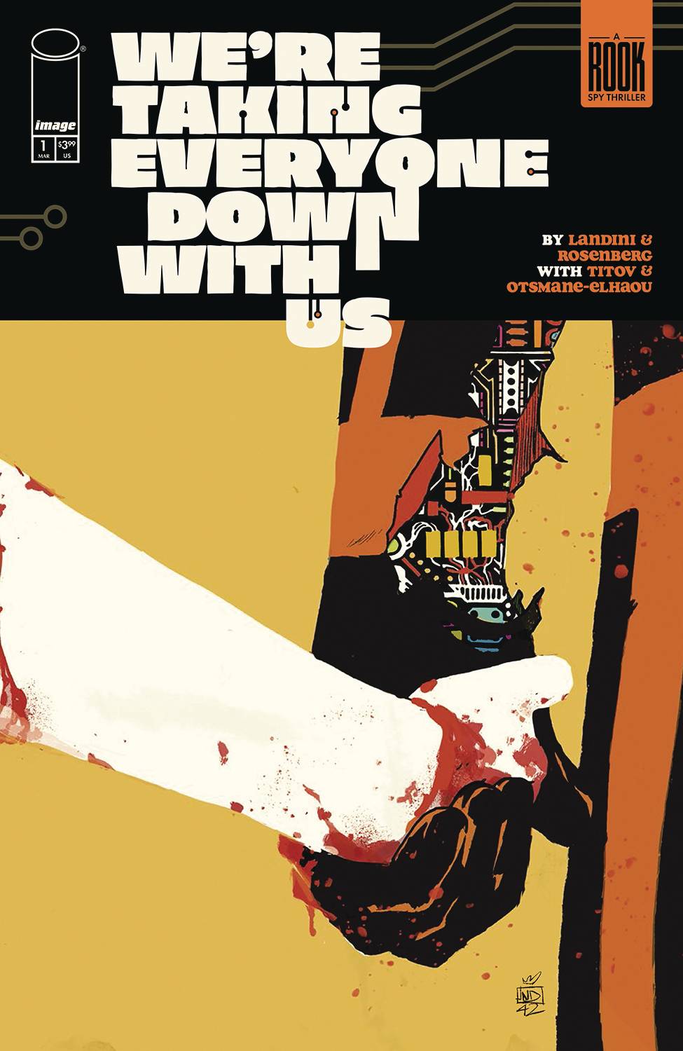
We’re Taking Everyone Down With Us #1
Writer: Matthew Rosenberg
Artist: Stefano Landini
Letterer: Hassan Otsmane-Elhaou
Colorist: Roman Titov and Jason Wordie
Publisher: Image Comics
Release Date: March 26, 2025
Review by Jared Bird
Annalise is a thirteen year old kid, who just wants to spend time with her father as opposed to hanging out with his variety of colorful robots. The only issue? Her father is in the midst of vital, world-changing research, and when he is attacked by a mysterious spy organisation, Annalise’s life is set to change forever. The newest comic from writer Matthew Rosenberg, working alongside the fantastic artist Stefano Landini, We’re Taking Everyone Down With Us is unlike anything else being published right now. Part coming-of-age story, part science-fiction thriller, and part spy adventure, it’s sure to be one of the most unique comics you’ll check out this year.
Life is hardly normal when your father is a mad scientist, but when he is killed by the world’s greatest spy, Annalise is torn between revenge and change. Accompanied by her dead father’s robot bodyguard, this miniseries shines in its identity. It’s eccentric, funny and full of heart, wearing its influences on its sleeves whilst also trying to tell a unique story that can appeal to a huge variety of different audiences and demographics. Whilst this approach often ends up with a ‘jack of all trades, master of none’ situation, this series manages to make it work, thanks to the skillful work of the creative team involved who make every disparate style and plot thread feel like parts of one larger whole.
Matthew Rosenberg’s writing is great throughout. He continues to prove himself to be one of the funniest writers in comics, telling stories with an element of sincerity that they wear on their sleeves. Moments in this issue made me laugh out loud, but the mysteries that propel the series are also set up gracefully and leave the reader wanting more. It ends on a fantastic cliffhanger as well, which will be sure to get readers invested. If you are new to Rosenberg’s work, this is a great place to start, and if you are already a fan, it’s almost a certainty you’ll enjoy it.
Stefano Landini’s artwork is absolutely stellar. Aided by the incredible work of colorists Roman Titov and Jason Wordie, Landini gives the series an exciting and energetic visual style, with a propulsive sense of energy that keeps the reader entertained even during the more exposition-heavy moments of dialogue. He experiments with style and form in an interesting way as the issue goes on, and is sure to experiment more over the course of the series.
Overall, We’re Taking Everyone Down With Us #1 is a great read, an exciting start filled with mysteries, humour and heart. With witty writing and excellent art, this book combines the talents of two phenomenal creators to make something unique and interesting. There is absolutely something for almost everyone in this comic, and it’s sure to be a crowd pleaser. I mean, who doesn’t love a vaguely homicidal lovable robot?
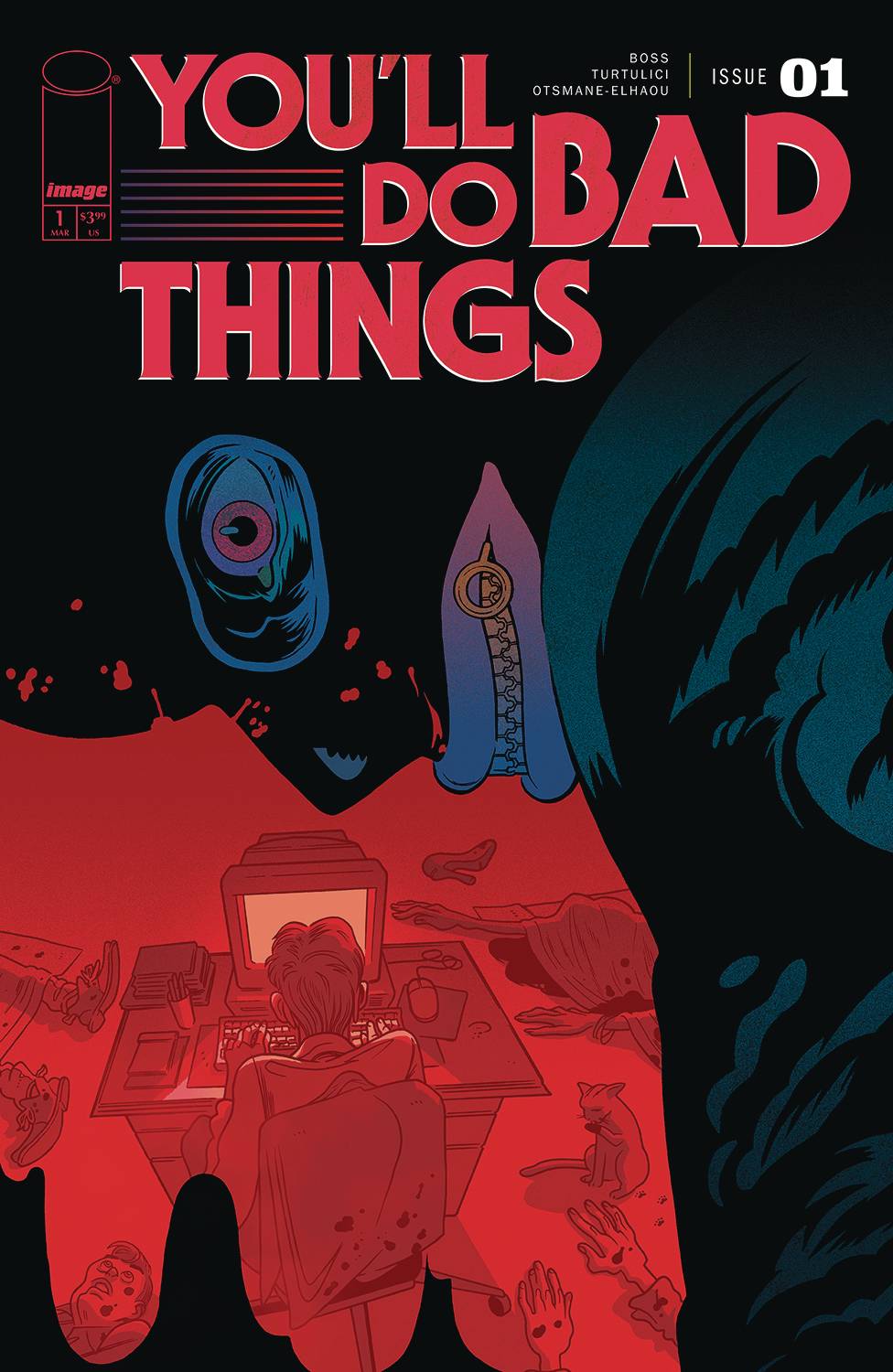
You’ll Do Bad Things #1
Writer: Tyler Boss
Artist: Adriano Turtulici
Letterer: Hassan Otsmane-Elhaou
Designer: Dylan Todd
Publisher: Image Comics
Release Date: March 26, 2025
Review by Tim Rooney
It’s best to go into You’ll Do Bad Things with as little information as possible.
Not because the book is full of shocks and surprises but because writer Tyler Boss’s story benefits from its reader being bounced around the shifting tones and genres and comics storytelling conventions of this first issue, which follows a writer suffering from a very specific type of writer’s block. It’s no surprise this comic plays with classic language and iconography of golden and silver age comics, as Boss is as much a designer as he is an artist and writer. His style is full of deliberate precision that almost obsessively plays with form and function in his solo work.
That same playful metatextual poking is present here, and artist Adriano Turtulici is a game creative partner in the effort. In the opening pages, Turtulici’s layouts and melodramatic staging screams of romance comics, with a CMYK color palette that works as both retro throwback and pulsing nightclub colors that highlight the hip urban feel of the world. To push the romance Boss’s script calls for thought balloons to evoke the same old-school feeling, with Hassan Otsmane-Elhaou giving a modern lettering flare. The internal monologue runs for several pages and Otsmane-Elhaou packs the balloons with words in pulsing size, the bubbles barely containing the frantic thoughts.
Everything shifts on a dime from there, with Turtilici effortlessly shifting his layouts to something more tense and staccato as compared to the romantic, intimate opening pages. Boss and Turtulici pull back again, separating fiction and reality through the use of a creative double-page spread that emphasizes the artificiality of the narrative. Though the book deals with writers and stories, and there are shifts in how Turtulici constructs his page as the disparate scenes unfold and derail, he does not drastically shift his actual style, and the same kind of off-kilter coloring continues no matter what level of narrative. It adds an unsettling uncertainty to the pages–not because there is a fear of anything supernatural but merely that there is something dark hiding amidst even the most normal, unassuming people.
This is a real showcase of a debut issue that is best experienced firsthand. Highly recommended!
The Prog Report
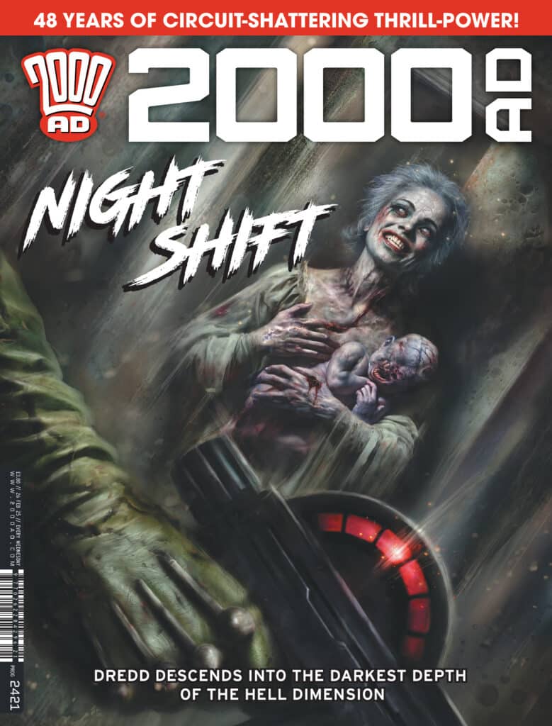
 2000AD 2421 (Rebellion Publishing): The Prog celebrates its 48th birthday this week by continuing a set of excellent stories, not so much with anything flashy, but rather with more stolid storytelling across the board. It’s been a few weeks since I’ve checked in here on Hawk The Slayer, but I found that strip to be the highlight of this week, right from a first page that sees a knight getting a magic sword chucked right through his face plate (with a satisfying THOKK). From there we get a tragic backstory reveal with major ramifications for one of this story’s antagonists, leading to perhaps the most consequential chapter in this excellent story yet. Hawk The Slayer: The Last of Her Kind is written by Alec Worley, with art by Simon Coleby, colors by Gary Caldwell, and letters by Annie Parkhouse. This week’s cover (above) is by Nick Percival. As always, you can pick up a digital copy of The Prog here. —Zack Quaintance
Read more entries in the weekly Wednesday Comics reviews series!
Next week, Monkey Meat returns with a new series, Usagi Yojimbo begins the story of the Ten Thousand Plumbs, and more!


