

Welcome back to the Marvel Rundown! This week, we jump into the oversized Daredevil #8, celebrating the 60th anniversary of Matt Murdock and the Man Without Fear! This review contains SPOILERS, so head on down to the Rapid Rundown for spoiler-lite reviews of Blade #10 and Ultimate Spider-Man #4!
What did you think of this week’s batch of fresh Marvel Comics, True Believers? The Beat wants to hear from you! Give us a shout-out, here in the comment section or over on social media @comicsbeat, and let us know what you’re thinking.
Daredevil #8
Writers: Saladin Ahmed, Ann Nocenti, D.G. Chichester, Elsa Sjunneson, Erica Schultz, & Ty Templeton
Artists: Aaron Kuder, Tommaso Bianchi, Stefano Raffaele, Ken Lashley, Eric Koda, Jan Bazaldua, & Ty Templeton
Color Artists: Jesus Aburtov, Dee Cunniffe, Juan Fernandez, & Ceci de la Cruz
Letterer & Production: VC’s Clayton Cowles
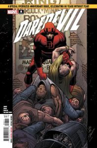
Cover Artists: John Romita Jr., Scott Hanna & Richard Isanove
Saladin Ahmed‘s DD run has taken some pretty interesting turns since it kicked off late last year, as a (mildly) amnesiac Matt Murdock juggles his duties as a Priest with his desire to hop around Hell’s Kitchen with Elektra in a pair of matching red pajamas. It speaks to the strength of Daredevil as a character that there are seemingly endless ways to reinvent him, but it also speaks to the strength of these creative teams that they’re able to create such compelling stories in this world.
This is why I don’t roll my eyes when the main story features Bullseye (who is all over most Daredevil runs) and Wilson Fist, the Kingpin of Crime himself. After spending a couple of years hanging with the muties, it feels like we’ve taken enough time for the Kingpin to come back and make his mark in Hell’s Kitchen once again, especially now that he’s no longer the Mayor of NYC.
Aaron Kuder has been a phenomenal fit for this title, with totally unique layouts that make the book feel just as topsy turvy as it must feel for Matt to run around the city. His figures are incredibly kinetic, bouncing off walls and security guards like Stretch Armstrong being pulled to the furthest extent. Jesus Aburtov helps with this effect, with colors that make characters look a bit like action figures in the best way possible. Clayton Cowles letters the entire issue, and bounces between different styles like its nothing.
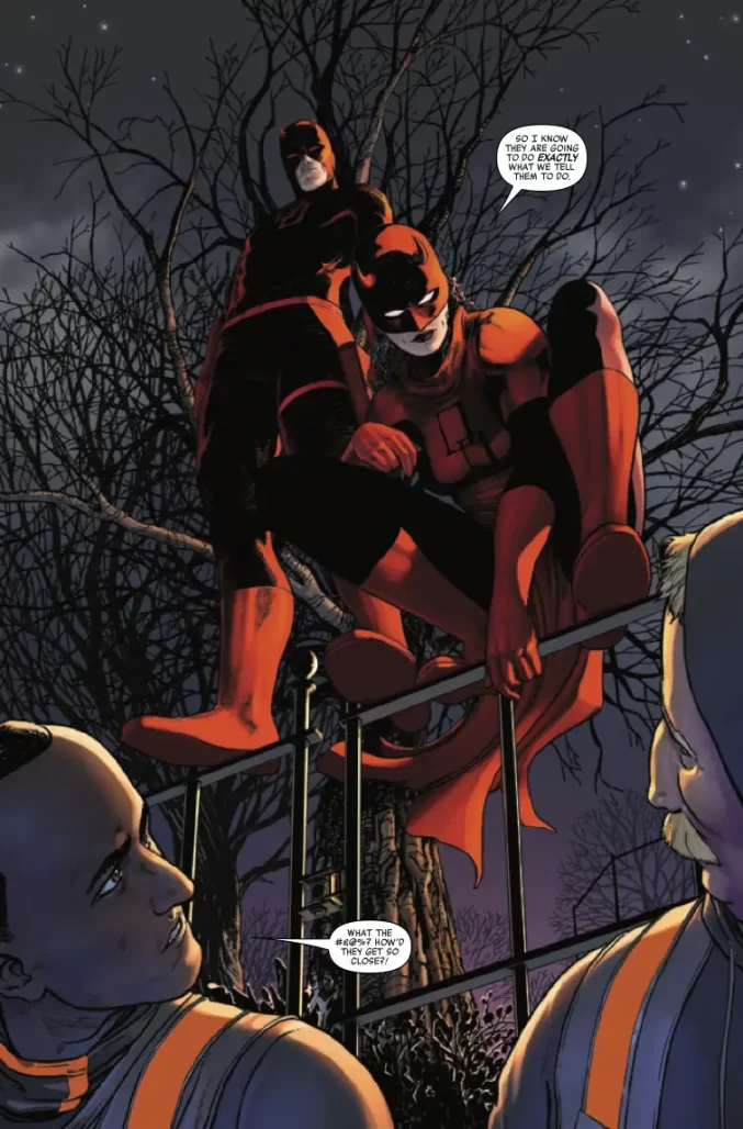
The issue also contains a number of back-up stories, along with the requisite cover gallery and short stories from creators, past and present. There’s an intriguing lead-in to the upcoming Woman Without Fear miniseries, written by Erica Schultz, Jan Bazaldua, and Ceci de la Cruz. It’s a bit strange to see Elektra in a motherly role, but it sets up an interesting premise for the upcoming mini.
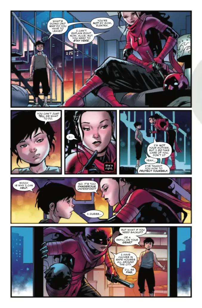
The issue also includes a short by Ann Nocenti, Stefano Raffaele, and Dee Cunniffe, who tell a fun story of classic Daredevil foil Turk and some impressionable new goons. Raffaele and Cunniffe do a phenomenal job of depicting Matt’s radar sense, with an interesting blueprint-like style. Ty Templeton‘s pastiches of popular newspaper strips might be my favorite of the bunch. Templeton is great at imitating classic styles, with excellent Watterson and Groening cartoons in ‘Matty and Stick’ and ‘Life in Hell’s Kitchen.’
All-in-all, this is a solid anniversary outing for the Man Without Fear, showcasing the tremendous range that comes with the character. These anniversary issues can be hard to pull off, but this is a great showcase of the character and his history.
Verdict: BUY
Rapid Rundown!

- Blade #10
- So another Blade series comes to an end. Blade and his crew make their final stand against The Adana, the embodiment of evil they’ve fought over the course of this series. Bryan Hill and Elena Casagrande’s take on the Daywalker has mostly been an action oriented affair. Blade has hacked and slashed his way through a lot of monsters to get to this big bad. The Adana is one of those all powerful evil forces that readers mostly get told is an all powerful evil force. The extent of their evil in this series mostly consists of people taking about how evil they were and her unleashing people’s inner monsters. This means that the final fight is a bit anticlimactic. Evil has to go so evil goes even if they’ve never seemed to be truly threatening. That said this series has been a great showcase for Elena Casagrande. Her action sequences are smooth, flowing from one panel to another. Her Blade looks stylish and moves with swagger. Her design for The Adana looks reminiscent of skinless people from the Hellraiser franchise. The purples and reds that Jordie Bellaire colors each pages with only aids in the mood Casagrande sets. This has been a great looking book in her hands. She’s a real talent to watch and hopefully, this project gets her on more high profile books. —DM
- Ultimate Spider-Man #4
- You are cordially invited to a dinner for four with Peter, MJ, Harry, and Gwen! There will most certainly be conversation and food, but not much else. Single scene issues weigh heavily on their premise to deliver their value to a series’ character development arcs and overall narrative. However in bottle issues that revolve entirely around a conversation, their page real estate quickly turns into heads and shoulders filling the panel with their word balloon breath. While Jonathan Hickman is no stranger to conversational comics, the entire issue lacks an intensity it desperately tells you it has. With dramatic reveals that require readers to have knowledge outside the series, USM #4 feels like an uniquely nuanced book for superhero readers that isn’t particularly nuanced in and of its own narrative, but rather the history outside it. That alone wouldn’t be an issue if David Messina’s approach to a 9-panel grid held more thematic weight, but with such intense closeups, the visual claustrophobia doesn’t reflect the tempo of our diners’ convo. A consequence of sticking to a 9-panel grid means Messina’s character performances are limited to heads, shoulders, and hands, which is commendable, but with all the hand acting, each of the four dining feel like they express themselves identically; especially MJ and Gwen. Every time Messina’s female characters open their mouth or smile, there’s a pleased coquettishness that feels like a SW was used as reference, because the expressions and use of heavy eyeshadow feel so off the mark. Now, while the diners have done this dinner before, Matthew Wilson didn’t miss an opportunity to call back to their Golden Age adventures by dyeing this high-end restaurant in luxurious gold, which helps contrast with the cold blue spring night outside this function. Similarly, while I’ve been hot and cold on Cory Petit’s [of VC] balloon stacking, the combination of mixed case font, Hickman-length dialogue, and layouts not made with lettering in mind result in unintentionally stuffy panels crowded with text small enough that I will say calls for an all caps font. USM #4 is a fascinating look at what works and doesn’t work in a bottle ep, but I’m still left wondering how much the readers have to pay for what they didn’t order. — BQ
Next week: Blood Hunt explodes across the 616!


Wow, hard to believe Daredevil’s been published for 60 years and still only on issue #8.